
Editing guide
How to Use Negative Space in iPhone Film Photos
Give iPhone film photos room to breathe. Learn where to leave open space, how to compare crops, and how to keep grain and vignette from competing with the subject.
Give the open area a job
Negative space is the quieter area around your subject: a pale wall, an overcast sky, a stretch of snow, or a dim corner of a room. It does not have to be completely empty. In an iPhone film photo, that quieter area can make a small gesture easier to notice and give the scene a slower, more reflective mood.
Before adding a film look, decide what the space contributes. Sky above a lone walker can suggest scale. Room in front of a person looking out a window can follow their attention. An open wall beside two friends can keep a busy portrait from feeling crowded. If the extra area adds neither atmosphere nor direction, try a tighter frame.
Find a quieter background before reaching for a filter
When taking a new photo, move a little to either side and watch the background around the subject. A small change in position may place a head against a plain wall instead of a sign. Keep enough of the setting to explain the moment, but look for bright objects or strong lines that pull your eye away.
For an existing photo, compare two crops using your usual crop tool and keep the original. In one version, leave more room around the subject; in the other, trim the least useful edge. Keep the same shape for both versions so you can judge the amount of space without also changing the format.
- Try space in the direction someone is looking or walking.
- Leave a little clearance around hands, hair, and important objects.
- Check all four edges for small bright distractions.
- Keep an off-center subject only when the surrounding space feels useful.
Use the preview as a framing exercise
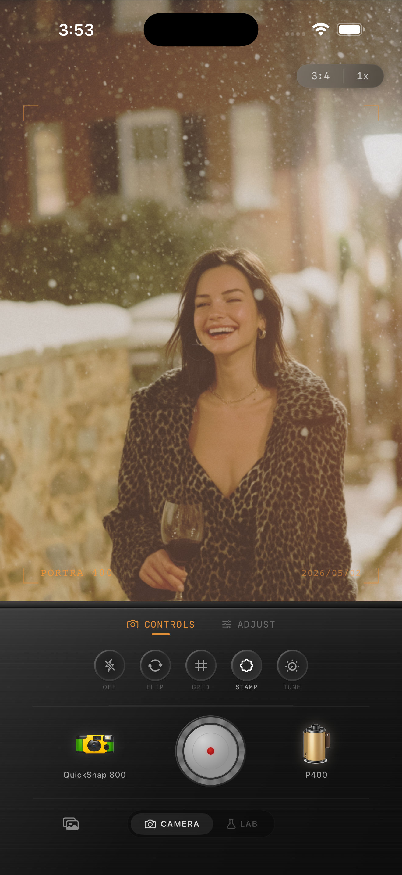
In the snowy brownstone preview above, the woman sits low in the photographic frame while the upper area establishes the street and weather. The buildings contain detail, so this is quieter supporting space rather than a blank background. Imagine trimming part of that upper area: the expression becomes more prominent, but the sense of the snowy setting becomes smaller.
Neither choice is automatically better. Keep the wider version when the weather and place are part of the memory. Favor the closer version when the laugh is the whole story. Judge the photograph inside the app preview, excluding its controls and labels; those interface elements are not part of the composition exercise.
Film and camera names visible in this preview describe style inspiration. Nostalgia Cam is not affiliated with Kodak, Fujifilm, or other camera or film manufacturers.
Keep the film treatment quieter than the subject
Once the framing works, preview a camera body and film look in Nostalgia Cam. Start with restrained grain, fade, and vignette. Watch both the subject and the broad background as you adjust. A texture that feels subtle on a patterned coat may become the main thing you notice across a plain wall.
Increase grain only until it supports the mood at the size you expect to view the whole image. If the open area starts to feel restless, compare a lower-grain version before changing the crop again. You can keep a strong color mood with gentler texture; every part of the film treatment does not need equal emphasis.
Protect subjects near the edge
An off-center face can fall into a darkened corner when you add vignette. Compare the same framing with less vignette and check whether the face becomes easier to read. Avoid brightening the entire picture just to compensate for an effect that darkened the subject.
Also watch the boundary between the subject and the background. If extra fade makes a pale coat disappear into a pale wall, reduce fade or preview a different film look. Open space works best when it gives the eye a clear place to rest without erasing the person or object you wanted to emphasize.
Make the final choice with the whole photo visible
Compare your two crops with a similar film treatment and the entire image visible on the same screen. Look away briefly, then return to each. Notice what you see first: the person, the setting, or the texture. Choose the version whose first impression matches the story you want to keep.
There is no required percentage of empty space. A quiet travel scene may benefit from a small subject and a broad sky, while a group snapshot may need a closer crop. Stop when the open area feels intentional, the subject stays readable, and the film character supports both.
Give your next film edit room to breathe
Choose a photo with a quiet background, settle on a crop, then import it into the Nostalgia Cam Lab. Preview a camera body and film look, and refine grain, fade, and vignette while keeping your subject easy to see.
FAQ
How much negative space should an iPhone film photo have?
There is no fixed ratio. Compare a roomy crop with a tighter crop and keep the version that makes the subject and mood easiest to understand. Leave more space when it contributes scale, direction, or a sense of place.
Does negative space have to be a plain background?
No. Soft buildings, distant scenery, or a dim room can act as supporting space when they attract less attention than the subject. Check for bright details and strong lines that interrupt that balance.
Why does grain look distracting in the empty part of my photo?
A broad, quiet area gives the texture little visual competition. Compare less grain at your intended viewing size before filling the space with a tighter crop. Keep enough texture for the mood while letting the subject remain the first thing you notice.