
Editing guide
How to Make iPhone Photos Look Like Film Without Oversharpening
A practical iPhone film-editing guide for softer edges, calmer contrast, restrained grain, and more natural texture when your photos look too crisp and digital.
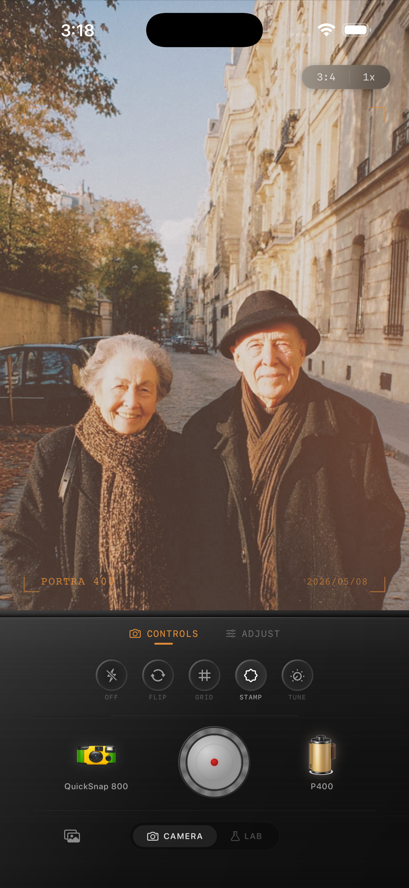
Why oversharpening ruins the film feeling first
Most iPhone photos that fail as film edits are not failing because the color is wrong. They fail because every brick edge, eyelash, jacket seam, and sign border feels too crisp. Film usually carries gentler transitions, a little optical softness, and texture that sits inside the image instead of outlining everything.
If the file already looks sharp and glossy before you start editing, adding more grain or warmth will not solve the problem by itself. The better move is to soften the digital bite first, then add film character on top.
- Keep contrast softer so edges do not snap too hard.
- Use fine to medium grain instead of heavy rough texture.
- Add only a little fade so detail stays readable.
- Judge skin, lettering, and building edges at the same time.
- Stop when the image feels printed, not blurry.
A dependable softer-film baseline
Start around film intensity 72-86%, grain 20-32%, warmth +3 to +9, fade 3-7%, and vignette 3-8%. That range usually takes the clinical edge off an iPhone file without making the photo collapse into haze.
If the image still looks crunchy, reduce the sense of sharpness by calming contrast and keeping the grain fine before you push warmth or fade. Oversharpened photos often break when every slider gets raised at once.
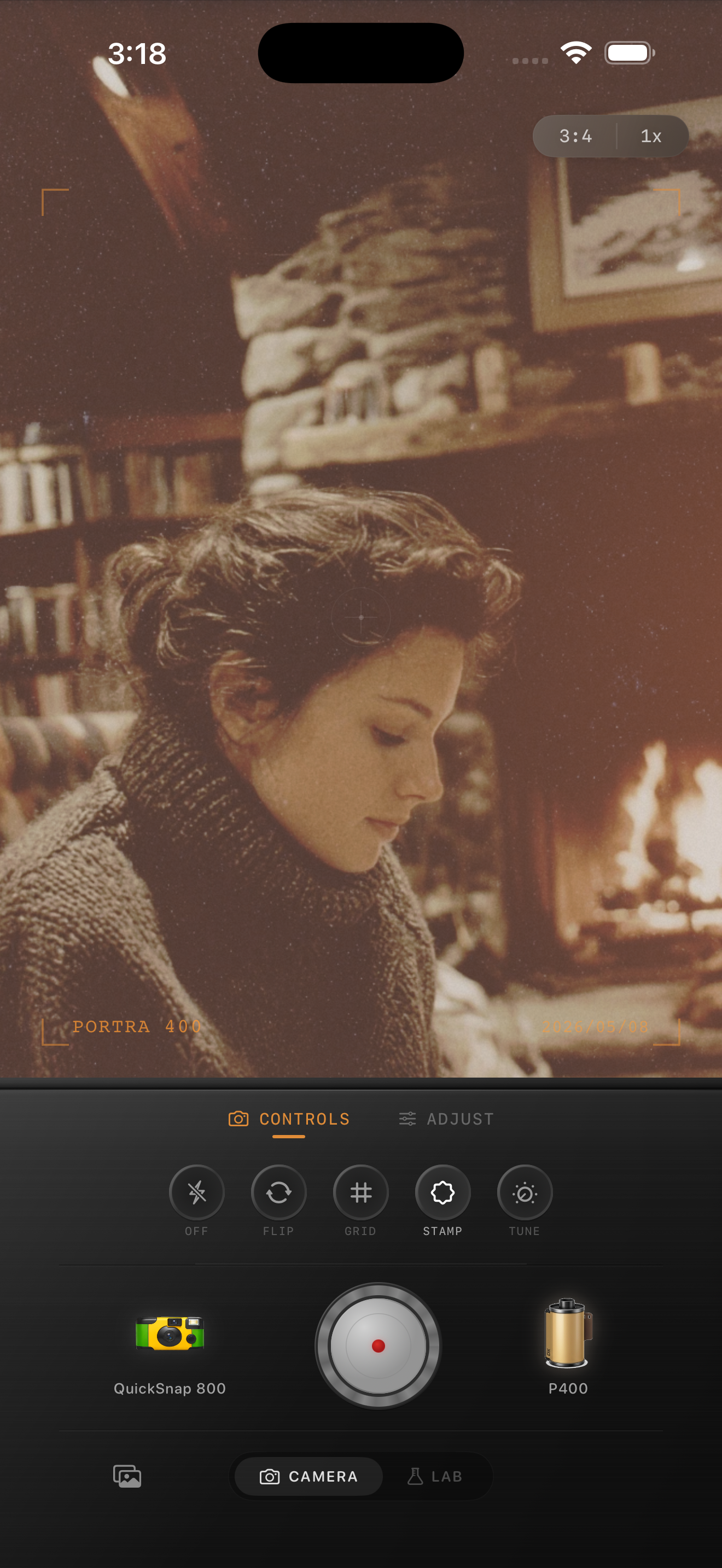
Check the three areas that reveal too much digital detail
Skin, text, and repeating textures tell you quickly whether the edit still feels oversharpened. Skin should look alive, not waxy or etched. Text should stay legible without glowing at the edges. Brick, fabric, leaves, and hair should keep shape without becoming crunchy.
If one of those three areas still looks too sharp, pull back the aggressive feel before doing anything more cinematic. A believable film-inspired edit usually feels quieter, not louder.
Match the camera mood to the subject
A cleaner 35mm-inspired body works well for portraits, travel scenes, bookstores, cafes, and architecture where you want softness without obvious damage. A rougher disposable-inspired body can still work for flash snapshots and nightlife, but it should add texture rather than sharpening the chaos.
In Nostalgia Cam, choose the camera body first, then tune grain, warmth, fade, and vignette until the photo feels like a scan or small print instead of a hyper-detailed phone file. If you want a Portra-style or Fuji-style mood, treat it as color inspiration rather than as a literal affiliation.
Soften digital detail without losing the photo
Use Nostalgia Cam to pair iPhone photos with calmer contrast, natural grain, and film-style camera bodies so portraits, travel shots, and everyday scenes feel tactile and analog instead of overly sharp.
FAQ
Can a film edit still look sharp?
Yes, but it should not look clinically sharp. A good film-inspired edit keeps important details readable while softening the hard digital edge around them.
What is the best first fix for an oversharpened iPhone photo?
Usually start by calming contrast and keeping grain fine. That reduces the crunchy digital feeling more reliably than simply adding warmth or a stronger preset.