Editing guide
How to Make iPhone Photos Look Like Faded Film
A practical faded-film recipe for iPhone photos: softer contrast, lifted shadows, restrained warmth, fine grain, and enough color loss to feel nostalgic without turning muddy.
Faded film should feel soft, not lifeless
When people ask for a faded film look, they usually want softer contrast, lifted shadows, slightly muted color, and a print-like calmness. What they usually do not want is a gray, flat photo with dirty highlights and weak skin tones.
The trick is to remove some of the digital snap from the image while keeping a clear emotional center. The scene should still feel lit, readable, and present even after the colors get quieter.
- Lift shadows gently instead of flattening the whole frame.
- Use fine grain so the photo feels scanned, not noisy.
- Reduce saturation a little, not all at once.
- Warm highlights slightly without turning whites beige.
- Keep vignette subtle so the fade feels natural.
A dependable faded-film recipe for iPhone
Start around film intensity 68-82%, grain 22-34%, warmth +5 to +11, fade 8-16%, and vignette 3-8%. That range usually gives the photo a gently worn look without erasing depth or making faces look tired.
If the image starts feeling chalky, lower fade first. If it still looks too modern, add a little more grain or softness before stripping out more color.
Choose scenes that already carry memory
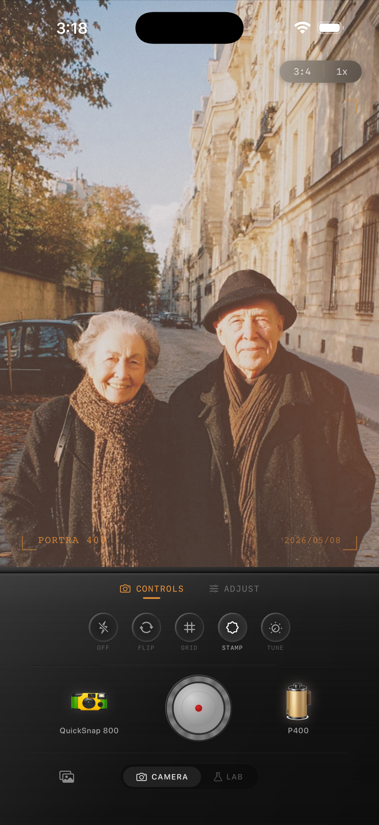
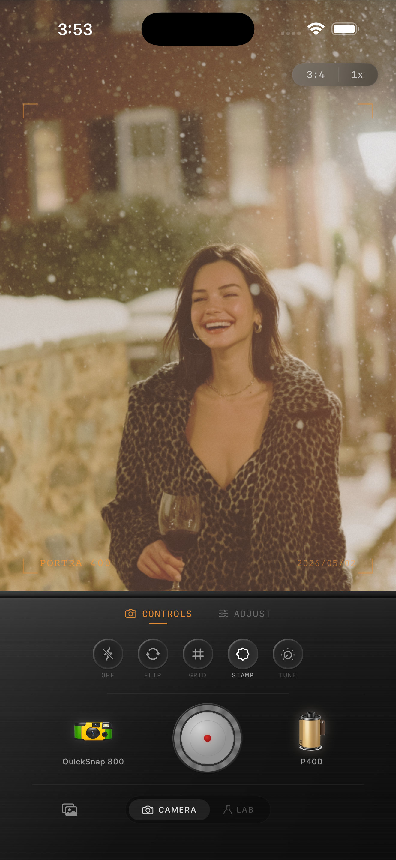
Faded-film color works best on travel portraits, quiet street scenes, grandparents, cafés, snow, old buildings, and casual snapshots that already feel a little sentimental. The edit supports memory best when the subject matter already feels lived in.
Very glossy product photos or ultra-bright midday scenes usually need a lighter hand. Those images can tolerate some fade, but they rarely want the whole nostalgic treatment pushed to the limit.
What to fix when the fade turns muddy
Muddy faded-film edits usually come from combining too much fade with too much warmth. Pull warmth down first if whites, sidewalks, or skin start drifting beige.
If the photo still feels dull, swap to a calmer film-inspired look or cleaner camera body before removing more contrast. A believable faded look should seem aged and gentle, not weak.
Build a softer faded-film look in Nostalgia Cam
Use Nostalgia Cam to combine film-inspired color, grain, fade, and camera-body character so iPhone photos feel gently worn, printed, and natural instead of washed out.
FAQ
What makes a faded-film edit look realistic on iPhone?
Realistic faded-film edits usually keep some contrast, use restrained warmth, and add fine grain. The goal is a soft aged print feel, not a flat gray overlay.
How much fade should iPhone photos use for this look?
A practical starting range is around 8-16%. That usually lifts the image enough to feel nostalgic without draining all the depth from faces, skies, and shadows.