Editing guide
How to Edit iPhone Portraits to Look Like Film Without Orange Skin
A portrait-focused iPhone film recipe that keeps skin tones natural: softer contrast, controlled warmth, gentle grain, and film-inspired color without the usual orange cast.
Most portrait film edits fail on skin first
People usually notice orange skin before they notice good grain or a nice vignette. That is why portrait film edits need a different approach than diners, neon streets, or snowy architecture shots.
Start by protecting skin tones and pale neutrals. Once faces look believable, you can add the film feeling through contrast, grain, and softer highlight rolloff instead of more and more warmth.
- Warm the image moderately, not aggressively.
- Keep skin peachy or neutral instead of bronze.
- Use gentle contrast so highlights stay creamy.
- Add fine-to-medium grain after color looks right.
- Test the edit on cheeks, forehead, and white clothing before exporting.
A reliable portrait-film starting recipe
Start around film intensity 70-84%, grain 20-32%, warmth +4 to +9, fade 3-7%, and vignette 3-8%. That range usually gives portraits enough analog softness without making faces heavy or overly yellow.
If skin starts turning orange, reduce warmth before reducing film intensity. If the portrait still looks too digital, add a little more grain or softness instead of pushing the color harder.
Use film-inspired color, not blanket warmth
Good portrait film color often means warmer highlights, calmer greens, softer blues, and lower digital sharpness. It does not mean dragging every tone toward orange. White walls, snow, and pale sweaters are useful reality checks because they reveal when the warmth has gone too far.
If you want a classic warm portrait feel, think in terms of inspiration rather than copying a branded stock exactly. A soft portrait-film mood is more believable than an exaggerated one.
What to adjust when skin still looks wrong
If faces look too orange, pull warmth down a few points and reduce fade slightly so the image regains clean separation. If faces look too gray instead, add a little warmth back and lower grain if it is dirtying the skin.
Portraits also benefit from choosing a cleaner camera body than party or disposable-style shots. Let the analog feeling come from the color and texture, not from rough damage layered on top of a face.
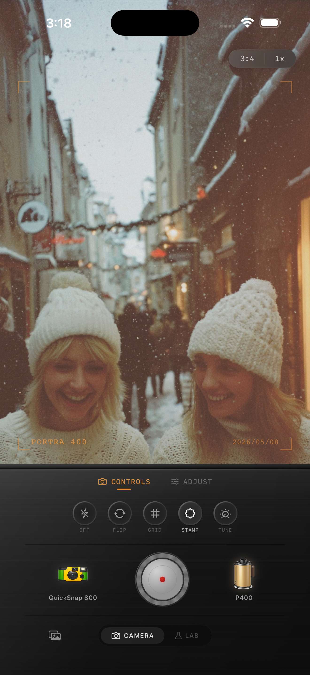
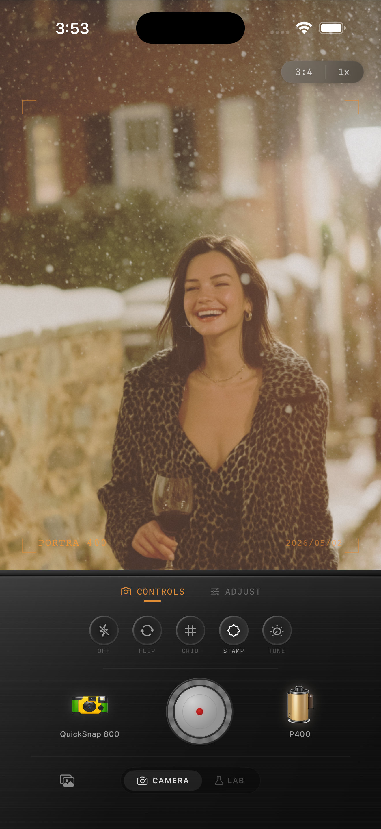
Keep portrait skin tones natural in Nostalgia Cam
Use Nostalgia Cam to pair portrait-friendly film-inspired color with controlled grain, warmth, fade, and camera-body character so iPhone portraits feel soft and analog without the orange cast.
FAQ
Why do film filters make iPhone portraits look orange?
Many filters push global warmth too hard. Portraits look better when the warmth stays controlled and the analog feel comes from softer contrast, cleaner highlights, and subtle grain.
What grain level works best for film-style portraits on iPhone?
A lower range around 20-32% is a strong starting point. It adds texture without making faces, makeup, or pale clothing look dirty.