Editing guide
How to Make iPhone Photos Look Like Drugstore Film Prints
A practical guide to the drugstore film-print look on iPhone: softer contrast, mild color shift, restrained grain, and the slightly imperfect finish that feels like a stack of one-hour prints.
What makes a photo feel like a drugstore print
Most people do not mean gallery-grade scans when they talk about old film prints. They usually mean small glossy prints from a pharmacy or one-hour lab: a little warm, a little soft, slightly imperfect, and easy to imagine in a shoebox or family album.
That look is less about dramatic vintage effects and more about lowering the polished digital finish. The best version keeps skin believable, whites a touch creamy, and detail gentle enough that the image feels handled and printed.
- Use moderate grain, not heavy texture.
- Soften contrast before adding fade.
- Keep warmth small and uneven rather than orange.
- Let highlights roll off gently instead of staying glossy.
- Use vignette only if the edges still feel too clean.
A starting recipe that usually works
Start around film intensity 72-84%, grain 24-36%, warmth +5 to +11, fade 5-10%, and vignette 3-7%. This keeps the image in print territory rather than pushing it into a damaged-film effect.
If the photo already has warm indoor light, lower the warmth and rely more on softer contrast. If the image is bright daylight or snow, stay lighter on grain so pale areas do not turn dirty.
The difference from a generic old photo filter
A believable drugstore print look should still feel like a normal photo someone kept, not a novelty effect. That means fewer scratches, less sepia, and much less aggressive fading than a stereotypical retro filter.
Think in terms of ordinary memory: family trips, sidewalk portraits, dinner snapshots, a holiday afternoon, or an everyday street scene. The edit should support that kind of realism.
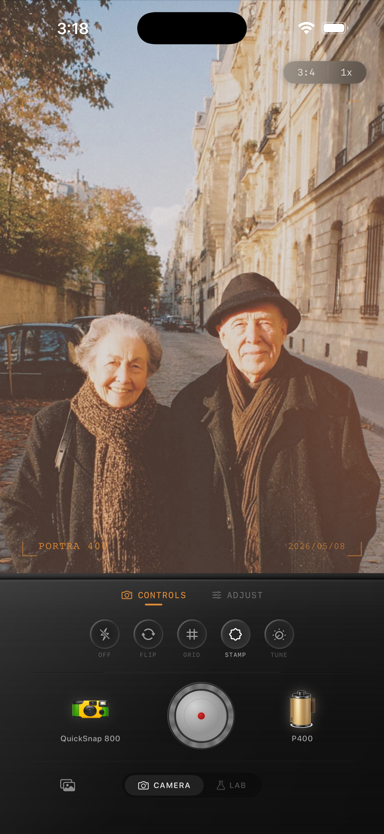
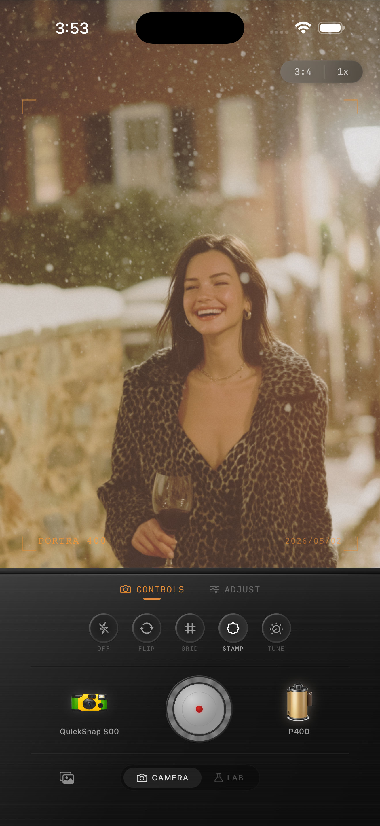
How to get the look inside Nostalgia Cam
Begin with a clean or balanced camera body instead of the roughest disposable option. Then choose a film look that already feels slightly warm and printed, and only after that tune grain, fade, and vignette.
Check the result at phone-feed size. If the photo feels like something you could pick up from a drugstore envelope before the grain becomes obvious, the edit is close.
Build a print-like finish in Nostalgia Cam
Use Nostalgia Cam to shoot or import iPhone photos, then adjust camera body, film color, grain, warmth, fade, and vignette until the image feels like a real stack of film prints instead of a polished phone file.
FAQ
What is the difference between a drugstore print look and a film scan look?
A drugstore print look is usually softer, slightly warmer, and more print-like, while a film scan look often keeps more detail and cleaner contrast.
Should I add scratches to make it look like an old print?
Usually no. A few tiny imperfections can help, but most everyday film prints looked worn through softness and color shift more than obvious scratches.