Editing guide
How to Make iPhone Food Photos Look Like Film
A practical guide for food photos on iPhone: soften harsh digital detail, keep colors appetizing, use restrained grain, and shape restaurant or window light into a natural film-inspired look.
Food photos look fake when every detail is too crisp
iPhone food photos often look overly digital because the default processing sharpens every edge, brightens every highlight, and makes plates, cutlery, and table textures feel clinically clean. A film-inspired edit works by calming that perfection down.
The goal is not to make the meal darker or muddier. It is to keep the food appealing while giving the scene softer contrast, warmer atmosphere, and enough texture that it feels photographed instead of processed.
A solid starting recipe for restaurant and cafe scenes
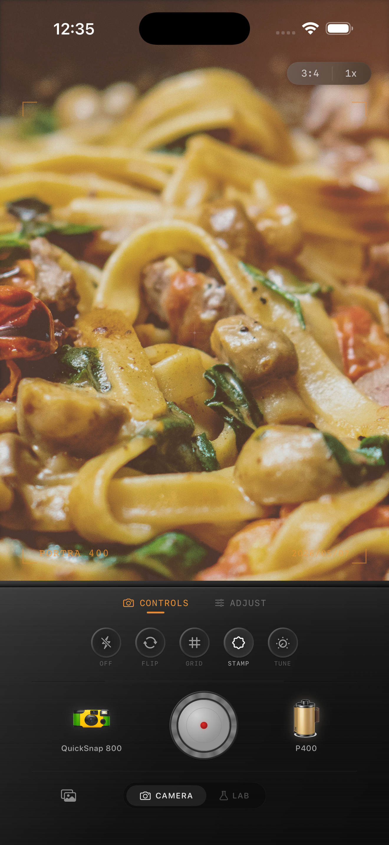
Start around film intensity 70-82%, grain 18-30%, warmth +6 to +14, fade 3-7%, and vignette 4-10%. This range usually adds atmosphere without making pasta, drinks, or skin at the table look dirty or overly brown.
If the light is already warm, keep the warmth boost modest and let the room do the work. If the scene is cooler daylight from a window, add a little more warmth but keep the contrast gentle so plates and napkins do not blow out.
- Use finer grain than you would for party or flash photos.
- Protect whites on plates, menus, and tablecloths.
- Let reds and oranges stay rich without oversaturating them.
- Use only a light vignette so the meal still feels inviting.
Match the edit to the type of light
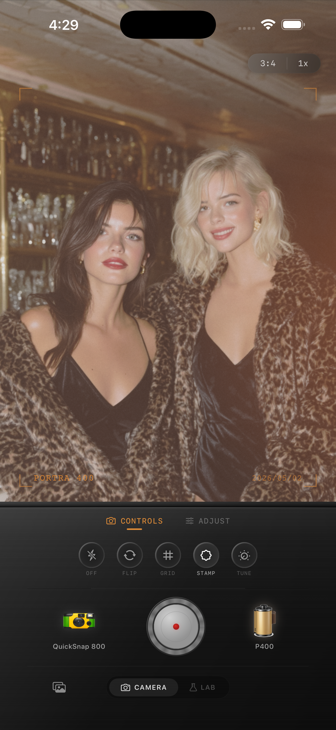
Window-light brunch photos usually want a cleaner 35mm-inspired feel: lower grain, subtle warmth, and enough softness to keep glass, cutlery, and plates from looking harsh. Night restaurant photos can take a little more grain because shadows and candles already carry mood.
If you used direct flash, treat the image more like a nightlife snapshot than a polished food editorial. Keep the pop from the flash, then use grain and a little fade to take the digital edge off.
Keep the meal believable
The fastest way to ruin a food photo is turning everything the same shade of sepia. Good film-style food edits still separate sauce from pasta, drink from table, and skin from background. Color should feel cohesive, not flattened.
In Nostalgia Cam, start with a camera body that matches the mood of the room, then adjust the film look until the meal feels like a memory from dinner rather than a filter laid over dinner.
Give food photos a softer film finish
Use Nostalgia Cam to combine film-style color, camera body character, grain, fade, and vignette so restaurant shots and home dinner photos feel warm, natural, and less digitally sharp.
FAQ
How much grain should food photos use?
Usually less than nightlife or disposable-style edits. Start around 18-30% so the scene gains texture without making plates, sauces, or skin look dirty.
Should food photos be warmed a lot to look like film?
Not usually. A small warmth boost often works better, especially indoors where the room light is already warm. Softer contrast and restrained grain do more for realism than heavy orange tones.