
Editing guide
How to Keep Text Readable in iPhone Film Photos
Keep shop signs, handwritten notes, and menu lettering readable in iPhone film edits with careful framing, gentle color, and restrained grain and fade.
Decide which words need to survive the edit
A cafe name can explain where a travel photo was taken. A handwritten note can be the whole reason you kept the picture. To keep text readable in iPhone film photos, identify the words that carry the story before choosing the finish. Those letters become your reference for every adjustment.
Not every sign needs equal attention. In a portrait beside a storefront, background lettering may simply establish the setting. In a photo of a birthday card, the message matters more than the surrounding table. Decide whether you need the exact words to be readable or only the shape and color of the sign.
Check the original before adding texture
Open the original and read the important line at the size you expect to share. Then enlarge it to see whether the letter edges are actually distinct. If a word is already blurred, hidden by glare, or too small to resolve, adding a film look will not restore it. Choose another frame when the wording is essential.
When you can retake the picture, move closer without cutting off the message, hold the phone steady, and check the result before leaving. For a flat note or menu, try a more face-on view so the far end of the line does not become much smaller than the near end. If reflections cover letters, change your position and check whether the words become clearer.
- Read the smallest important word without guessing from context.
- Check thin strokes, punctuation, and the spaces inside letters.
- Keep a copy of the original so you can compare the finish with real source detail.
Frame for readable words and a complete scene
Use your usual crop tool before settling on grain. A tighter composition can give a shop name more room in the finished picture, but enlarging a tiny word does not create missing letter detail. Keep enough of the storefront, card, or person to explain why the words are there.
Watch the first and last letters as well as the main subject. A crop that feels balanced around a face can accidentally trim the edge of a sign. If a square version loses the message, use a wider composition or make a separate crop instead of forcing every image into the same shape.
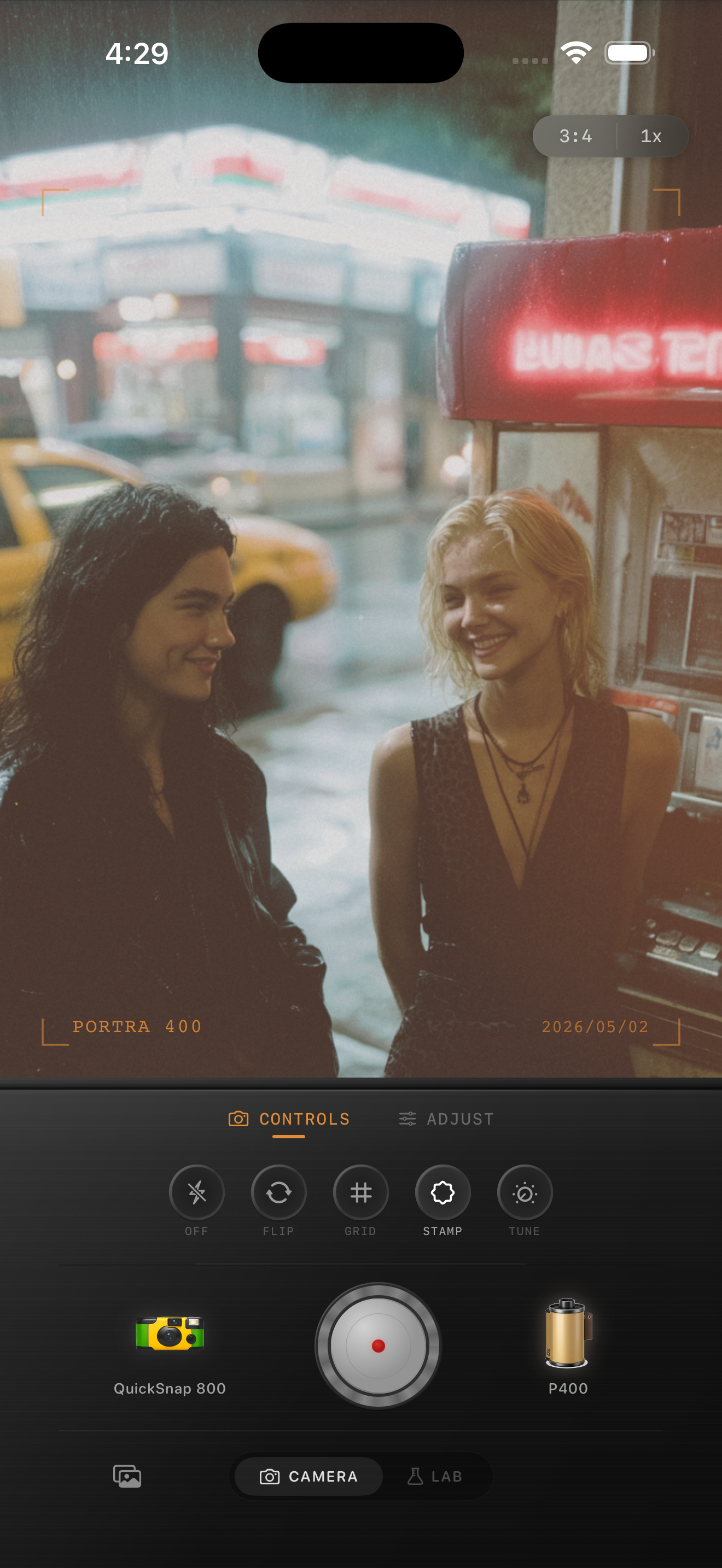
The diner preview on this page is a style reference: its soft background signage supports the portrait rather than demonstrating readable lettering. Use a clearer source when exact words matter. Film names visible in the preview describe stylistic inspiration; Nostalgia Cam is not affiliated with or endorsed by those film brands.
Protect the contrast between letters and their background
Import the photo into the Nostalgia Cam Lab and compare film looks with little added grain. Watch the important word as you adjust intensity and warmth. Colored lettering can become harder to read when the finish makes it too similar to the surface behind it. Try a gentler look before making the entire image brighter or darker.
For dark ink on pale paper, excessive fade can make fine strokes look weak. For pale lettering on a dark shopfront, check whether the background remains distinct without losing nearby faces or architectural detail. Adjust in small steps and return to the original frequently; the goal is readable words within a believable scene.
If the text lies near a corner, compare the image with less vignette. Edge darkening may suit the photograph while making the one useful street name difficult to read. Keep the amount that works for the actual composition.
Judge grain on the smallest important letters
Add grain only after the wording reads comfortably with your chosen color. Increase it gradually while watching a small letter with an enclosed space, such as an e or an a. Stop when the added texture begins competing with those small gaps or making thin strokes look broken.
A large painted sign can tolerate a finish that overwhelms a handwritten sentence. Let the smallest essential text set the limit. If a rough camera look makes the lettering too soft, compare a cleaner body while keeping a similar color direction.
Save two versions with the same crop and color, one with less grain. Compare them at the intended sharing size. Choose the version where you can read the important line naturally, without zooming in to prove that the letters are still there.
Check the saved picture as a reader
Open the saved export and try reading the words before recalling what they say. Familiarity can hide a legibility problem: you may be recognizing the sentence from memory rather than seeing each letter clearly. If another person is nearby, ask them to read the line without a hint.
For a travel album, the shop name may only need to be recognizable. For an invitation or a note you are sharing for its contents, keep a clear reference photo alongside the creative edit. Use a caption for essential information when the photograph is mainly about atmosphere.
- The important phrase is complete and readable at the intended display size.
- Grain and fade do not overwhelm thin strokes.
- The words still fit naturally within the scene.
- The final export retains the framing you checked in the editor.
Try a film finish that keeps the words clear
Import a favorite street scene or handwritten note into the Nostalgia Cam Lab. Compare camera bodies and film looks, then adjust intensity, warmth, fade, vignette, and grain while watching the important lettering. Export the version that keeps both the message and the mood.
FAQ
Can a film filter make blurry text readable?
A film filter does not restore missing letter detail. If the original words are unclear, choose a sharper source frame or retake the picture when possible. Lowering added grain or fade can help preserve text that was readable before the edit.
Why is small handwriting harder to read after adding grain?
Added texture can compete with thin pen strokes and the small gaps between them. Reduce grain, compare with less fade, and check the final crop at the size you intend to share.
Should every background sign be sharp in a film-style photo?
No. A sign can contribute color and context without being fully readable. Preserve exact wording when it explains the place or carries the message; let incidental background lettering remain part of the atmosphere.