
Editing guide
How to Fix Flat Black-and-White iPhone Film Photos
Give black-and-white iPhone film photos clearer faces, clothing, and backgrounds with a practical tonal-separation workflow before adding fade and grain.
Find the boundary that disappeared
A black-and-white film edit can have plenty of grain and still feel flat. First, find the specific place where the photograph becomes hard to read: a cheek against a wall, dark hair against a doorway, or a coat against the street. Fixing that boundary gives you a clearer goal than making the whole image more dramatic.
Compare the color original with a monochrome preview before adding extra texture. Different colors can become similar shades of gray. If a red jacket stood out against green foliage in the original, that distinction may weaken after conversion. The useful question is whether the person remains easy to recognize without relying on color.
Use three reference areas instead of chasing contrast
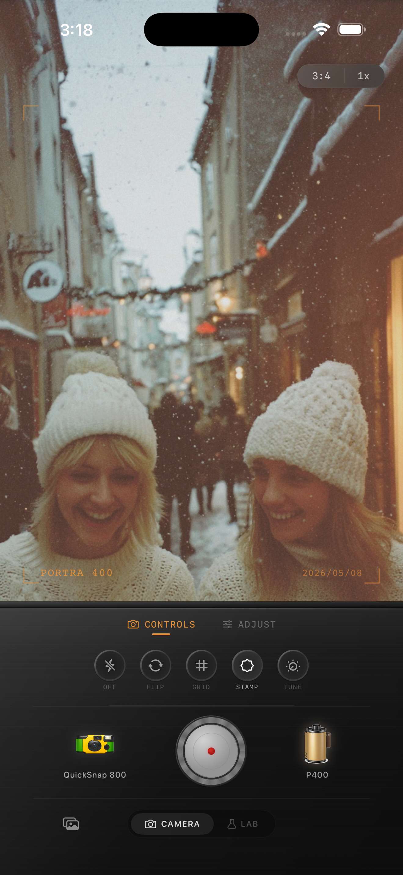
Choose one area on the subject, one immediately behind it, and one bright area you want to preserve. For a winter portrait, those might be a cheek, a dark doorway, and a pale knitted hat. Keep returning to these same three places as you compare looks.
In the color preview above, the pale hats and darker buildings offer a useful exercise in reading brightness. This is a composition reference, not a black-and-white before-and-after demonstration. Look only at the photograph inside the interface. Film brand names visible in the preview describe style inspiration; Nostalgia Cam is not affiliated with or endorsed by those brands.
- Subject: can you read the expression or important shape?
- Background: does the outline remain visible where it matters?
- Bright area: can you still see the texture you wanted to keep?
Compare monochrome looks with a steady starting point
Import the original into the Nostalgia Cam Lab and compare black-and-white film looks while keeping the camera body unchanged. Begin with little added grain, fade, or vignette so those effects do not distract from the underlying tones. Pick the look that makes your three reference areas easiest to read.
Adjust exposure in small steps while watching all three areas. If brightening the face also turns the hat into a blank patch, back off. Moving overall brightness is not the same as separating two neighboring areas. Try another look or a different source frame when both areas keep moving together.
Keep softness without flattening every shadow
Add fade gradually after the subject reads clearly. A gentle lifted shadow can suit an old-print mood, but stop if the hair, coat, and background become one gray mass. Compare with less fade before deciding that the photograph needs more texture.
Check vignette separately. Darkening a corner may quiet a distraction, but it can also merge a shoulder with the wall behind it. For an off-center portrait, compare with the vignette reduced and watch the outer edge of the face. A convincing film mood does not require dark corners in every picture.
Solve a difficult background in the composition
If the subject and background remain equally gray across several looks, try a crop that removes the busiest overlap without cutting awkwardly through the person. A crop can remove a distraction; it cannot create a missing boundary along hair or clothing. A neighboring frame from the same moment may give you a more useful background.
When taking another photo is possible, move your viewpoint a little and watch what sits behind the head and shoulders. Look for a lighter background behind dark hair or a darker area behind a light hat. Review the monochrome preview before committing to the position. You do not need a strong outline around the entire person; preserve the parts that explain the pose.
Finish with a clean-versus-textured comparison
Save a restrained version, then try a second version with a little more grain. View both at the size you expect to share. If the texture makes an eye socket or coat edge harder to understand, keep the cleaner version. Grain adds surface character; it does not replace readable shapes.
Finally, look away and return to each photo. Notice where your eye lands first, then check the face, background boundary, and bright texture again. A quiet monochrome portrait can stay soft and low in contrast while still having a clear subject. Keep the original so you can revisit the conversion without stacking another finish onto an exported edit.
Build a clearer monochrome edit in Nostalgia Cam
Import a favorite portrait into the Lab, compare black-and-white film looks with the same camera body, then refine exposure, fade, vignette, and grain. Export the version that keeps the expression and the film mood easy to see.
FAQ
Why does my iPhone photo look flat after a black-and-white filter?
Colors that looked different in the original may become similar gray tones. Compare the subject with the area immediately behind it, try another monochrome look, and reduce added fade before changing the entire exposure.
Will more grain improve contrast in a black-and-white portrait?
Grain adds texture, but it does not reliably separate a face or coat from a similarly bright background. Establish readable shapes first, then add only enough texture to support the finish.
Do black-and-white film photos need deep black shadows?
No. A soft, pale edit can work when the important shapes remain distinct. Judge the face, its background, and one bright detail together rather than forcing every photograph to contain very dark shadows.