
Editing guide
How to Keep iPhone Film Edits Consistent Across a Photo Album
Match daylight, indoor, and flash photos with a reference image, shared film character, and small per-photo adjustments that keep an iPhone album feeling coherent.
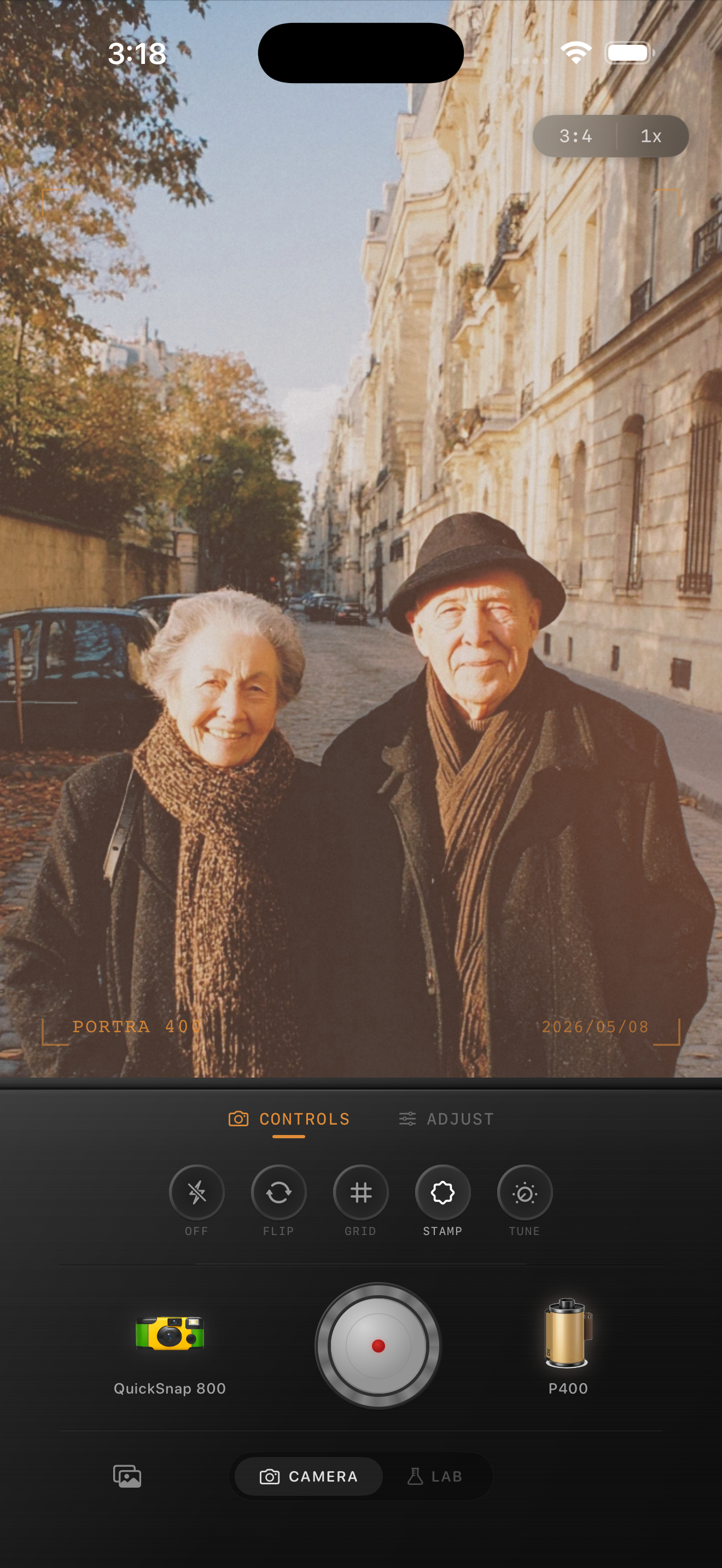
Choose one reference photo before editing the album
A photo album can feel uneven even when every image uses the same film look. A bright street scene, a warm restaurant portrait, and a flash snapshot begin with different light. Giving all three identical adjustments may make one pleasant, another orange, and the last too pale. Aim for a shared visual character while allowing each scene to keep its own lighting.
Pick a small set of six to twelve favorites before working through the whole album. Choose a reference photo with a clearly visible face or familiar object, readable shadows, and light you already like. A heavily colored nightclub image is a difficult reference for an album that is mostly daylight. Edit the representative image first and use it as your visual anchor.
- Decide on a short description of the look, such as gentle warmth, clear shadows, and quiet grain.
- Keep the original files so you can restart an edit that drifts too far.
- Record the camera body, film look, and adjustments used on the reference in a simple note.
Make a reference for each kind of light
Divide the selected photos into daylight, warm interiors, and flash or night scenes. Make one convincing edit in each group, then compare those three references together. They should feel related in color restraint and texture, but the indoor reference can stay warmer and the night reference can stay darker.
For a weekend trip, the daylight reference might be a portrait on a Paris street. The interior reference might be friends at dinner. Keep the street stone believable and let the dinner lamps remain warm; forcing the walls in both scenes to the same color can spoil the atmosphere. Use the nearest lighting reference when editing the remaining photos.
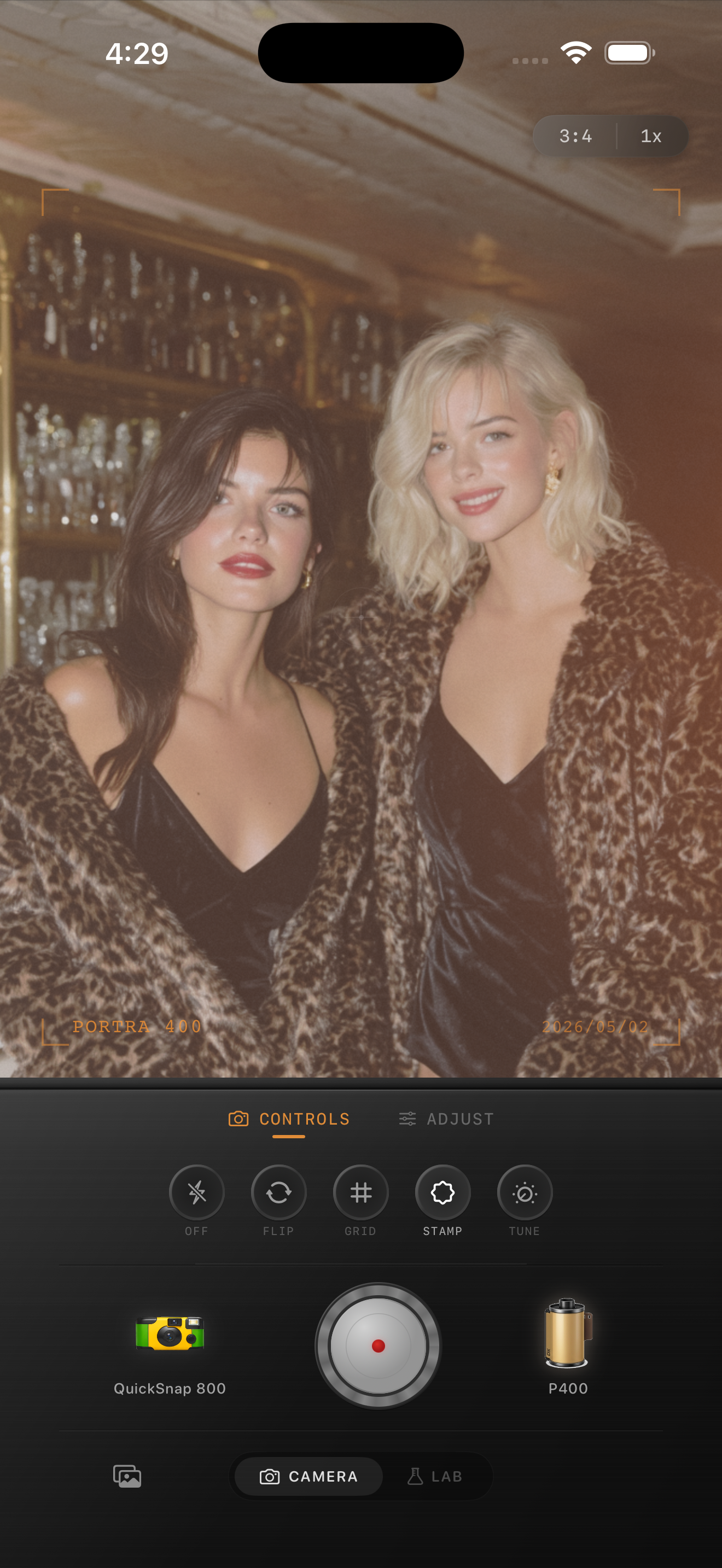
Review pairs before reviewing the whole sequence
Compare each finished photo with its lighting reference at a similar on-screen size. Ask one question at a time: does the face feel much warmer, do the blacks look much flatter, or does the grain suddenly become the subject? Change the most distracting difference first, then compare again. Several small changes at once make it harder to tell what helped.
Next, view the album in its intended order. A dark dinner image following a sunny landscape is a natural transition. A single portrait that suddenly looks gray or heavily textured deserves another pass. Try moving an image beside another from the same setting before deciding that it needs a stronger edit. Sometimes the sequence, rather than the settings, causes the jump.
- Check the first, middle, and final photos together for gradual drift in warmth.
- Compare faces at similar viewing sizes instead of comparing one close-up with a tiny thumbnail.
- Keep a difficult image separate until the rest of the set feels settled.
Finish with one short consistency pass
Once the sequence works, stop adjusting the whole album to accommodate one outlier. Return that image to its original and rebuild from the closest reference, or leave it out if it repeats a stronger photo. A smaller selection can tell the story more clearly than a larger collection with several competing treatments.
Save the finished images and look through them once at the size you expect people to view them. Check that the main subject is readable, color changes follow the lighting, and texture stays supportive. Keep your three reference notes for the next album, but make fresh references when the light changes. Consistency is a repeatable review process, not one universal set of slider values.
Build your album references in Nostalgia Cam
Choose a camera body and film look in Nostalgia Cam, then make a daylight, indoor, and night reference. Adjust exposure, warmth, grain, and fade by eye as you work through your favorites, keeping the references nearby for comparison.
FAQ
Why does the same film filter look different on every iPhone photo?
The starting brightness, color, subject, and lighting differ between photos. Use the same film look as a starting point, then adjust exposure and warmth for each image while comparing it with a reference.
Should every photo in an album use the same grain amount?
Not necessarily. Judge texture at the same viewing size. A quiet portrait may need less grain than a busy street scene to create a similarly restrained impression.
How do I match daylight and indoor film edits?
Create one reference for each lighting group. Keep their overall contrast and texture related, while allowing the interior to remain warmer or darker. Avoid forcing different light sources to look identical.