
Editing guide
How to Edit Train Window Photos to Look Like Film on iPhone
A practical iPhone guide for train-window photos: softer reflections, calmer grain, and film-style color that keeps travel scenes feeling real instead of overprocessed.
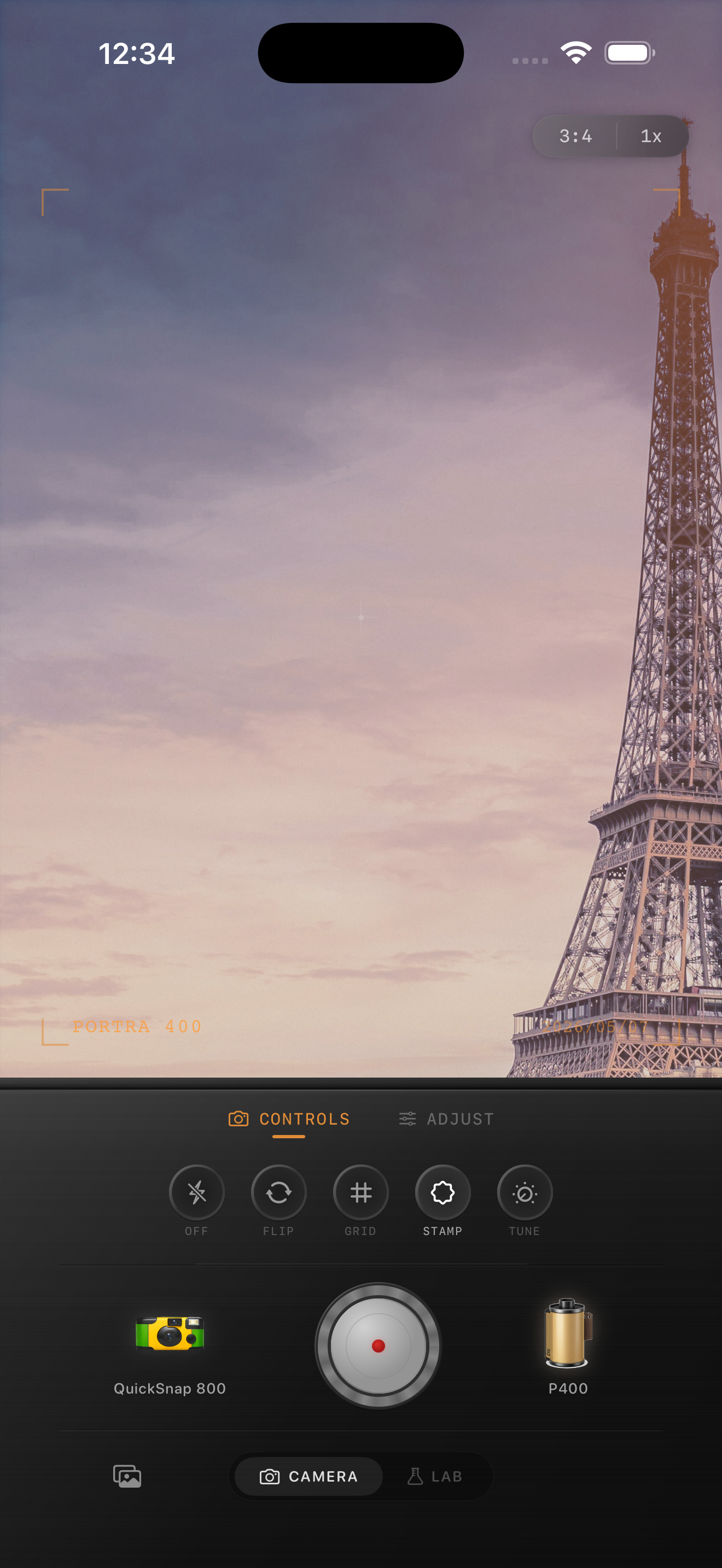
Train-window photos need separation, not heavy effects
Train-window photos often have three layers competing at once: the view outside, reflections on the glass, and whatever is happening inside the carriage. A good film-inspired edit keeps those layers readable instead of flattening them into one gray wash.
The goal is not to erase reflections completely. A little reflection can help the frame feel lived-in and documentary. What you want to avoid is an overprocessed look where the glass, sky, and subject all merge into the same muddy tone.
- Decide whether the outside view or the reflection is the subject.
- Keep grain lighter in bright sky and glass.
- Use warmth gently so clouds and skin do not turn beige.
- Avoid too much fade or the window scene loses depth.
- Let motion and softness do some of the nostalgia work.
A reliable train-window starting recipe
Start around film intensity 70-82%, grain 20-32%, warmth +4 to +10, fade 3-7%, and vignette 2-6%. That range usually softens the digital edge while keeping window highlights, station details, and faces from turning cloudy.
If the train photo was shot on an overcast day, keep warmth lower and use the grain lightly so the sky stays open. If it was shot in golden-hour travel light, you can push warmth a little more as long as the highlights still feel airy rather than orange.
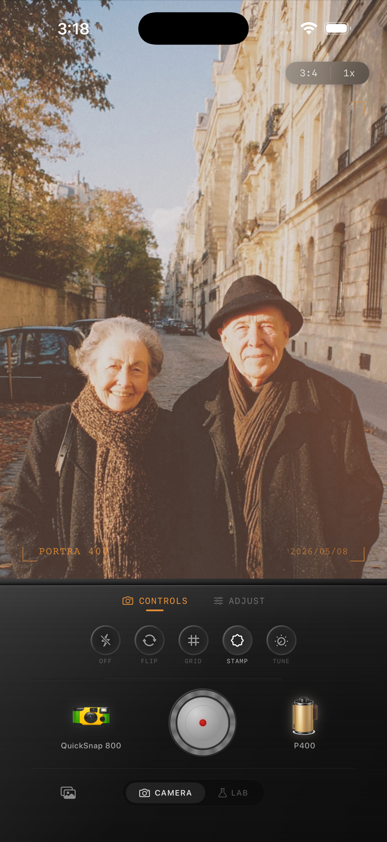
Handle reflections after the main color balance
Many train-window edits go wrong because the editor chases reflections first. Start with the outside light and the main subject, then decide whether the glass reflection needs to be softened or left visible. Reflections often look more natural when they stay faint and imperfect.
If the frame includes station platforms, passing buildings, or other passengers, use those details to judge whether the edit still feels spatial. Once everything starts looking equally faded, the photo loses the travel feeling that made it worth keeping.
Choose calm film mood over rough texture
Train-window photos usually benefit from a cleaner compact-film or 35mm-inspired treatment rather than a rough disposable-camera effect. The glass, sky, and layered detail already provide complexity. Heavy dust, strong scratches, or coarse grain usually fight the scene instead of helping it.
Nostalgia Cam makes this easier because you can choose a calmer camera body, then add just enough grain, warmth, and fade to make the frame feel like a printed travel memory.
Keep travel-window light calm in Nostalgia Cam
Use Nostalgia Cam to tune camera body, grain, warmth, fade, and vignette so train-window photos keep their layered travel atmosphere while reflections, skies, and faces stay clear.
FAQ
Should train-window photos look soft to feel like film?
A little softness helps, but the scene still needs separation between the glass, the outside view, and any faces or seats inside the train. Film-inspired should feel calm, not blurry everywhere.
Why do train-window edits turn flat so easily?
They usually go flat when fade and warmth are pushed before the outside highlights and reflections are balanced. Keep the main light readable first, then add texture and softness carefully.