
Editing guide
Best Film Settings for Motel Sign Photos on iPhone
A practical motel-sign film recipe for iPhone photos, with cleaner neon color, restrained grain, and enough analog softness to make roadside signs feel nostalgic instead of harsh.
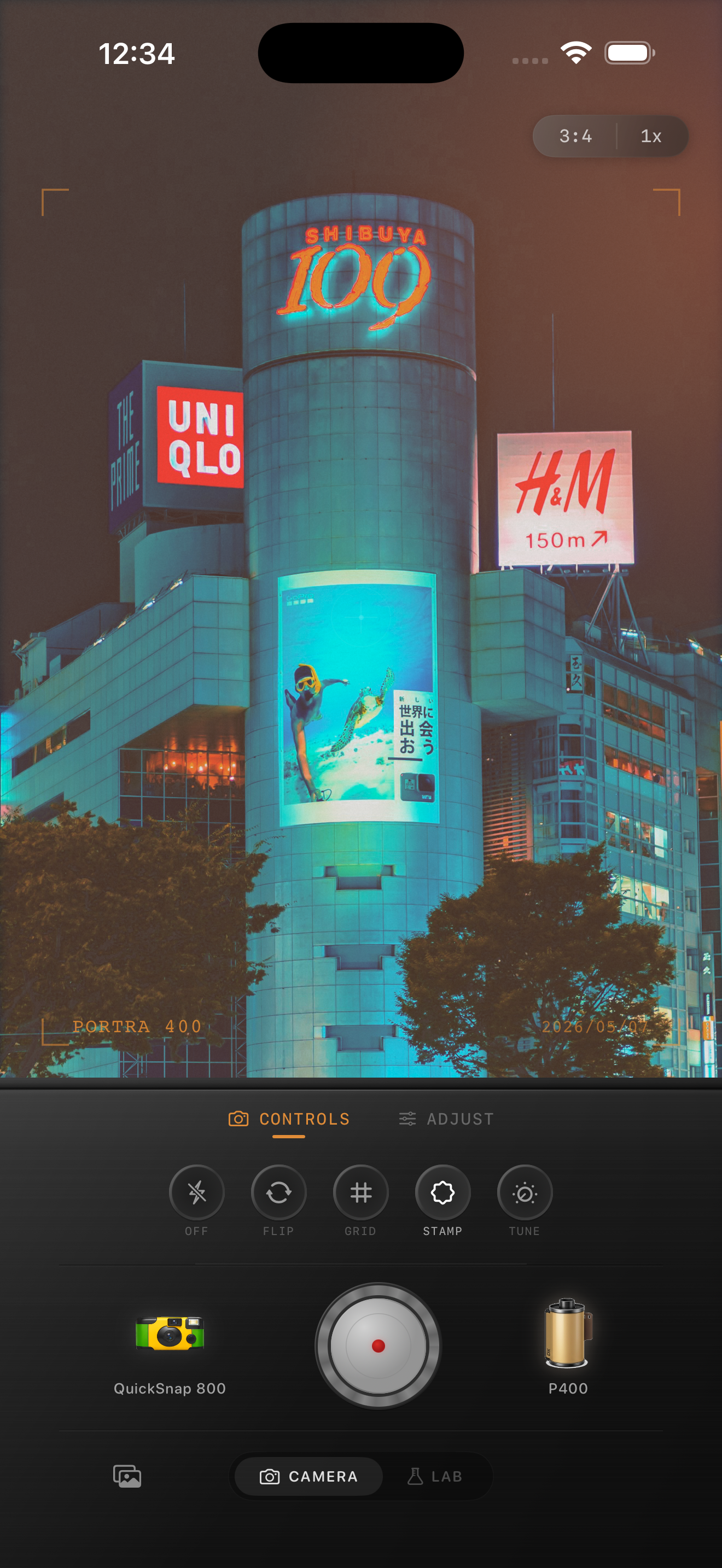
Motel signs already carry the nostalgia
Motel signs, empty parking lots, dusk skies, and roadside glow already do most of the emotional work. The edit should not bury that mood under heavy grain or muddy color. It should make the scene feel printed and remembered.
The most common mistake is pushing warmth and fade too hard at the same time. That can turn red lettering, blue evening sky, and chrome details into one dull haze instead of keeping the sign readable.
- Protect the lettering before you add texture.
- Let the sky stay slightly cooler than the sign.
- Keep grain stronger in pavement and shadows than in the bright neon.
- Use vignette lightly so the sign does not feel boxed in.
- Stop before the glow turns into a white smear.
A dependable motel-sign baseline
Start around film intensity 74-86%, grain 24-38%, warmth +3 to +8, fade 3-7%, and vignette 3-8%. This usually keeps the sign soft enough to feel analog while preserving the separation between the neon tubes, sky, and dark asphalt.
If the photo was taken at blue hour, keep warmth lower and let the cooler sky carry some contrast. If it was taken later at night with mostly artificial light, you can push warmth a touch more as long as the reds and yellows still hold shape.
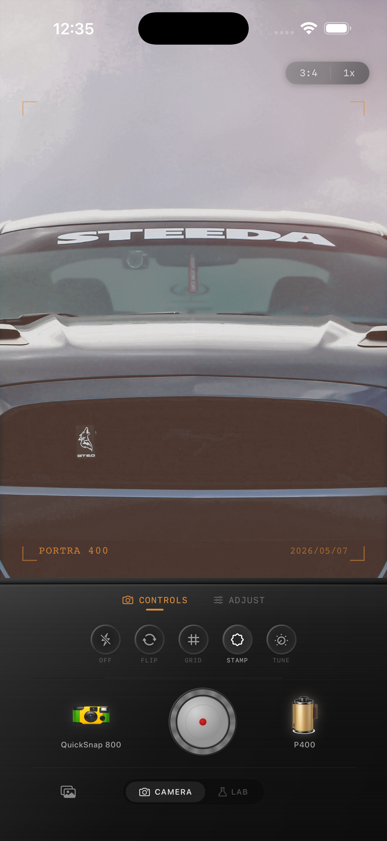
Balance neon with the rest of the frame
Motel-sign photos usually include more than the sign itself: parked cars, windows, asphalt, palm trees, or the blank space around the building. Those supporting details are where the grain can live. The sign needs the cleanest treatment so the photo keeps its focal point.
If the shot starts looking fake, lower grain before lowering color. Roadside neon can handle color character, but once texture spreads evenly across the whole frame, the image starts to feel like an overlay.
Choose a cleaner film body than you expect
A rough disposable-inspired body can work for direct-flash snapshots in a motel lot, but a motel sign itself usually looks better with a cleaner 35mm-inspired or color-negative inspired body. That gives you softer contrast and analog mood without sacrificing the typography and glow that make the scene interesting.
Nostalgia Cam works best here when you treat the sign as the hero and the grain as support. Preserve the shape of the neon first, then add just enough texture to take the edge off the iPhone sharpness.
Keep roadside neon soft in Nostalgia Cam
Use Nostalgia Cam to balance camera body, grain, warmth, fade, and vignette so motel signs, parked cars, and evening skies feel nostalgic and film-inspired without turning the neon muddy.
FAQ
Should motel-sign photos use strong grain to look like film?
Usually no. Moderate grain works better because the neon itself already adds texture and mood. Too much grain can smear lettering and flatten the sky.
Why do motel-sign edits turn muddy so fast on iPhone?
They usually turn muddy when warmth, fade, and grain all get pushed together before the neon lettering and sky are balanced. Keep the sign readable first, then add texture carefully.