
Editing guide
How to Edit Snowy Brownstone Portraits to Look Like Film on iPhone
Edit winter city portraits on iPhone with softer contrast, restrained warmth, realistic grain, and enough shadow detail to keep snow, skin, and brick looking natural.
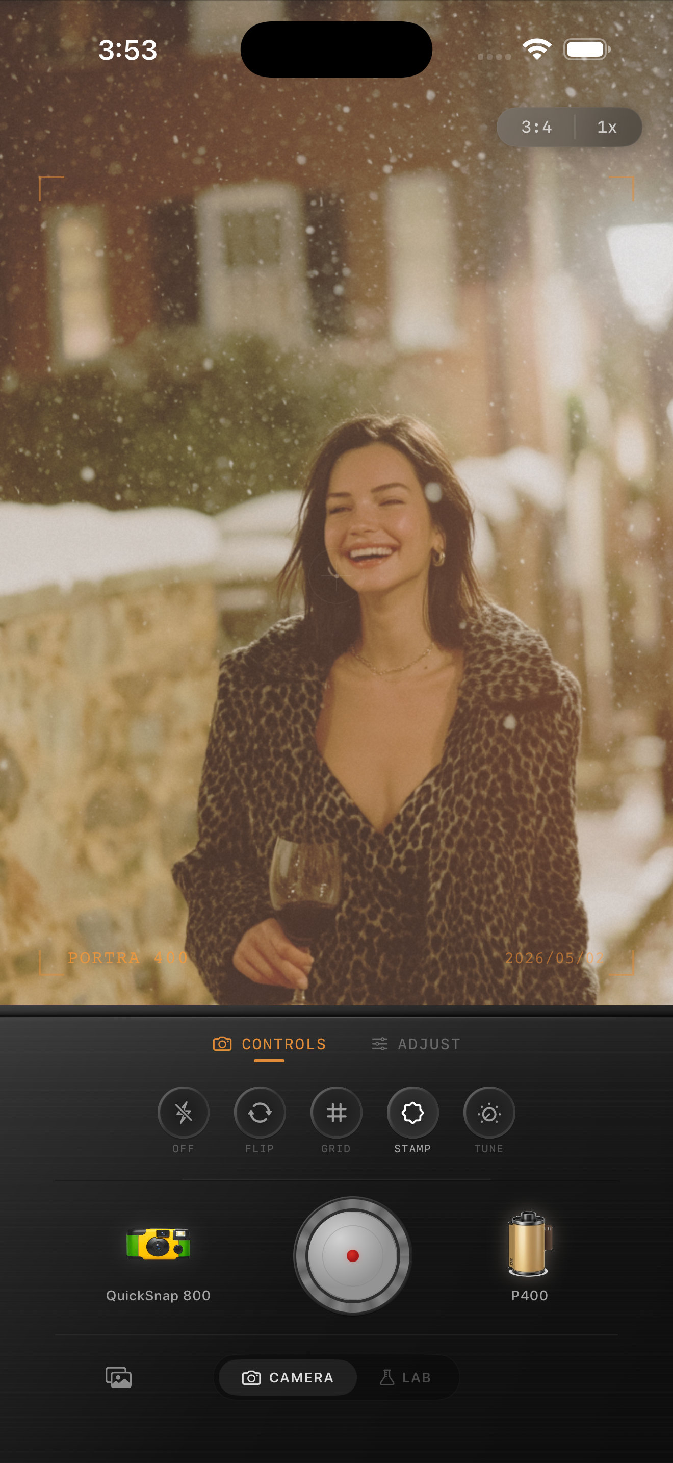
Balance the snow before you stylize the color
Snowy brownstone portraits are easy to overcook because the frame already mixes cool snow, warm brick, dark coats, and pink skin. If you start with too much warmth or too much fade, the snow turns gray and the portrait loses the crisp winter feeling.
The best film-inspired edit keeps the snow bright enough to read as snow, then adds texture and softness around it. You want the image to feel printed, not dirty or sepia-washed.
- Keep whites clean before adding warmth.
- Use grain to soften the digital edge, not to bury coat texture.
- Add only a small amount of fade so the snow stays lively.
- Let the brownstone color stay warm without making the whole frame yellow.
- Use vignette sparingly because winter scenes already have strong subject contrast.
A practical winter portrait recipe
Start around film intensity 70-82%, grain 24-34%, warmth +2 to +7, fade 3-6%, and vignette 4-9%. That usually keeps the scene clean while removing the polished iPhone look.
If the portrait feels too cold, raise warmth a little. If it feels too flat, lower fade before you add more contrast. Winter film edits usually fail when the shadows get lifted too far and the snow loses separation from the sidewalk or coat.
Use the background to shape the mood
Brownstone portraits already give you a strong analog-friendly palette: red-brown masonry, black iron, cream stone, and winter neutrals. Lean into that natural color contrast instead of forcing a heavy vintage wash over the whole frame.
A film look should help the portrait feel quieter and more tactile. The background can stay recognizable and textured while the subject remains the emotional center of the image.
Pick a body that feels like winter street film
For this kind of scene, a compact 35mm-inspired body usually works better than a disposable one because it keeps facial detail and coat texture while still taking the digital edge off the phone image.
In Nostalgia Cam, start with a cleaner body, then tune grain, warmth, fade, and vignette until the photo feels like a cold-day print you found in a stack of city memories. If you want Kodak-style warmth or Fuji-style restraint, use that only as style inspiration and not as any affiliation claim.
Build a cleaner winter film look in Nostalgia Cam
Use Nostalgia Cam to match camera body, film-inspired color, grain, fade, and vignette so snowy city portraits keep their winter clarity while still feeling soft and nostalgic.
FAQ
Why does snow turn gray in some film edits?
Usually because fade, warmth, and grain are all pushed too far together. That lowers separation in the whites and removes the crisp brightness that makes snow feel real.
How much warmth should I add to a winter portrait?
Usually just a little. Start small and let the brick, skin, and coat tones carry the warmth while the snow stays close to neutral.