
Editing guide
How to Edit iPhone Bookstore Photos to Look Like Film Without Yellow Pages
A practical bookstore-photo film recipe for iPhone: warm but readable paper tones, softer highlights, and enough grain to feel analog without turning pages and skin overly yellow.
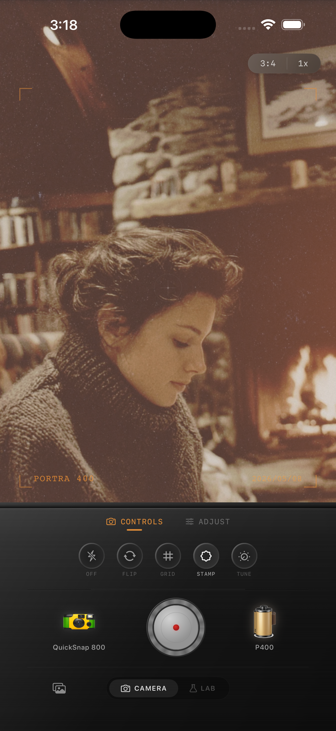
Why warm bookstore light gets heavy
Bookstores and reading corners often mix amber lamps, wood shelves, cream paper, and skin tones in one tight frame. That is great for mood, but it also means a film edit can go yellow very quickly if every warm surface gets pushed in the same direction.
A believable film-inspired bookstore photo should feel soft and lived-in without making pages, lamp shades, and skin collapse into one amber wash.
- Check paper, hands, and the brightest lamp-lit area together.
- Use grain moderately so text edges and fabric texture stay readable.
- Keep warmth gentle because the room already supplies most of it.
- Let shadows stay soft, but not so lifted that the shelves lose depth.
A dependable bookstore-film baseline
Start around film intensity 73-85%, grain 24-34%, warmth +3 to +8, fade 3-7%, and vignette 4-9%. That range usually removes the clinical iPhone finish while keeping enough separation that pages still look like paper instead of yellow cards.
If the pages already look too warm, lower warmth before touching grain. The texture is usually not the problem. Most of the time the image just needs a calmer color move and softer contrast.
Treat paper as the neutral reference
In many indoor reading photos, the page is the easiest truth test. If paper turns deep yellow, the whole image will feel overcooked even if the room itself looks cozy. Use the page, a sleeve cuff, or a pale wall as your neutral checkpoint while you tune the film look.
Once those lighter surfaces look believable, the rest of the scene usually falls into place with only small moves to grain, fade, or vignette.
Choose a calm camera mood for quiet interiors
Reading and bookstore photos rarely need the roughest disposable treatment. A cleaner compact-film or 35mm-inspired body usually works better because it preserves page detail, lamp glow, and skin tone while still softening the digital edge.
In Nostalgia Cam, start with the camera body first, then tune warmth, grain, fade, and vignette until the image feels like a real print from a quiet afternoon. If you want Portra-style warmth or Fuji-style restraint, keep that language as inspiration only and avoid any affiliation claim.
Keep bookstore warmth without turning everything yellow
Use Nostalgia Cam to balance camera body, grain, warmth, fade, and vignette so bookstore photos keep their cozy mood while paper, skin, and lamp light stay naturally film-inspired.
FAQ
Why do bookstore photos turn yellow so easily on iPhone?
Because warm lamps, wood tones, cream paper, and skin all sit close together, and iPhone processing plus extra warmth can push them into one overly amber color block.
What should I check first in a bookstore film edit?
Check the paper first. If the page still looks believable, the rest of the room usually needs only smaller adjustments to grain, warmth, and fade.