
Editing guide
How to Edit iPhone Silhouettes to Look Like Film
Give iPhone silhouettes a film look with readable outlines, gentle sky color, restrained fade, and grain that leaves the subject easy to recognize.
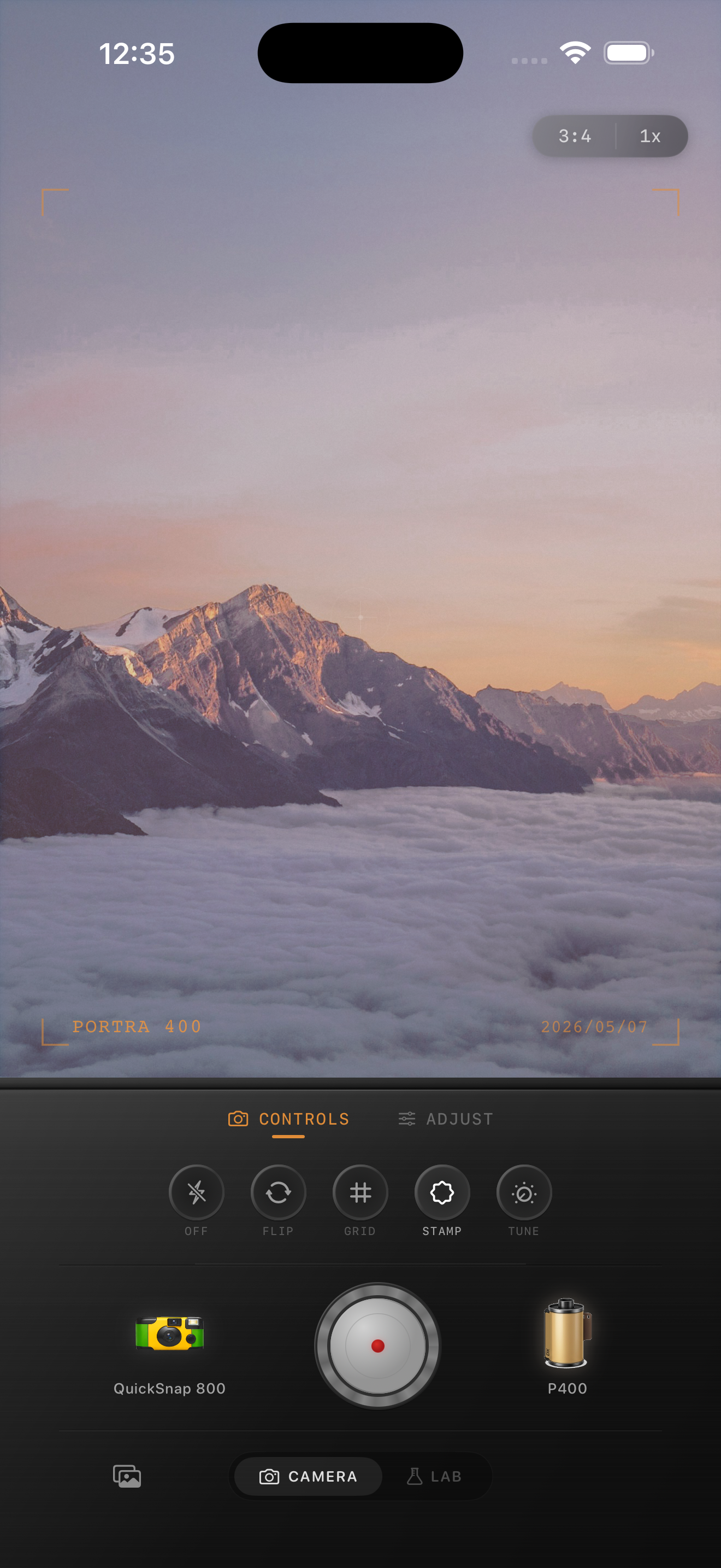
Decide which shape needs to stay readable
A silhouette works when the outline tells the story. Before adding a film look, view the whole photo and identify the shape you want someone to recognize: a profile, two people holding hands, a bicycle, or a lone tree. The subject can remain dark. The edit needs to preserve its separation from the background.
Try this quick check: make the photo small enough to see it at a glance. Can you still tell what the subject is doing? If a face overlaps a branch or two bodies merge into one shape, choose another frame or crop away a distraction. More grain will not untangle an unclear outline.
Separate a silhouette from an underexposed portrait
Choose the role of the face before adjusting brightness. If the expression is the reason you kept the picture, you may want a backlit portrait with visible facial detail. If the pose and outline carry the picture, let the face remain dark. Switching goals halfway through often leaves a gray subject against a dull sky.
For a deliberate silhouette, start with the original and watch the space around the subject. A small gap between an arm and the body, or a clear edge around a hat, may matter more than detail inside the shadows. Keep those gaps visible as you compare film looks.
Choose sky color before adding texture
Begin with modest film intensity and minimal added grain. Compare the color of the sky near the horizon with the color higher in the frame. Choose a look that preserves their difference. If a pale pink horizon becomes a broad orange band, reduce warmth or film intensity and compare again.
The mountain preview used here is a color and outline reference, not a silhouette before-and-after. Notice how the ridges remain distinct against the sky. For a person or tree in your own photo, look for similarly clear separation without trying to reproduce the exact mountain colors. Film names visible in the preview describe stylistic inspiration; Nostalgia Cam is not affiliated with or endorsed by the referenced film brands.
Use fade without turning the subject gray
Increase fade only until the dark shape feels slightly softer. Stop if the subject starts looking like a pale cutout or if nearby dark objects become harder to separate. A film-inspired finish can keep a deep silhouette; it does not require every shadow to look faded.
Leave vignette low at first, especially when a person stands near the edge of the frame. Dark corners can close a useful strip of light between the subject and the border. Compare with vignette reduced before trying to brighten the entire picture.
- Watch one important contour, such as the nose, hat brim, or handlebar.
- Keep the sky beside that contour visibly separate from the subject.
- Check that the bottom of the frame still reads as intentional ground rather than an accidental dark border.
Judge grain against the empty sky
Add grain after the color and silhouette balance feel right. Use the open sky as your first checkpoint: does it still look like a quiet background, or has the texture become the subject? Then check delicate outlines such as hair, small branches, or bicycle spokes.
Inspect the complete photo at the size you expect to share it. If grain competes with thin outlines, reduce it before changing contrast. For a small person in a wide landscape, a lighter texture can preserve the gesture better than a strong distressed finish.
Compare two versions with the same crop
Save a restrained finish, then make a second version with slightly more film intensity or fade. Change one of those at a time so you can see what helped. Compare both at the same size and with the same crop; a tighter composition can otherwise make one edit appear stronger simply because the subject is larger.
Choose the version where you notice the pose first, the sky second, and the texture last. If neither works, return to the original and reconsider the frame. Keep an untouched copy so a different color treatment later does not have to build on this finished edit.
Build a quieter silhouette edit in Nostalgia Cam
Import your photo into the Nostalgia Cam Lab, compare film looks, and adjust intensity, warmth, fade, vignette, and grain while watching the outline against the sky. Save the version that keeps the gesture clear.
FAQ
Should I brighten the face in an iPhone silhouette?
Only if facial detail is part of the picture you want. For a deliberate silhouette, prioritize a recognizable pose and a clear outline. If the expression matters more, treat it as a backlit portrait and choose a source photo with visible face detail.
Why does my silhouette look gray after a film filter?
Try reducing fade, then compare a lower film intensity. Judge the dark subject against the sky rather than trying to make every shadow brighter. Keep any gap that separates the outline from nearby objects.
Does a sunset silhouette need heavy grain to look like film?
No. Start with the sky color and dark shape, then add a little grain. Stop when the texture starts competing with the pose or makes thin outlines harder to read at the final viewing size.