Editing guide
Best Film Settings for Bookstore Photos on iPhone
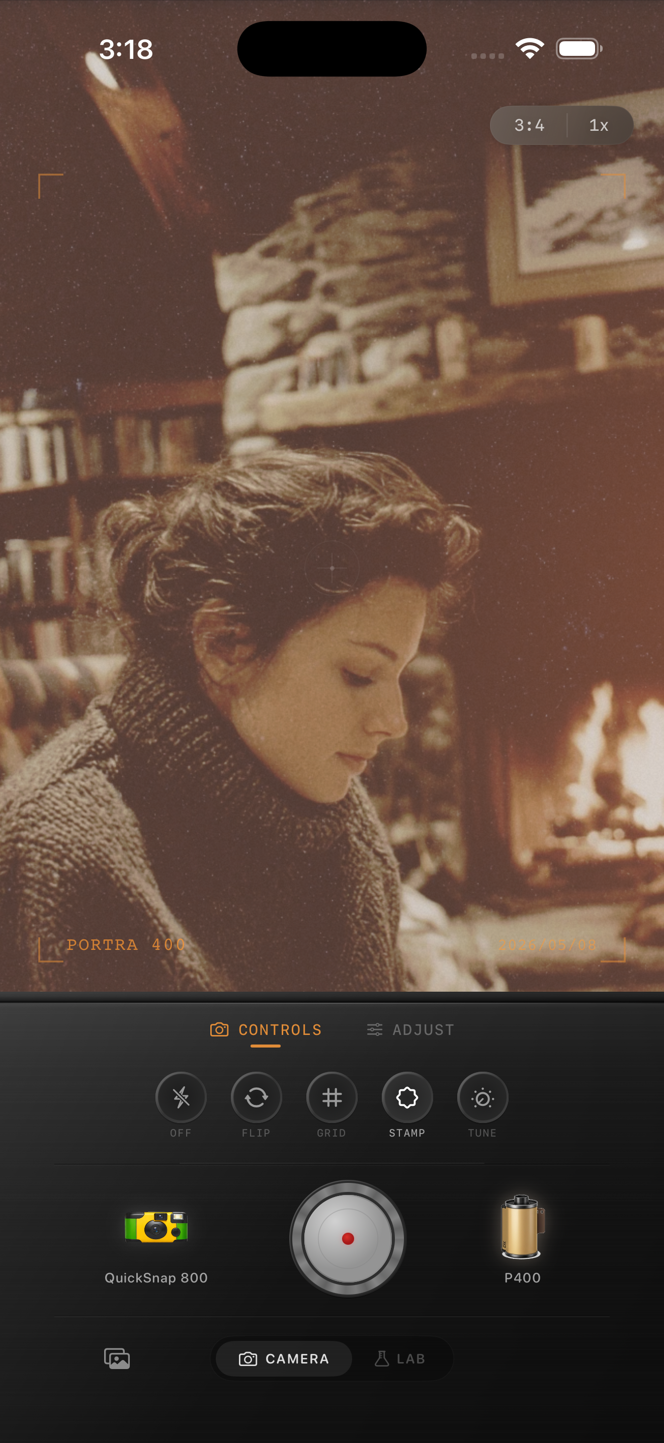
A practical film-look recipe for bookstore photos on iPhone, with settings for warm lamp light, paper tones, quiet portraits, and texture that feels printed instead of noisy.
Bookstore photos need warmth without turning yellow
Bookstore scenes already have the ingredients that make film-inspired edits work: warm practical lights, soft shadows, paper texture, wood tones, and a slower mood. The mistake is pushing warmth too hard until pages, skin, and walls all drift into the same yellow cast.
A better approach is to keep the scene calm and tactile. Let the analog feeling come from gentle contrast, fine grain, and slightly softer highlights rather than from a heavy vintage wash.
- Keep warmth moderate so book pages stay cream, not orange.
- Use fine grain that supports texture on shelves and jackets.
- Lift shadows slightly, but keep enough depth between aisles.
- Use only a light vignette so corners do not feel staged.
- Check skin tones and white pages before exporting.
A dependable bookstore-film starting recipe
Start around film intensity 68-82%, grain 22-34%, warmth +5 to +10, fade 4-8%, and vignette 4-9%. That range usually keeps the room cozy without flattening the books or muddying the paper tones.
If the space is darker, lower fade before lowering warmth. Bookstore photos still need some shadow shape so shelves, lamps, and jackets do not blend together.

What to prioritize in bookstore scenes
If a person is in the frame, protect skin and page tones first. If the photo is more about the space, focus on keeping wood, lamp light, and shelf depth distinct from each other. Either way, the photo should feel soft and lived in, not sepia and overdone.
Bookstore photos also benefit from cleaner camera-body character than disposable-style nightlife shots. Let the mood come from the room itself rather than rough scratches or exaggerated vignette.
How to fix the most common problems
If the scene turns too yellow, reduce warmth by a few points and lower film intensity slightly before touching grain. If the photo still looks too digital, add a little more grain or softness instead of more color.
If shelves lose depth, pull fade back first. A believable bookstore-film edit should still feel dimensional, with shadows separating the room instead of turning into a flat brown haze.
Tune indoor bookshop mood in Nostalgia Cam
Use Nostalgia Cam to pair film-inspired color, controlled grain, fade, and camera-body character so bookstore and reading photos feel quiet, warm, and naturally analog on iPhone.
FAQ
What grain level works best for bookstore photos on iPhone?
A moderate range around 22-34% is a strong starting point. It adds texture to shelves, pages, and wood without making low-light areas look noisy.
Why do bookstore film edits turn too yellow?
Indoor lamp light is already warm, so heavy warmth on top of it can push pages, skin, and walls into the same yellow cast. Controlled warmth and softer contrast usually look better.