
Editing guide
How to Edit iPhone Portraits to Look Like Film Under Fluorescent Lights
A practical fix for fluorescent-lit iPhone portraits, with calmer green casts, softer contrast, cleaner skin tones, and film-style texture that keeps indoor photos natural.
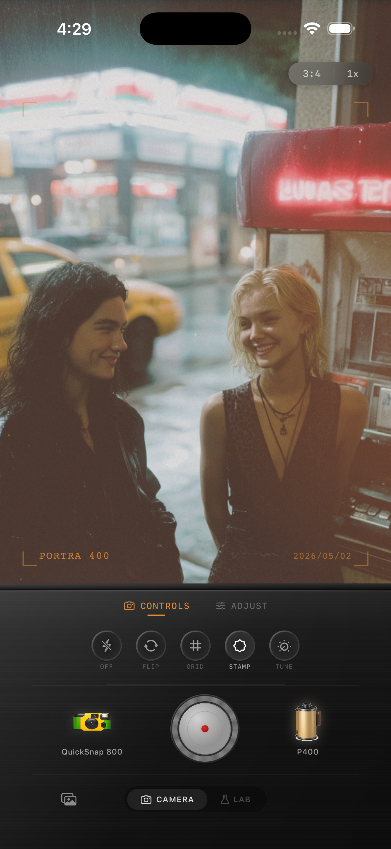
Fluorescent light looks fake when the color is too even
Fluorescent-lit portraits often go wrong in two directions: either the photo stays green and sterile, or the correction pushes everything too magenta and flat. A film-style edit works better when it removes just enough of the cast for skin to feel alive while keeping some of the room's original mood.
You are not trying to turn a convenience store, diner, hallway, or office into golden hour. You are trying to make the scene feel photographic instead of clinical.
Use a color-first settings baseline
Start around film intensity 70-84%, grain 22-34%, warmth +3 to +8, fade 3-7%, and vignette 3-8%. If skin still looks green, nudge tint warmer or pinker before you add more grain. Fixing the color cast first keeps the rest of the film look from feeling like camouflage.
Fluorescent scenes usually need less warmth than people expect. Too much warmth turns pale walls yellow and can make faces look muddy instead of healthy.
- Correct the green cast in skin before you touch texture.
- Keep grain restrained so pores, fabric, and wall texture do not go crunchy.
- Lower highlights slightly if overhead bulbs or menu boards look harsh.
- Use a little fade only after the color balance is believable.
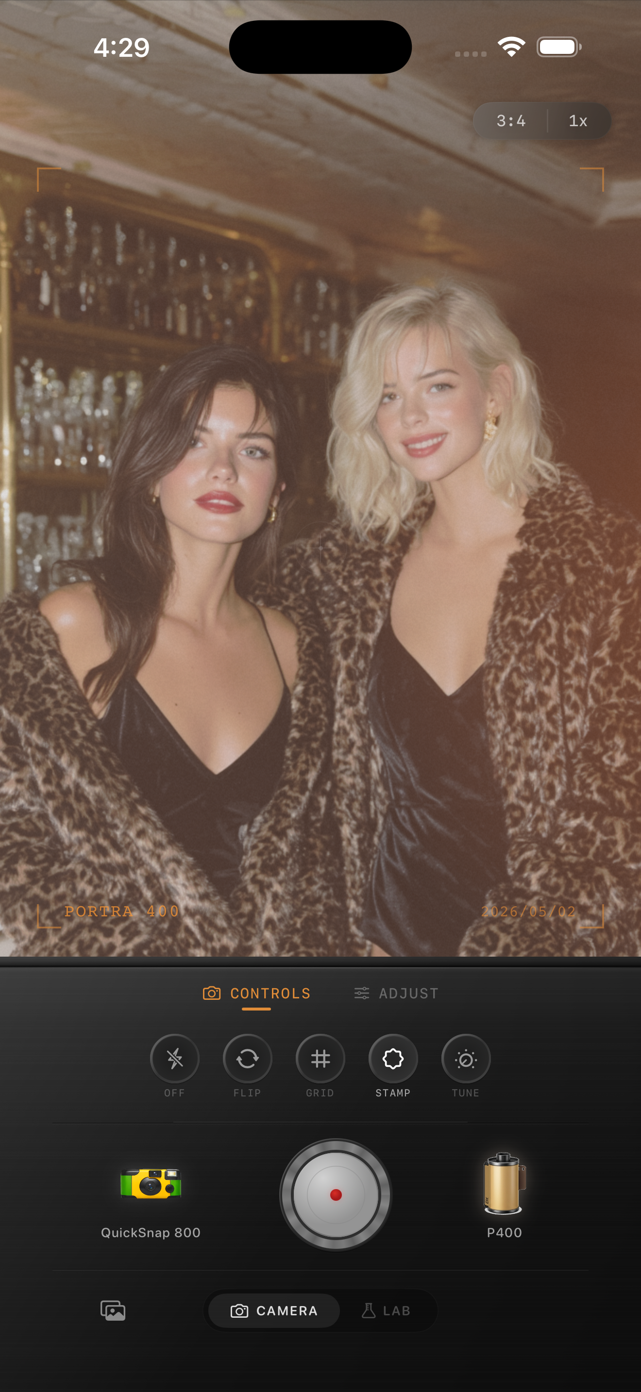
Separate skin, walls, and practical lights
Faces should usually be the warmest and most natural part of the frame. White walls, menus, tile, and ceiling fixtures can stay a little cooler or greener if that matches the space. Leaving some environmental color helps the portrait still feel truthful.
If you neutralize every part of the image equally, the room can lose character. A believable film edit lets the person feel alive without pretending the light source was something else.
Choose a camera mood that fits the room
A cleaner compact-camera feel works well for quiet portraits in bookstores, diners, stations, and hallways where expression matters more than chaos. A rougher disposable-inspired look fits fast snapshots with brighter overhead light, stronger color shifts, and more casual framing.
The key is not to use heavy grain as a cover for bad fluorescent color. Let the camera mood shape the photo only after the portrait already looks balanced.
Fix fluorescent portraits without losing the mood
Use Nostalgia Cam to tune camera body, film look, grain, warmth, fade, and vignette so fluorescent-lit portraits feel softer and more natural while still keeping their indoor atmosphere.
FAQ
How do I remove the green cast from fluorescent portraits without making skin pink?
Correct the cast in small steps and keep checking nearby whites and neutral surfaces. If skin improves but walls turn obviously pink or yellow, back off and rely more on softer contrast than extra color correction.
Should fluorescent-light portraits use heavy grain to feel more like film?
Usually no. Fluorescent portraits look better with restrained grain and better color balance first. Once skin looks natural, a modest amount of texture is enough to break the digital feel.