
Editing guide
How to Edit Coffee Shop Photos to Look Like Film on iPhone
A practical coffee-shop film edit for iPhone photos, with softer contrast, cleaner window highlights, calmer lamp warmth, and grain that keeps cafe scenes nostalgic instead of muddy.
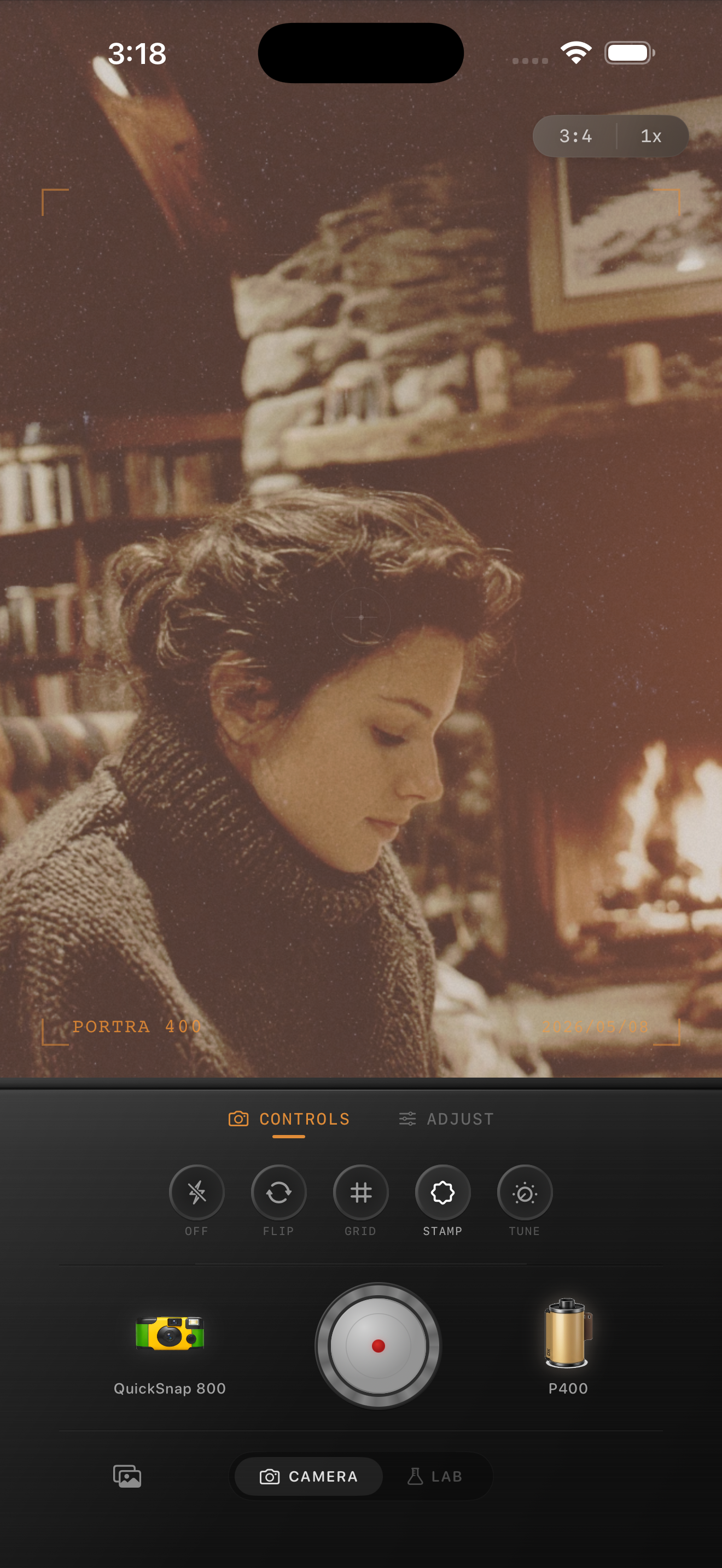
Coffee shops already have the right film ingredients
Coffee-shop photos usually give you mixed light, warm wood, paper textures, glass reflections, and little pockets of shadow. That is exactly the kind of scene that can feel film-inspired on iPhone without needing a loud preset.
The main mistake is treating cafe photos like bright studio interiors. If you push clarity, saturation, or HDR cleanup too far, the room stops feeling cozy and starts looking hard and digital.
Start with a soft cafe settings baseline
A reliable starting point is film intensity around 72-86%, grain around 24-38%, warmth around +6 to +12, fade around 4-8%, and vignette around 4-10%. If the table is right beside a window, pull highlights down before adding more warmth so cups, pastry boxes, and skin stay readable.
If the scene already feels amber, do not solve the mood by stacking more orange color. Softer contrast and restrained grain usually do more for the film look than an aggressive warmth boost.
- Keep window light a little cleaner than the lamp-lit side of the frame.
- Use moderate grain so paper menus, mugs, and sweaters still hold detail.
- Lift shadows slightly if dark corners feel blocked, but stop before the image turns flat.
- Add only a small vignette unless the edges are distracting.
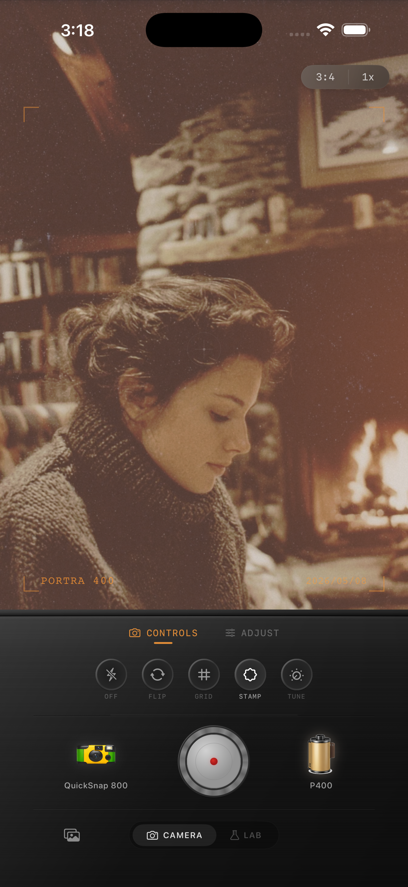
Treat windows, table light, and skin separately
Most coffee-shop photos contain two different moods at once: cooler daylight from the window and warmer practical light over the table. A believable film edit keeps both. Let windows stay a bit cleaner and cooler while cups, hands, wood, and faces carry most of the warmth.
If you flatten those zones into one color, the image starts to feel fake. Keeping some separation makes the scene feel more like a print from a compact film camera.
Match the camera mood to the moment
Use a cleaner 35mm-inspired camera body for quiet solo coffee, reading, journaling, or soft portraits by the window. Use a rougher point-and-shoot or disposable-inspired body if the scene is more about quick friend snapshots, crowded counters, or direct flash at night.
The simplest rule is this: calm moments want cleaner grain and gentler color; busy moments can handle more roughness and imperfect texture.
Make cafe photos feel printed, not processed
Use Nostalgia Cam to shoot or import coffee-shop photos, then tune camera body, grain, warmth, fade, and vignette so cozy interiors feel tactile and film-inspired without turning orange or muddy.
FAQ
How do I keep coffee-shop photos warm without making them orange?
Start with a small warmth boost, then rely on softer contrast and moderate grain for the rest. White cups, paper menus, and skin tones are the fastest checkpoints for whether the edit still looks believable.
Should coffee-shop photos use a clean film look or a disposable look?
Usually start cleaner for quiet interiors, reading scenes, and portraits by the window. Add more disposable-style roughness only when the moment is flash-heavy, crowded, or intentionally snapshot-driven.