
Editing guide
How to Edit iPhone Pasta Dinner Photos to Look Like Film Without Orange Sauce Highlights
A practical restaurant-photo film recipe for iPhone: softer table light, controlled warm highlights, natural food color, and grain that adds texture without making dinner photos muddy.
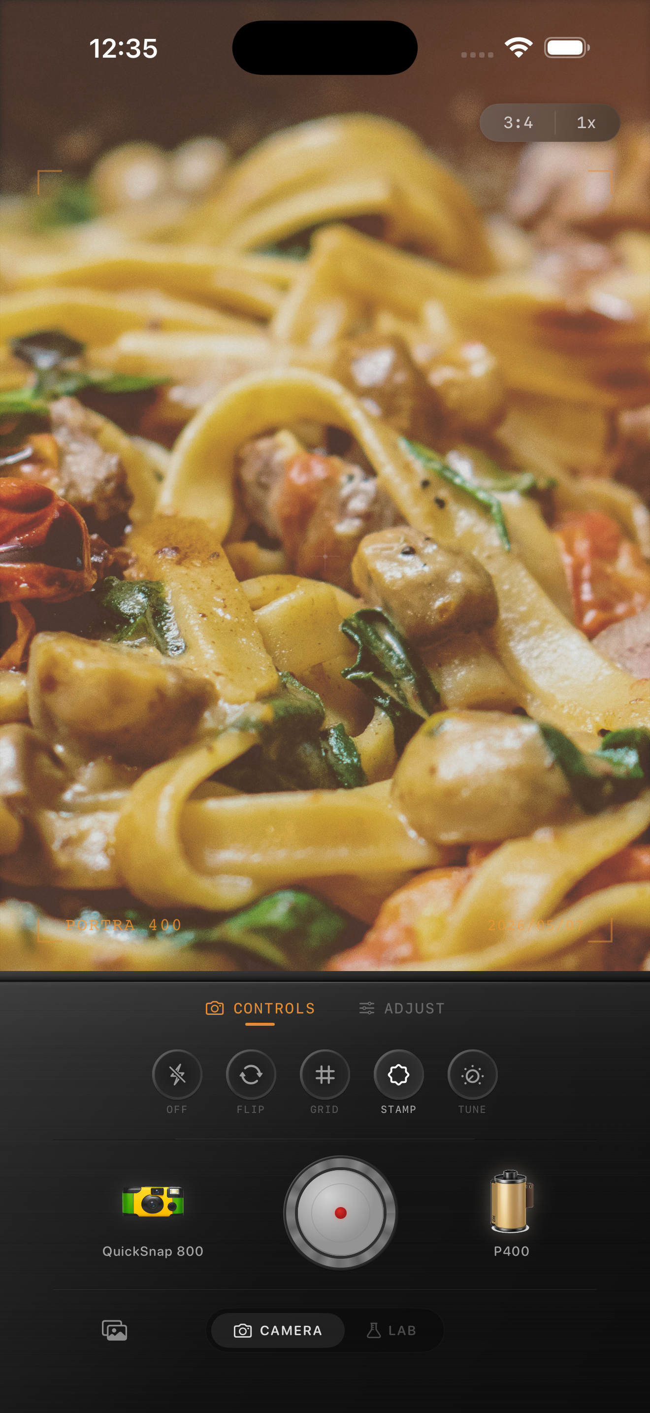
Why pasta dinner photos go too orange
Dinner photos already start warm because of lamps, candles, and restaurant bulbs. When the edit adds more warmth without controlling the brightest parts of the plate, sauce, cheese, skin, and tabletop highlights all collapse into the same orange tone.
A film-inspired dinner edit should feel warm, but it still needs separation. The plate can glow without becoming neon, and skin can stay alive without matching the food.
- Use moderate warmth, not a full amber wash.
- Keep fade low enough that the plate still has shape.
- Use fine-to-medium grain instead of rough grain.
- Reduce highlight harshness before adding more color.
- Let practical table light create the mood instead of forcing it in post.
A reliable starting recipe
Start with a balanced film look at about 70-82% intensity, warmth around +6 to +12, grain around 20-30%, fade around 4-8%, and vignette around 8-14%. This gives the photo an analog restaurant feel without turning the sauce radioactive.
If the image already came in very warm, lower warmth first and keep the grain restrained. Most restaurant photos need cleaner highlight control more than they need stronger nostalgia.
How to keep food color believable
Treat the sauce, plate, and table as three separate color zones. The sauce should stay rich but not fluorescent. The plate should stay neutral enough to show contrast. The table should support the scene without going muddy brown.
If the whole frame turns one color, the film look stops feeling photographic. Real prints still preserve small differences between ceramic whites, warm wood, and tomato or cream sauces.
What to do with skin tones at the table
If hands, faces, or arms are in the frame, check them before you commit to the edit. Warm dinner lighting can make skin drift orange faster than food does, especially if the iPhone photo already had heavy indoor processing.
A good restaurant edit lets the food stay warm while skin stays slightly softer and more neutral. If the people look believable, the whole scene usually does too.
Dial in warm dinner shots in Nostalgia Cam
Use Nostalgia Cam to balance film-inspired color, grain, fade, vignette, and camera body character so pasta dinner photos feel warm and printed instead of muddy and overfiltered.
FAQ
Why do pasta photos look too orange after a film edit?
Because restaurant light is already warm. If you add more warmth before controlling highlights, sauce, skin, and plates all merge into the same orange cast.
Should dinner photos use strong grain to feel like film?
Usually no. Fine or medium grain works better because it adds texture without making food highlights and table shadows look dirty.