
Editing guide
How to Edit iPhone Night Photos to Look Like Film Without Neon Turning Purple
A practical night-editing guide for keeping neon signs, skin tones, and shadow color believable while giving iPhone photos a softer film look.
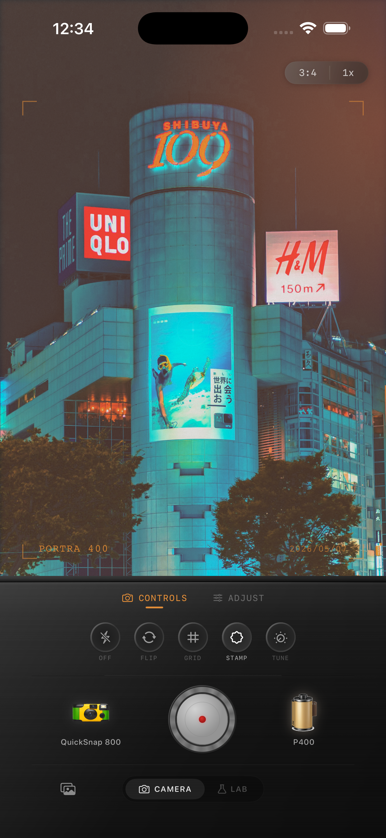
Why neon often turns purple
Bright night signs push an iPhone image into a difficult mix of clipping, white balance correction, and aggressive color processing. Reds and blues start to collapse into the same family, so pink signs, magenta reflections, and violet casts spread farther than they should.
A film-style edit works better when you protect the original color separation first. The goal is not to mute every sign. The goal is to keep neon looking bright while stopping the whole frame from drifting into one purple wash.
- Lower global saturation before adding any film look.
- Keep magenta and blue from peaking at the same time.
- Warm skin tones separately from the sign color when possible.
- Let shadows stay a little deep instead of lifting every dark area.
Start with a cleaner capture
If you are shooting fresh, tap on the brightest sign and pull exposure down slightly before you take the photo. Night film edits survive better when the highlights are a little protected at capture instead of being rescued later.
Try to include one neutral element in the frame such as pavement, a gray wall, black clothing, or a warm face lit by storefront spill. That reference point helps you judge whether your edit is atmospheric or just color-shifted.
A good night-film settings baseline
Start with film intensity around 70-80%, grain around 25-35%, fade around 4-8%, and warmth only high enough to keep skin from looking cold. Then lower magenta pressure by keeping the edit softer instead of simply pushing more color.
If the frame still reads too purple, reduce overall intensity a little and let the mood come from contrast, grain, and highlight bloom rather than saturation. This is also a good place for a cleaner 35mm-inspired look instead of a rough disposable treatment.
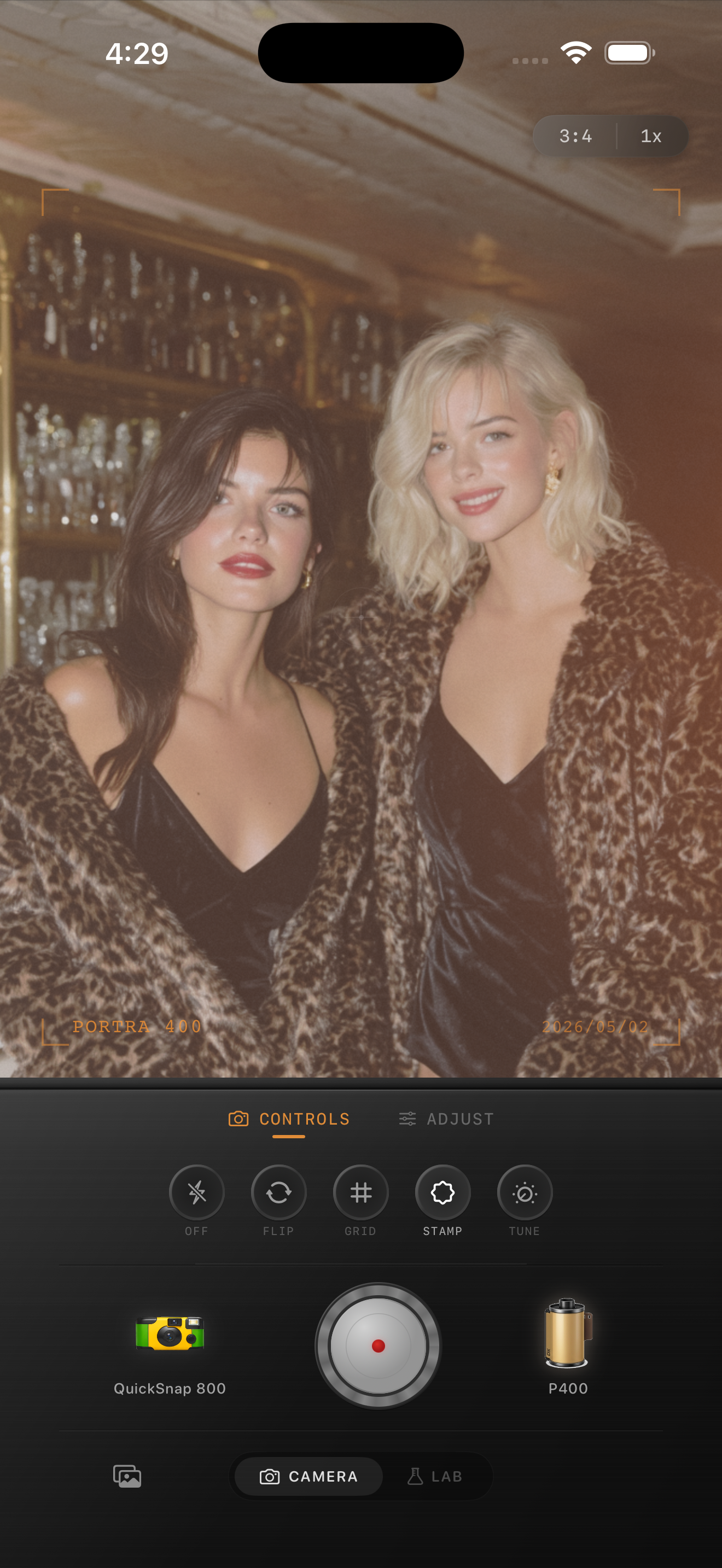
Keep skin tones and signs from fighting each other
The most obvious failure in neon edits is when faces inherit the sign color more strongly than the environment does. If skin goes lavender, the edit stops feeling photographic even if the rest of the frame looks stylish.
Use a film look that keeps warmth in faces while letting blues and reds stay vivid but slightly softened. If you want Portra-style warmth or Fuji-style cool greens as inspiration, treat them as starting moods rather than exact emulations, and avoid forcing every frame into one stock personality.
When the edit is finished
The photo is done when the neon still feels bright, but your eye moves through the scene instead of getting stuck on a color cast. Streetlights, reflections, faces, and storefronts should each keep some separation.
If the image still feels digital, add a little more grain or softness before adding more saturation. Night film photos usually feel nostalgic because of texture and restraint, not because every sign glows harder.
Dial in night color inside Nostalgia Cam
Use Nostalgia Cam to combine film-inspired color, camera body character, grain, fade, and softer night rendering so neon scenes feel cinematic instead of oversaturated.
FAQ
Why do neon iPhone photos turn purple so easily?
Bright reds and blues often clip and blend together in low light, especially after strong color processing. A softer film edit helps preserve separation.
Should I use more saturation to make night photos look like film?
Usually no. Most believable night film edits rely more on controlled highlights, softer contrast, and texture than on heavy saturation.