
Editing guide
How to Edit iPhone Food Photos to Look Like Film Without Greasy Highlights
A practical food-photo film recipe for iPhone: softer highlights, warmer but believable color, restrained grain, and enough contrast control to keep dinner shots nostalgic instead of oily and overprocessed.
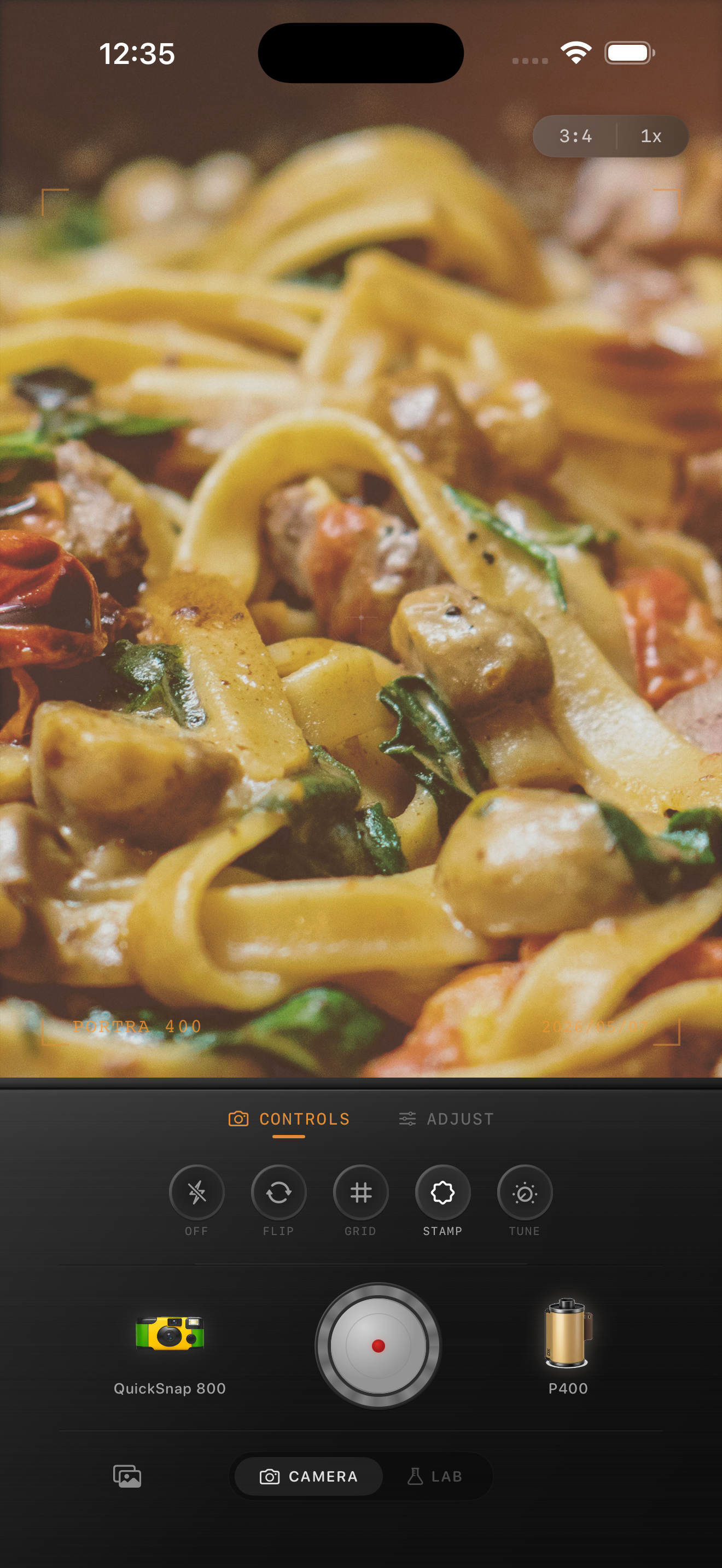
Why food photos turn shiny and fake so fast
Dinner photos already come with small bright reflections on sauce, glasses, plates, and cutlery. iPhone processing often pushes those shiny spots harder, which makes the image feel glossy and digital before you even start editing.
A believable film-style food edit should keep the meal appetizing while calming that plastic sheen. The goal is warmth, softness, and print-like texture, not a heavy orange filter over every highlight.
- Judge the edit from the brightest sauce, plate rim, or glass reflection first.
- Use moderate grain so texture supports the scene instead of roughening every ingredient.
- Keep warmth gentle because restaurant light is already warm.
- Protect whites like plates, napkins, and table candles from turning yellow.
A dependable food-photo baseline
Start around film intensity 72-84%, grain 18-28%, warmth +4 to +9, fade 3-6%, and vignette 4-8%. That range usually softens the iPhone finish without flattening the food or making the table light look muddy.
If the scene already has candlelight, amber bulbs, or dark wood around the plate, use less warmth than you think. The better move is usually calming contrast and highlight bite first, then adding only enough warmth to keep the meal inviting.
Edit from the plate and the skin tones together
If people are in the frame, do not judge the image from the plate alone. Restaurant edits often look fine on the food but make hands, faces, or table linens look too orange. Film-inspired dinner photos usually work when both the meal and the people feel grounded in the same light.
Check pasta sauce, bread crust, glass reflections, and fingertips in the same pass. If one area looks believable and the others do not, the edit is leaning too hard on one color decision.
Choose a cleaner film mood than you would for nightlife
Most food photos look better with a cleaner 35mm-inspired or everyday compact-film body than with a rough disposable treatment. Grain and softness should support the meal, not distract from it.
In Nostalgia Cam, start with the camera body first, then tune warmth, grain, fade, and vignette until the image feels like a dinner print or travel journal memory rather than a glossy phone snapshot. If you want a Portra-style warmth or Fuji-style restraint, treat those only as inspiration and keep the edit natural.
Make dinner photos feel printed, not glossy
Use Nostalgia Cam to shoot or import food photos, then balance camera body, warmth, grain, fade, and vignette so the meal keeps its atmosphere without shiny digital highlights taking over.
FAQ
Why do restaurant food photos get greasy highlights so easily?
Because sauces, glasses, metal, and plates already have reflective surfaces, and iPhone processing can make those bright spots look harder and shinier than they felt in person.
Should film-style food photos use heavy grain?
Usually no. Fine to moderate grain works better because food already has a lot of texture, and too much grain can make highlights and plate details feel dirty.