Editing guide
How to Edit iPhone Fall Festival Photos to Look Like Film Without Dull Skies
A practical iPhone film-editing guide for fall festival photos: keep people, colorful booths, and pale autumn skies clear while adding a gentle printed finish.
Start with the frame where the person and the place both read
Fall festival photos can hold a lot at once: a face in changing daylight, colorful tents, handmade signs, leaves, and a broad cloudy sky. Before editing, compare nearby frames at normal phone size and choose one where the expression, gesture, or activity is already clear. A film-inspired finish can make the afternoon feel softer, but it cannot restore a face hidden in deep shade or detail that was never captured.
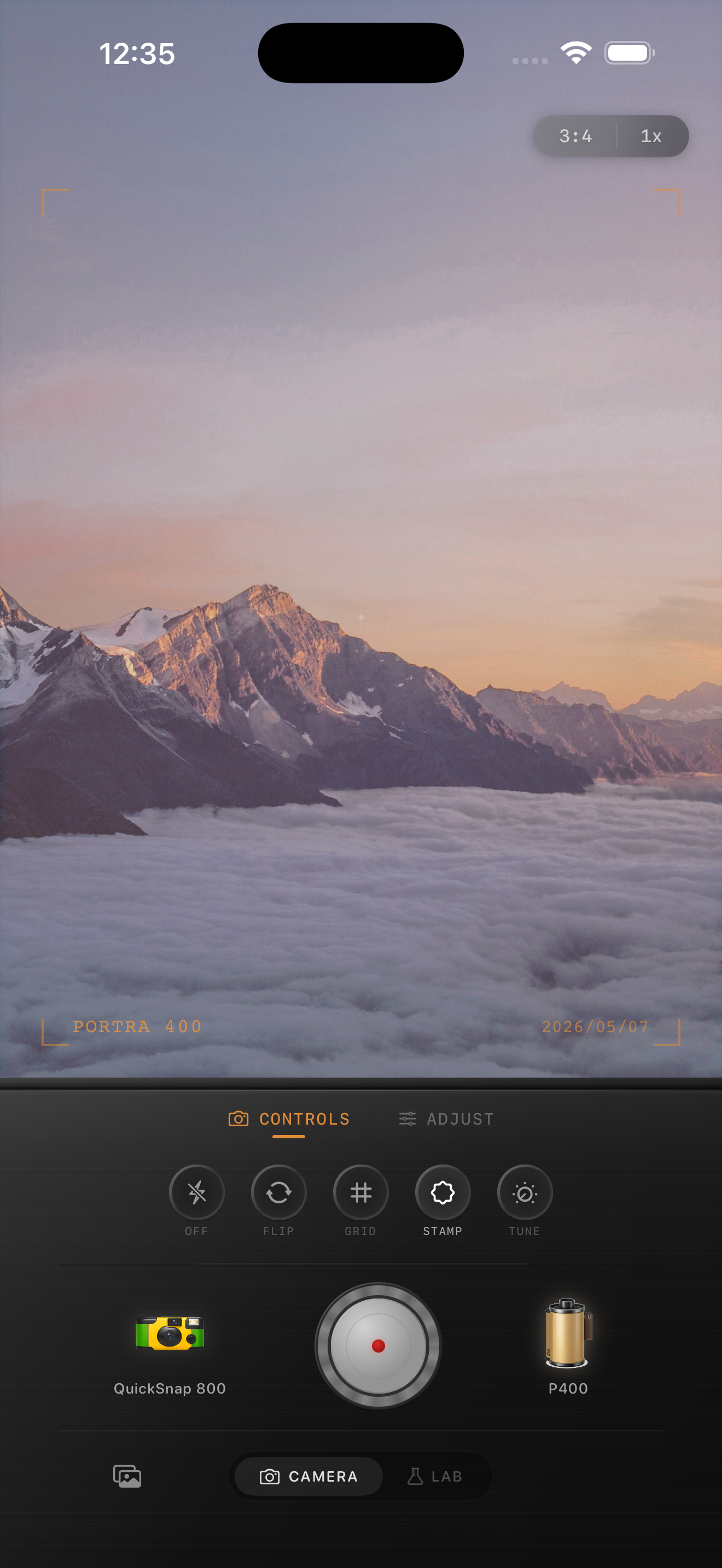
Keep the original beside the edit as you work. The goal is not to turn a gray sky into a dramatic sunset; it is to keep the person, the festival color, and the open air feeling like the same afternoon. The existing preview above is an outdoor-light style reference, not a fall festival comparison.
Use a face, a colorful detail, and the sky as three references
Pick three small areas before changing the film look: a face or hand, a recognizable color such as a banner or sweater, and the lightest part of the sky. Revisit them after every broad adjustment. This catches the common mistake of adding enough warmth or fade to make the sky look livelier while turning skin orange or making a red tent look flat.
A pale sky can remain pale. It only needs enough separation from the clouds, rooftops, or tree line to feel intentional. If it becomes a blank white sheet, lower the broad intensity or fade before making the entire picture darker.
- Judge the finished photo at the size you expect to share.
- Use a neutral shirt, paper cup, or sign edge to notice unwanted color casts.
- Keep small lettering and booth details readable before adding texture.
- Change one broad control at a time so the sky stays connected to the foreground.
Begin with a restrained overcast-day film recipe
Start around film intensity 58–72%, grain 14–25%, warmth +1 to +5, fade 2–5%, and vignette 2–7%. Stay toward the lower end when the sky is already bright or the scene has vivid painted signs and clothing. A modest warmth adjustment can make an overcast afternoon feel welcoming, but compare it against a face and a pale cloud before pushing the look further.
A cleaner compact-film or 35mm-inspired camera body is usually a better starting point than the roughest disposable look. Festival scenes already have plenty of visual activity in leaves, fabric, lettering, and distant people. Let the edit soften the digital edge without burying those details in noise.
Add grain only after the sky and small details stay clean
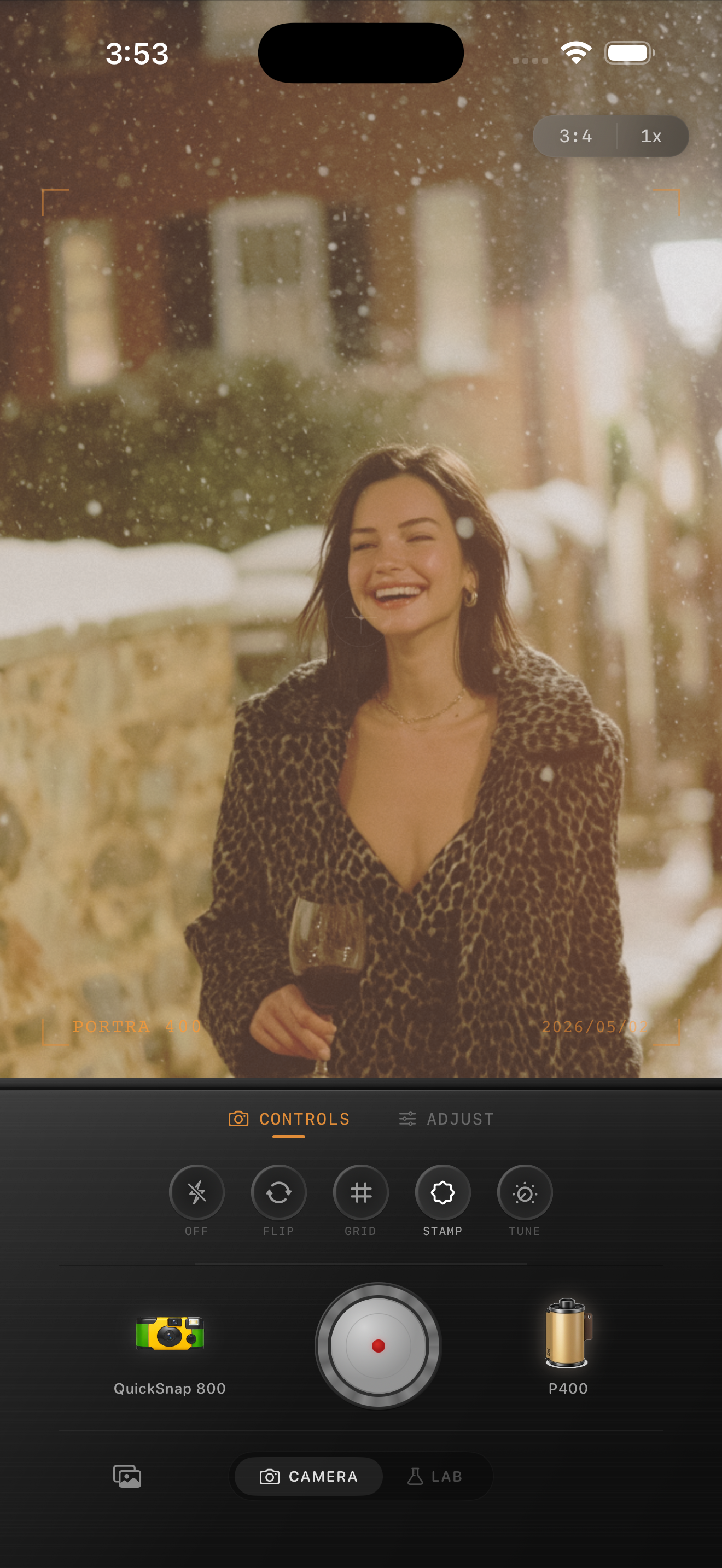
Grain can make an outdoor afternoon feel tactile, but too much can make a cloudy sky look speckled and turn a banner, face, or distant booth into visual clutter. Set brightness and color first, then add texture slowly while watching a smooth patch of sky, a face, and one detailed object together. If the sky gets noisy before the photo feels less digital, lower the grain.
Keep fade modest for the same reason. A little can soften hard iPhone contrast, while too much can erase the difference between light cloud layers and make the whole scene look washed out. Compare two gentle versions at normal viewing size and choose the one where the memory appears before the effect does.
Finish with a sky-to-subject check
View the saved image away from the editing controls. Your eye should find the person or festival moment first, then the color and setting, and only then the film character. If the first thing you notice is orange skin, a blank sky, or crunchy grain, return to the gentler version and let the original light carry more of the mood.
In the Nostalgia Cam Lab, compare camera bodies and film looks at moderate intensity before fine-tuning warmth, fade, vignette, and grain. Film names describe stylistic inspiration only; Nostalgia Cam is not affiliated with or endorsed by Kodak, Fujifilm, or other camera or film manufacturers.
Keep the gathering bright and the sky believable
Import a favorite fall festival photo into the Nostalgia Cam Lab, compare camera bodies and film looks at moderate intensity, then refine warmth, grain, fade, and vignette. Check a face, one colorful detail, and the brightest part of the sky before saving the version that feels most like the afternoon.
FAQ
Why does the sky look dull in my iPhone fall festival photos after a film edit?
A pale sky can lose its subtle cloud detail when overall fade, warmth, or film intensity is pushed too far. Use the brightest part of the sky as a reference alongside a face and a colorful object, then reduce the broad treatment before darkening the whole picture.
Should I use a lot of grain for outdoor fall festival photos?
Usually not. Leaves, fabric, lettering, and distant people already create texture, while grain is especially visible in a smooth cloudy sky. Add a modest amount only after color and brightness feel balanced, then check at normal viewing size.
How can I keep colorful booths and skin natural in a film edit?
Use a face, a colorful sign or garment, and a pale sky area as references. If the color treatment makes skin too warm or every bright object shift toward the same tone, try a lower-intensity or less-warm version before making a broad exposure change.