
Editing guide
How to Edit iPhone Farm Stand Photos to Look Like Film Without Dull Produce Colors
A practical iPhone film-editing guide for farm stand photos: keep fruit, vegetables, handwritten signs, and people colorful and believable without making the scene look flat or over-warmed.
Choose a frame with a clear subject and a useful range of color
Farm stands give an iPhone camera a lot to solve at once: shaded awnings, bright tomatoes or apples, pale paper bags, handwritten signs, and faces moving between sun and shade. Before editing, compare nearby frames at normal phone size and choose one where the person, basket, or display already has a clear role. A film-inspired finish can make the scene feel less digital, but it cannot recover detail hidden by deep shade or a highlight that was already clipped.
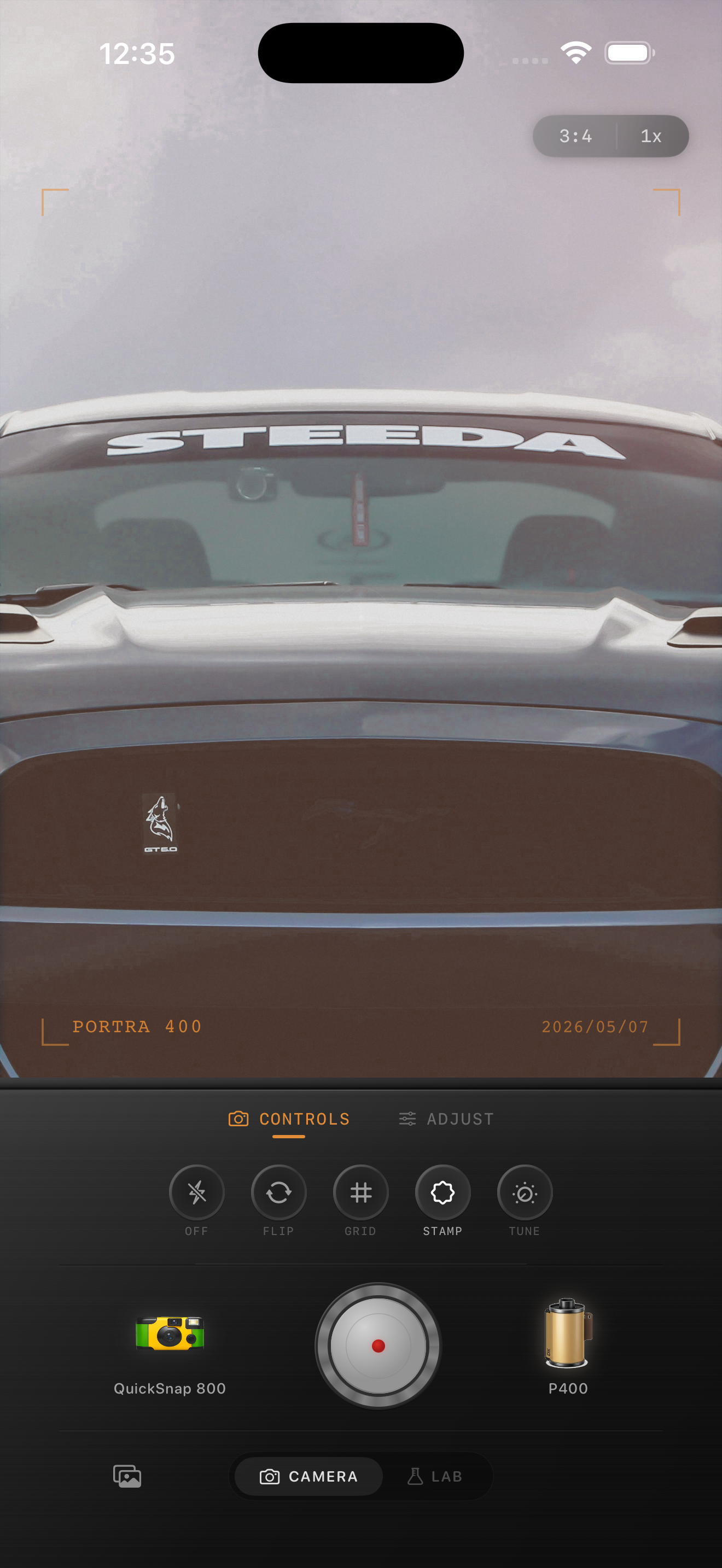
Keep the original beside the edit while you work. The useful goal is not to make every color equally loud; it is to keep the distinct color relationships that explain the place. The existing preview above is a warm-outdoor style reference, not a farm stand comparison.
Use produce, a neutral surface, and a face as three references
Pick three small areas before changing the look: one recognizable item of produce, a neutral paper bag or sign edge, and a face or hand when someone is in the photo. Revisit all three after each broad adjustment. This catches the common issue where a soft film look makes a red tomato, green leaves, and a cream tablecloth drift toward the same muted brown.
A natural-looking market photo can still be warm and gentle. If the neutral area turns yellow or the produce loses its own hue, lower the film intensity or warmth before trying to brighten the whole image. Broad brightness changes can flatten sign lettering and erase the small differences between sunlit and shaded baskets.
- Check color at the size you expect to share.
- Keep handwritten prices and labels readable before adding texture.
- Use a paper bag, table edge, or white shirt to spot an unwanted cast.
- Change one broad control at a time so you can tell what dulled the color.
Start with a restrained outdoor-market recipe
Start around film intensity 55–70%, grain 12–24%, warmth +1 to +5, fade 2–5%, and vignette 2–7%. Stay at the lower end when the display is already colorful or the scene was photographed in late sun. A modest treatment can soften a crisp iPhone file, while a strong warm look often makes berries, peppers, wood, and skin all compete for the same orange-brown tone.
A cleaner compact-film or 35mm-inspired camera body is usually a better starting point than the roughest disposable look. Farm stands already contain texture in leaves, crates, chalk lettering, and fabric canopies. Let the edit support that detail instead of adding noise everywhere.
Keep sunlight and awning shade from turning muddy
A display may have bright sun on one crate and cool awning shade on the next. That variation can make the photo feel like the visit you remember, so do not force every shadow to match the sunlit area. Watch the boundary between the two: if shade becomes gray-brown or sunlit produce becomes a bright flat patch, compare a gentler film look before adding more warmth or fade.
It is fine for a basket in the shade to remain quieter than the foreground. The target is enough separation to read the produce and setting, while keeping the light direction believable. A pale sign or paper bag is especially useful here: it should not look dingy just because the frame contains warm fruit or wood.
Add grain after the color and lettering stay clear
Grain can make an outdoor snapshot feel tactile, but it can quickly make leafy greens, small berries, price signs, and fabric look busy. Set brightness and color first, then add texture slowly while checking one smooth paper area, one detailed crate, and the main subject together. If the lettering gets fuzzy or the greens turn noisy before the photo feels less digital, reduce the grain.
Keep fade modest for the same reason. A little can soften hard phone contrast, while too much removes the depth between stacked baskets and makes ripe colors look chalky. Compare two gentle exports at normal viewing size and choose the one where the scene reads before the effect does.
Finish with a color-and-subject check
View the saved image away from the editing controls. Your eye should find the person, basket, or display first, then the range of seasonal color, and only then the film character. If the first thing you notice is brownish produce, orange skin, or gritty leaves, return to the gentler version and let the original light do more of the work.
In the Nostalgia Cam Lab, compare camera bodies and film looks at moderate intensity before refining warmth, grain, fade, and vignette. Film names describe stylistic inspiration only; Nostalgia Cam is not affiliated with or endorsed by Kodak, Fujifilm, or other camera or film manufacturers.
Keep the color varied and the market moment clear
Import a favorite farm stand photo into the Nostalgia Cam Lab, compare camera bodies and film looks at moderate intensity, then refine warmth, grain, fade, and vignette. Check one colorful item, one neutral detail, and the main subject before saving the version that feels most like the visit.
FAQ
Why do the colors in my iPhone farm stand photos look dull after a film edit?
Strong film intensity, warmth, or fade can pull different produce colors toward the same muted tone. Use one item of produce, a neutral bag or sign, and a face or hand as references, then reduce the broad treatment before brightening the whole photo.
Should I add a lot of grain to outdoor market photos?
Usually not. Leaves, crates, handwritten signs, and textured produce already provide detail, while grain can make fine lettering and greens look noisy. Add a modest amount only after color and brightness feel balanced, then check at normal viewing size.
How can I keep shaded produce from looking muddy in a film edit?
Use the boundary between sun and shade as a check. A shaded basket can stay quieter than the foreground, but it should retain enough color and edge detail to read. Try a lower-intensity or less-warm version before raising global brightness or fade.