
Editing guide
How to Edit iPhone Diner Photos to Look Like Film Without Muddy Reds
A practical diner-photo film workflow for iPhone: cleaner reds, warm but believable skin, restrained grain, and enough contrast control to keep retro interiors nostalgic instead of heavy and muddy.
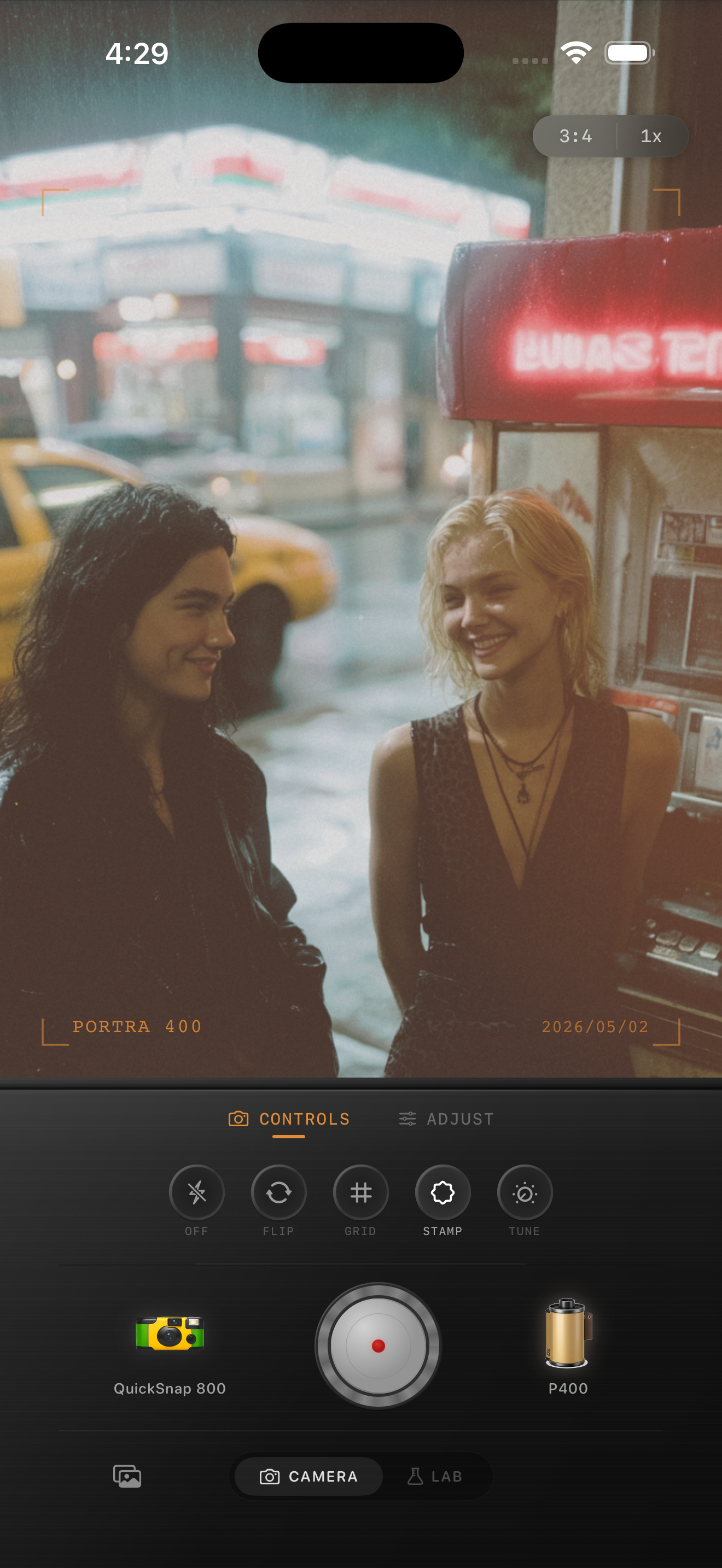
Why diner reds go bad so quickly
Diner scenes usually stack several warm color sources at once: red booths, ketchup bottles, neon, tungsten bulbs, reflective tables, and skin tones all fighting for attention. iPhone processing often compresses those colors together, which makes the whole frame feel muddy before the film edit even starts.
A believable film-inspired diner edit should separate those reds instead of pushing everything warmer. The room can stay nostalgic and rich, but faces, table surfaces, and bright highlights still need breathing room.
- Check booth reds, lips, and skin at the same time before calling the edit finished.
- Use moderate grain so vinyl, menus, and faces stay readable.
- Keep warmth gentle because the room already carries plenty of it.
- Protect white cups, plates, and chrome so they do not turn pink.
A dependable diner-film baseline
Start around film intensity 74-86%, grain 24-34%, warmth +3 to +8, fade 3-6%, and vignette 4-8%. That range usually softens the digital finish while keeping enough separation that red surfaces do not collapse into one flat tone.
If the scene includes neon or very deep booth color, lower warmth before you lower intensity. The problem is usually not that the image needs less film mood. It is that the warm colors need more space from each other.
Edit the people and the room as one scene
Retro diner photos rarely work if you only optimize for the room. Booth color, wall light, and table reflections can look great while the people start to look overly pink or dull. The best film-inspired result keeps the subjects believable inside the mood of the space.
Check cheeks, hands, booth vinyl, and the brightest reflective object in the frame together. If one area looks right and another collapses, the fix is usually a smaller move on warmth, intensity, or grain rather than adding more stylization.
Choose a camera mood with a little structure
Most diner photos benefit from a cleaner compact-film or 35mm-inspired body rather than the roughest disposable treatment. You still want some softness and character, but booth lines, chrome details, and faces should stay structured enough to feel printed.
In Nostalgia Cam, start with the camera body first, then tune warmth, grain, fade, and vignette until the photo feels like a late-night print from a real roll. If you want Fuji-style restraint or Portra-style warmth, keep that language as inspiration only and avoid any implication of affiliation.
Keep the diner warm without losing color separation
Use Nostalgia Cam to shoot or import diner photos, then balance camera body, warmth, grain, fade, and vignette so reds stay rich, skin stays believable, and the whole scene feels naturally film-inspired.
FAQ
Why do diner photos get muddy reds on iPhone?
Because diner scenes often combine red booths, warm bulbs, neon, and skin tones in one frame, and iPhone processing can compress those warm colors together until they lose separation.
Should film-style diner photos use strong warmth?
Usually less than you think. The room already has warm color, so a smaller warmth move plus softer contrast often looks more believable than pushing the whole image orange.