Editing guide
How to Edit iPhone Bookstore Photos to Look Like Film
A practical iPhone film-editing guide for bookstore photos: keep warm paper tones natural, preserve book-spine detail, and add texture without making shelves look muddy.
Let the books and light set the mood
Bookstores already offer the parts that make a film-inspired photo feel inviting: layered color, worn surfaces, quiet corners, and warm pools of light. Start with the frame that has a clear subject—a reader, a stack of books, a handwritten recommendation card, or a shelf disappearing into the room—rather than trying to make every aisle equally dramatic.
Before applying a look, decide whether the scene is led by warm lamps, daylight near a window, or the color of the covers. That choice keeps the edit grounded. A film finish should make the photograph feel less clinical, not turn every page and wooden shelf orange.
Protect paper highlights and book-spine detail
Open pages, pale jackets, and price labels can clip quickly under overhead lights. Compare one bright page with a darker row of book spines before adding warmth or grain. If the page loses its texture, reduce the broad film effect or warmth instead of trying to rescue it with heavy contrast.
Likewise, do not let fade flatten the shelves into one brown block. You do not need every title to be readable, but the rows should still feel layered. Keep a little separation between the darkest shelf, the middle-toned covers, and the brighter paper.
- Use a light page or label as your highlight reference.
- Use a row of darker covers as your shadow reference.
- Check that the main subject still separates from the shelf behind it.
Start with a restrained indoor-film recipe
For a lamp-lit bookstore, begin around film intensity 70–82%, grain 20–32%, warmth +4 to +10, fade 3–7%, and vignette 3–8%. This usually softens the default iPhone clarity while keeping pages, wood, and skin believable. If the shop already has very amber bulbs, use less added warmth than you expect.
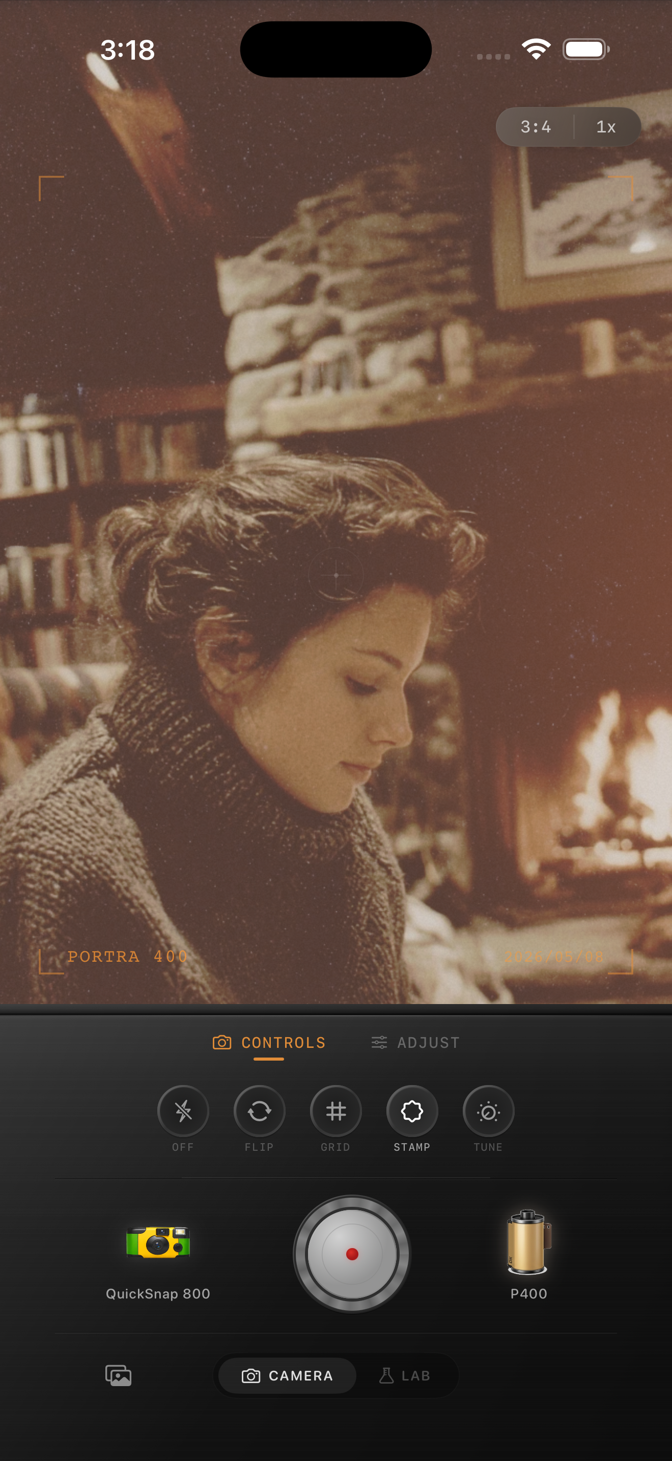
For window-lit corners, keep the color calmer and lower highlights first if the outside light is distracting. The reading preview here is an existing style reference for gentle indoor light, not a bookstore before-and-after. It is useful for noticing how a softer finish can retain texture without making an entire room look hazy.
Add grain after the color feels honest
Fine book text and paper texture reveal excessive grain quickly. Set the color and brightness first, then increase grain slowly while watching a small title, page edge, or handwritten card. Stop when the added texture begins competing with the real detail already in the photograph.
A rougher point-and-shoot mood can work for a quick friend snapshot between shelves, but a cleaner 35mm-inspired body is usually a better starting point for quiet browsing scenes. Compare both at sharing size; the better version should feel tactile before the grain becomes the first thing you notice.
Finish with a calm, readable frame
Check the saved version away from the editing controls. Your eye should land on the person, stack, or aisle you intended, then be able to wander through the surrounding books. If the edit makes labels, faces, or page edges difficult to see, return to less fade or grain rather than adding another effect.
In the Nostalgia Cam Lab, compare camera bodies and film looks at moderate intensity, then refine warmth, fade, vignette, and grain. Film names describe stylistic inspiration only; Nostalgia Cam is not affiliated with or endorsed by Kodak, Fujifilm, or other camera or film manufacturers.
Give quiet indoor photos a tactile film finish
Import a bookstore memory into the Nostalgia Cam Lab, compare cleaner camera bodies and film looks, then tune warmth, fade, vignette, and grain until the shelves, pages, and people all feel naturally connected.
FAQ
Why do my iPhone bookstore photos turn too orange after a film edit?
Bookstores often already have warm bulbs and wood tones. Add less warmth than usual, compare a pale page with a neutral surface, and lower the effect if white paper starts looking yellow.
Should I use heavy grain for a bookstore film look?
Usually no. Shelves, print, and paper contain fine detail that heavy grain can obscure. Use restrained texture after the light and color are balanced, then check the photo at the size you plan to share.
How can I keep book titles readable in a film-style photo?
Start with a sharp source frame and keep fade and grain modest around the important text. A film-inspired finish cannot restore lettering that was blurred, blocked by glare, or too small in the original capture.