
Editing guide
How to Edit iPhone Autumn Photos to Look Like Film Without Orange Leaves
Give iPhone autumn photos a gentle film-inspired finish while keeping leaves, skin, sky, and sweaters from collapsing into one heavy orange color cast.
Choose a frame with more than one warm color
Autumn photos can look inviting before you edit them: leaves, late-afternoon light, brick, wood, and sweaters often provide their own warmth. The challenge is that an iPhone film finish can push all of those colors in the same direction until the scene looks orange instead of seasonal. Start with a frame that has a clear subject and at least one cooler or neutral area, such as sky, pavement, a coat, or a pale wall.
Compare nearby frames at the size you expect to share. Choose the one where the leaf shapes and the person or object you care about already separate from each other. A film-inspired edit can soften the digital finish, but it cannot restore leaf detail or skin color that the original did not capture. Keep the original available so you can compare instead of layering another filter over an export.
Use one leaf, one neutral area, and one face as references
Open the original beside the edit and choose three small reference areas: a leaf with visible color, a neutral surface or sky, and a lit cheek or hand when a person is present. Check all three after each change. If the leaves look rich but the neutral area turns beige and skin turns orange, the overall treatment is probably too warm or too strong.
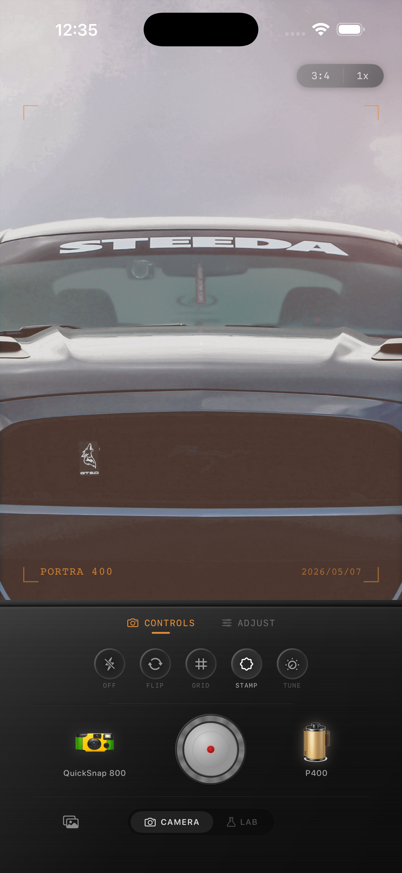
The existing preview above is a warm-color style reference, not an autumn before-and-after. Use the same comparison principle with your own photo: warm areas should feel related, while the cooler or neutral parts still explain the light in the scene.
- Check color at normal phone size before zooming in.
- Keep the original light direction believable.
- Reduce film intensity before adding more warmth to a weak-looking image.
- Change one broad control at a time so you can see what caused a shift.
Start with a restrained film look
Choose a camera body and film look at moderate intensity first. Autumn scenes usually need less added warmth than you expect because yellow and red foliage already supplies it. If the scene was made in cool overcast light, a gentle warm direction may help; if it was made near sunset, a quieter look often keeps the leaves from becoming fluorescent.
Compare two versions with the same crop: one with your first chosen look and one with slightly lower intensity. Look at the face, pale fabric, or sky before deciding which feels more like film. A result can keep a warm mood without making every shadow brown and every highlight yellow.
Keep leaf texture separate from grain
Foliage already contains fine detail, so heavy grain can turn individual leaves into a busy, rough surface. Set color and brightness before adding texture, then watch a cluster of leaves, a smoother sky area, and the main subject together. If the leaves become noisy before the subject feels less digital, lower the grain.
A wider landscape can accept more texture than a close portrait surrounded by leaves, because the foliage occupies fewer pixels. Export two restrained versions and compare them at the size you will actually use. Choose the one where the seasonal color reads first and the texture only supports it.
Protect pale skies and light clothing
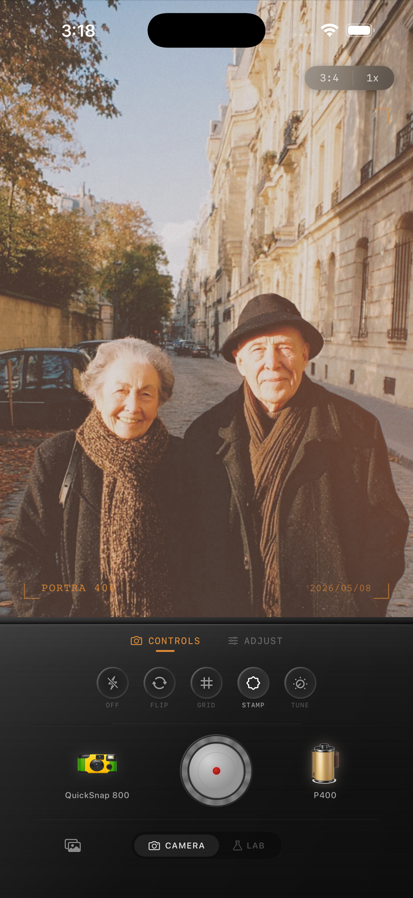
A pale sky, cream sweater, or white building makes a useful warning sign. If it starts looking yellow or muddy, do not immediately brighten the whole image. Compare a gentler film look or lower its intensity first, then reassess warmth. Broad brightness changes can remove useful shape from clouds and fabric without fixing the color cast.
Similarly, do not force every shadow to become warm. Cooler shadows can make golden leaves feel brighter by comparison. Keep some natural contrast between the foliage and its surroundings so the photo has depth rather than a single blanket of color.
- Check that clouds still look like sky, not tinted paper.
- Keep cream or white clothing distinct from yellow leaves.
- Let darker tree trunks and pavement retain their own color.
- Use fade sparingly if it makes the scene look dusty or flat.
Finish with a whole-scene review
View the saved photo as a whole before sharing. Notice the subject first, then the seasonal setting, then the film character. If orange is the first thing you see, return to the gentler comparison and reduce the broad treatment before adding more texture. If the result feels too quiet, restore a small amount of the original contrast rather than adding extra warmth everywhere.
In the Nostalgia Cam Lab, compare camera bodies and film looks before fine-tuning grain, fade, and vignette. Film names describe stylistic inspiration only; Nostalgia Cam is not affiliated with or endorsed by Kodak, Fujifilm, or other camera or film manufacturers.
Keep autumn color warm, not overcooked
Import a favorite fall photo into the Nostalgia Cam Lab, compare camera bodies and film looks at moderate intensity, then refine warmth, grain, fade, and vignette. Use one leaf, one neutral area, and your main subject as references before saving the version that feels most like the day.
FAQ
Why do autumn leaves turn neon orange after I add a film filter?
The source may already be warm, and a strong film look or extra warmth can push yellow and red foliage too far. Compare a lower-intensity version first, using a leaf, a neutral area, and a lit face or hand as references.
Should I add more grain to fall foliage photos?
Usually only a modest amount. Leaves already contain fine texture, so heavy grain can make them look noisy. Set color first, then compare exports at normal viewing size and keep the version where the subject and leaf shapes read before the texture.
How can I keep a blue sky natural in an autumn film edit?
Use the sky as a neutral reference while you compare film looks and intensity. If it shifts yellow or gray, try a gentler treatment before making a broad brightness adjustment that could flatten clouds or pale clothing.