
Editing guide
How to Edit Fireplace Reading Photos to Look Like Film on iPhone Without Orange Skin
A practical warm-interior guide for keeping fireplace photos soft, cozy, and film-inspired on iPhone without pushing faces and pages into heavy orange color.
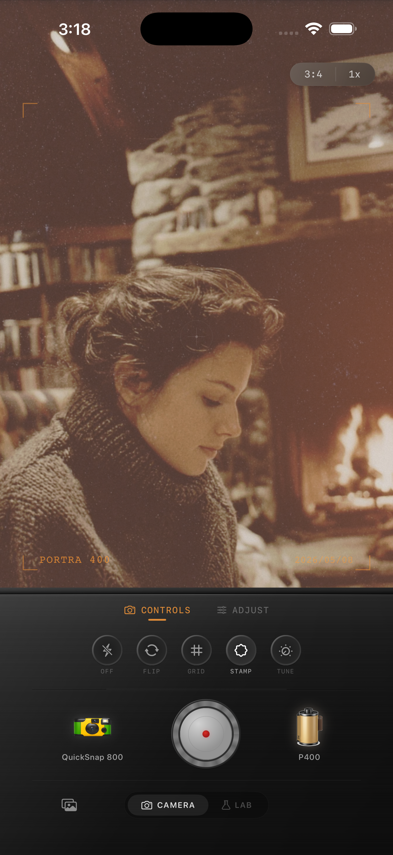
Warm light gets exaggerated fast on iPhone
Fireplaces, lamps, and candles already push a scene toward amber and red. iPhone processing often adds extra contrast and color pressure on top, which can make skin, paper, wood, and blankets all collapse into one hot orange range.
A film-inspired edit works better when it protects the warmth of the room without making every surface look cooked. The goal is cozy light with separation, not one blanket of orange.
- Keep face tones slightly warmer than neutral, not fully orange.
- Let pages, walls, and blankets stay distinct from skin.
- Use soft grain instead of heavy saturation to create nostalgia.
- Protect highlight detail in flames and lamp glow.
Set the room mood before adding more warmth
Start by deciding what should carry the scene: usually the glow of the fire, the face, and one neutral object like a book page, sweater, or wall. If those three points all stay readable, the edit will usually feel believable.
This is why warm indoor film edits usually work best with a cleaner camera mood. The room already has texture and atmosphere. It needs calm color handling more than extra roughness.
A dependable fireplace-film settings baseline
Start around film intensity 68-78%, grain 20-30%, warmth +4 to +9, fade 4-7%, and vignette 4-8%. That range usually softens the digital finish while keeping faces and pages from turning too yellow or orange.
If the room already has deep wood tones or red fabric, stay conservative with warmth and let the nostalgic feeling come from softer contrast and grain instead. Fireplace scenes usually break from color before they break from texture.
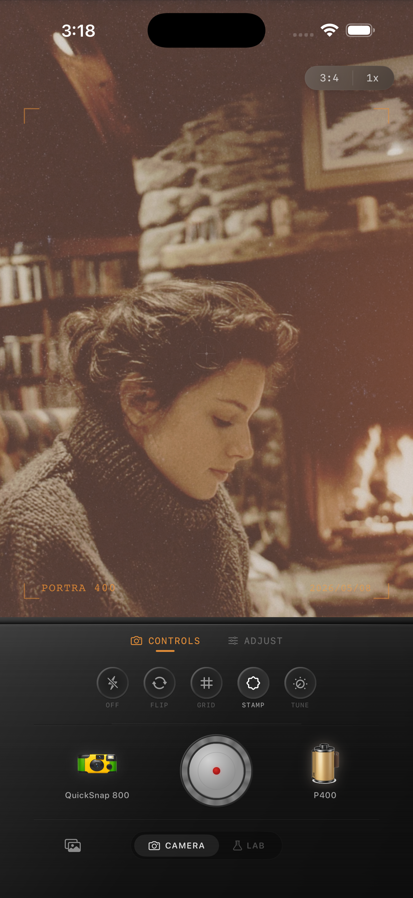
Keep flame highlights bright but not harsh
Bright flame areas can clip quickly, which makes the warmest part of the image look digital even when the rest of the frame feels good. Let the glow stay bright, but avoid adding so much contrast that the fire becomes a hard white patch.
A better result usually comes from a softer roll-off plus a little grain. That combination makes the room feel printed and tactile without forcing the highlights.
Know when the edit is finished
The photo is done when the room still feels warm, the subject still looks human, and the book, sweater, chair, or blanket keeps its own texture. If the whole frame starts matching the fire exactly, pull the warmth back.
Film-inspired indoor photos feel nostalgic because they are gentle and layered. Use color with restraint, then let softness and grain carry the memory.
Keep cozy interior light warm and believable
Use Nostalgia Cam to balance film-inspired color, grain, fade, and camera character so fireplace photos stay soft and nostalgic without turning skin and paper overly orange.
FAQ
Why do fireplace photos make skin look too orange on iPhone?
Because the room is already very warm, and phone processing plus strong filters can stack even more amber and red onto faces and highlights.
Should cozy indoor photos use strong grain to look like film?
Usually no. Warm interior scenes often work better with restrained grain and softer contrast, because the light already provides most of the mood.