
Editing guide
How to Edit Tokyo Neon Street Photos to Look Like Film on iPhone Without Clipped Highlights
A practical neon-street workflow for keeping signs bright, reflections readable, and iPhone night photos film-inspired without turning highlights into flat white patches.
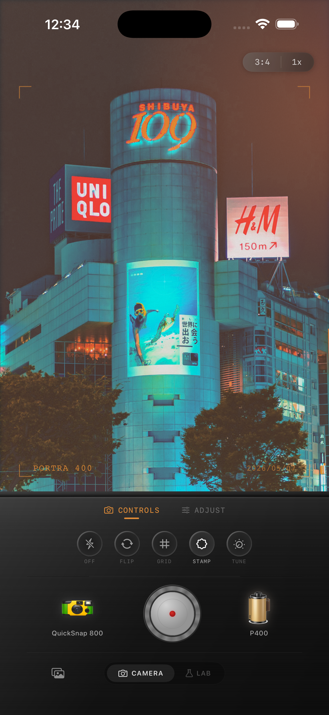
Neon signs fail before the shadows do
In dense night streets, the brightest signs, menus, windows, and light boxes usually break the illusion first. Once those highlights turn into flat blocks of white or magenta, the frame stops feeling like film no matter how good the grain is.
A better film-inspired night edit preserves brightness while keeping just enough shape in the hottest areas. That small amount of detail is what makes signs feel luminous instead of pasted on.
- Protect the brightest sign before tuning color.
- Let reflections stay bright, but not empty.
- Use grain to soften digital edges, not to hide clipping.
- Keep saturation controlled so signs do not merge into one glow.
Capture for the signs, then edit for the street
If you are shooting live, tap near the brightest sign and pull exposure down slightly before taking the frame. That gives the highlights a little room and makes the later film treatment much more forgiving.
Once you are editing, judge the image from three zones: the sign itself, the reflected pavement, and one darker area between storefronts. If those three zones still feel separate, the photo usually keeps its cinematic depth.
A dependable neon-film settings baseline
Start around film intensity 70-80%, grain 24-34%, warmth +1 to +5, fade 3-6%, and vignette 4-8%. That range keeps the scene atmospheric without flattening bright signs or making the whole street go muddy.
If a sign still clips, reduce the overall effect slightly and let texture do more work than color. Tokyo-style neon scenes usually benefit more from calmer highlight handling than from louder saturation.
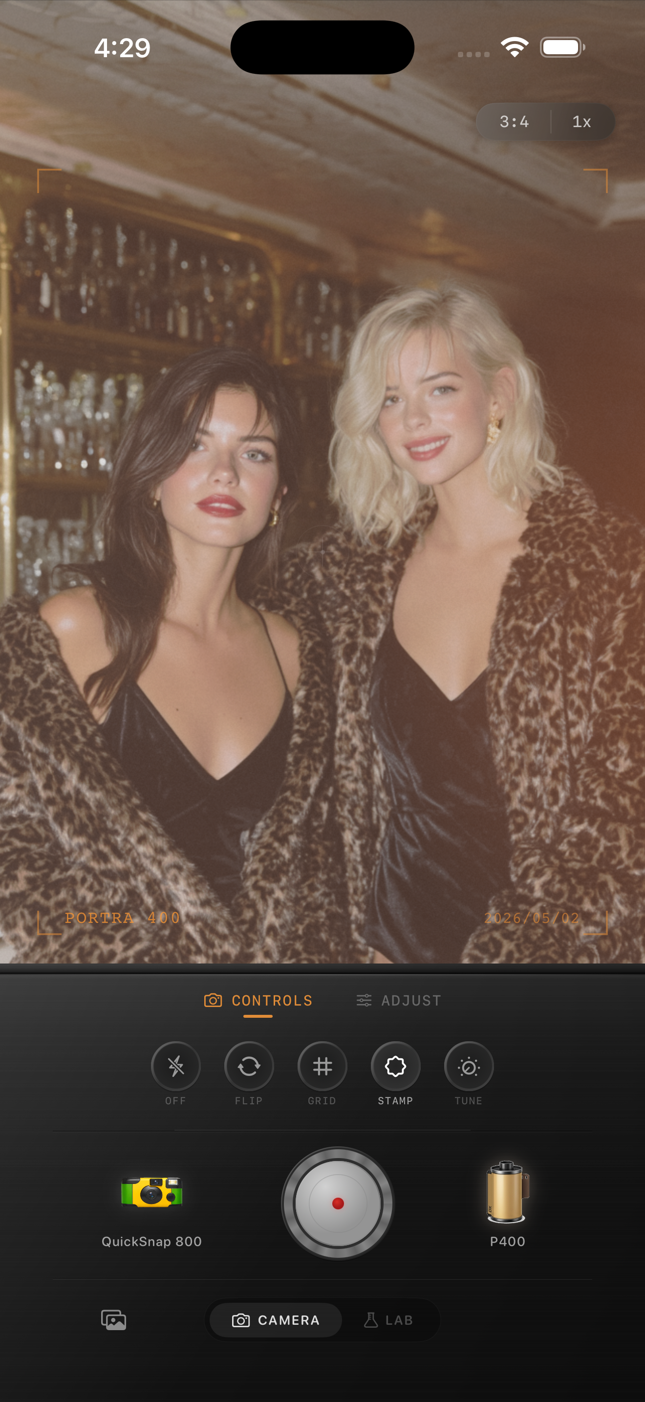
Keep bright colors separate from each other
The problem is not only brightness. It is also color collision. Reds, blues, pinks, and whites can stack into one electric layer if the edit is too aggressive, which makes the street feel synthetic instead of cinematic.
If you want Portra-style warmth or Fuji-style cooler color as inspiration, use that as a general direction rather than a literal match. The scene should still look like a real city at night, and no brand affiliation is implied.
Finish with texture, not with more glow
When the highlights are controlled, the final nostalgic step usually comes from grain and slightly softer contrast. Those two shifts make the frame feel less like a phone sensor and more like a scanned night print.
Stop before every sign starts blooming the same way. The strongest neon photos still have hierarchy: one sign leads, one reflection supports it, and the rest of the street falls back naturally.
Hold onto bright signs without losing the film mood
Use Nostalgia Cam to combine film-inspired night color, grain, fade, and camera character so neon streets stay vivid, readable, and less digitally harsh.
FAQ
Why do neon signs clip so quickly in iPhone edits?
They are already near the brightest part of the file, and strong contrast or saturation pushes them into flat highlight blocks very quickly.
Should I add more grain to hide clipped highlights?
No. Grain can soften the feel of the image, but clipped signs usually need calmer exposure and a lighter overall treatment first.