
Editing guide
How to Edit Car Photos to Look Like Film on iPhone in Parking Garage Light
A practical parking-garage film recipe for iPhone car photos: softer concrete color, calmer highlights, restrained grain, and enough warmth to feel analog without turning the scene muddy.
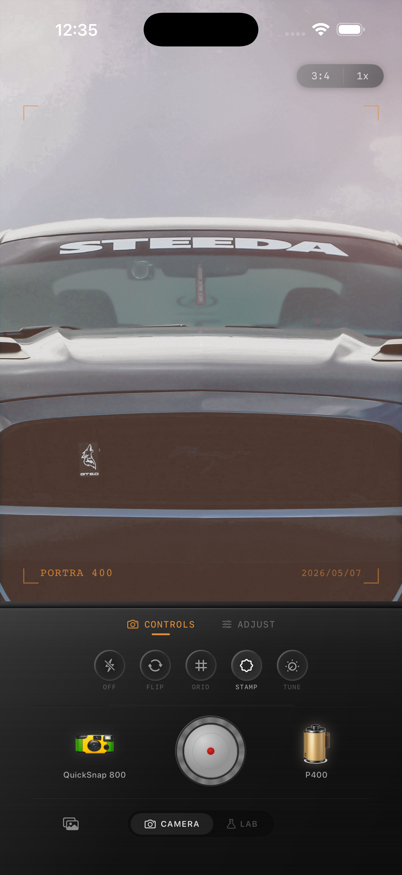
Parking garages already have the mood
Parking garage photos often start with the right ingredients for a film-inspired image: concrete color, patchy overhead light, reflections on paint, and a little darkness around the edges. What usually goes wrong is the default iPhone finish making every surface too sharp and every bright fixture too harsh.
A believable film-style edit should keep the structure of the garage visible while softening the sterile digital edge. The car still needs to look clean and dimensional, but the frame should feel more atmospheric than technical.
- Keep overhead lights from turning into hard white blobs.
- Use fine grain so paint and glass stay believable.
- Warm the scene slightly without making the concrete yellow.
- Let shadows stay open enough to show the setting.
A reliable starting point for garage light
Start around film intensity 72-86%, grain 22-34%, warmth +3 to +8, fade 3-7%, and vignette 5-10%. That range usually softens the glossy digital look without smearing metallic paint or making the garage feel brown.
If the garage has green fluorescent spill, lower warmth first and focus on cleaner contrast. If the scene has warmer sodium or tungsten pockets, you can let the frame lean a little warmer as long as the car color still reads accurately.
Watch the paint before you push the mood
Dark cars can handle a little more fade because the shadows still hold shape. Bright paint, chrome trim, and glossy reflections usually need more restraint. If the car starts looking dusty, gray, or flat, the grain or fade is too high.
This is especially important in parking garages because the light is already uneven. The best edit keeps the car as the subject while using the garage as supporting atmosphere, not a muddy veil over the whole frame.
Use camera personality carefully
A cleaner 35mm-inspired body works best when the photo is about the lines of the car. A rougher disposable-style body can help if the frame is more about the late-night errand, the empty deck, or the memory of the stop itself.
The rule is simple: if the image is a car portrait, stay cleaner. If it is a scene around the car, you can lean a little more into grain, softness, and snapshot character.
Know when the edit is finished
You are done when the image feels quieter and more cinematic, not when every effect is obvious. The concrete should still feel cool, the lights should still read as garage lights, and the car color should still make sense.
If the mood only appears when you zoom all the way in to inspect the grain, add a little more texture. If the first thing you notice is the grain or warmth, pull it back.
Give garage car photos a more natural analog finish
Use Nostalgia Cam to balance car paint, overhead lights, grain, fade, and camera-body character so parking garage photos feel cinematic and film-inspired instead of harsh and overprocessed.
FAQ
Should parking garage car photos use heavy grain?
Usually no. Garage scenes often look better with finer grain because glossy paint, windows, and overhead fixtures make heavy texture feel fake quickly.
How do I keep parking garage light from looking too yellow?
Keep warmth modest and judge the edit from the concrete and the car paint. If both start drifting warm at the same time, lower warmth before changing anything else.