
Editing guide
Color or Black and White? How to Choose for iPhone Film Edits
Choose color or black and white for an iPhone film edit with a simple comparison of mood, subject separation, background distractions, and texture.
Start with what you want the photograph to say
Choose color when the hues are part of the memory: a bright coat, autumn leaves, or the contrast between a cool street and a warm window. Try black and white when expression, gesture, light, or shape matters more. Neither treatment automatically makes an iPhone photograph feel more like film.
Before comparing filters, finish this sentence: I want someone to notice this first. It might be a smile, a silhouette, or a red umbrella. Use that answer to judge the edit. If removing color also removes the reason you took the picture, keep a color version.
Give both versions the same starting point
Make your color and monochrome previews from the same original, using the same crop. Keep added grain, fade, and vignette restrained while choosing the direction. Otherwise you may end up preferring one version because its texture is gentler or its framing is stronger.
In Nostalgia Cam, import the image into the Lab and compare a color film look with a black-and-white look. Keep the camera body the same for this first comparison. Each look can change the tonal balance, so aim for a similarly readable face or main subject before judging the mood.
Check whether the subject still separates from the background
A subject that stands out by color may blend into the background in monochrome. A red coat against green foliage can become two similar gray areas, depending on the look. View the whole picture and check the outline of the shoulders, the face, and any important hand gesture.
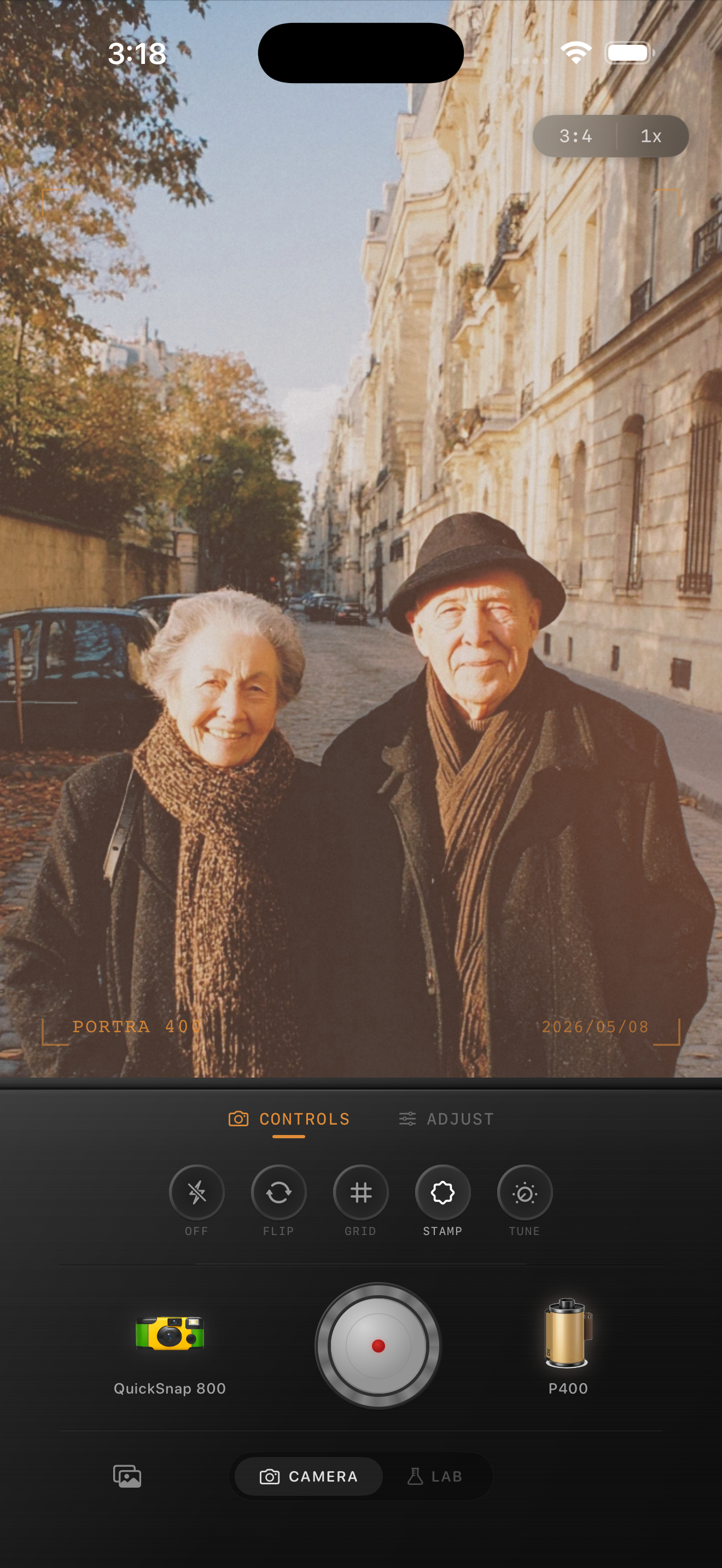
In the Paris preview above, the dark coats sit against pale stone, giving you a useful place to begin the comparison. The warm leaves and sunlight also contribute to the color version. Ask whether losing those hues strengthens the attention on the couple or removes atmosphere you want to keep.
The preview illustrates the color starting point, not a before-and-after comparison. Film names visible in the interface describe style inspiration; Nostalgia Cam is not affiliated with Kodak, Fujifilm, or other camera or film manufacturers.
- Keep color if it is the clearest way to distinguish the subject.
- Try monochrome if light and dark shapes already describe the scene well.
- If both versions feel cluttered, reconsider the crop before adding more effects.
Use monochrome deliberately around distracting colors
A vivid sign behind a face may demand less attention in black and white. But a bright sign can remain distracting even after its color disappears. Check what changed: did the background become quieter, or is the same pale rectangle still the first thing you notice?
For portraits under differently colored lights, a monochrome preview can offer a mood you prefer. It is a creative choice rather than a repair for every lighting problem. Harsh shadows, missing highlight detail, and an awkward expression can still be visible. Keep a color copy when the lighting colors help explain the place.
Finish the texture after choosing the direction
Once color or monochrome wins, refine the film character. Start with modest grain and inspect a face, a dark garment, and an open background. Black and white does not need heavy grain to look intentional; quiet texture may better suit a gentle portrait.
Add fade only as far as you enjoy the result. Watch whether dark clothing still has shape and whether a face remains distinct from a pale wall. If you want a rougher finish, increase one effect at a time and return to the full image after each adjustment.
Compare both directions in Nostalgia Cam
Import a favorite into the Lab, preview color and black-and-white film looks with the same camera body, then refine grain, fade, and vignette after choosing your mood. Keep the version that brings attention back to your subject.
FAQ
Does black and white automatically make iPhone photos look like film?
No. Monochrome changes how you read color and tone, but a film-inspired finish also depends on the chosen look and texture. Start with a clear subject and add grain or fade only when they improve the image.
Why does my subject disappear in a black-and-white edit?
Colors that looked different may become similar shades of gray in the chosen look. Compare the subject outline against the background, try another monochrome look, or keep color if it provides better separation.
Should black-and-white film edits have more grain than color edits?
Not necessarily. Judge texture against the subject and intended viewing size. A gentle portrait may suit subtle grain in either style, while a rougher candid frame may support more.