Editing guide
Best Film Settings for Window Light Portraits on iPhone
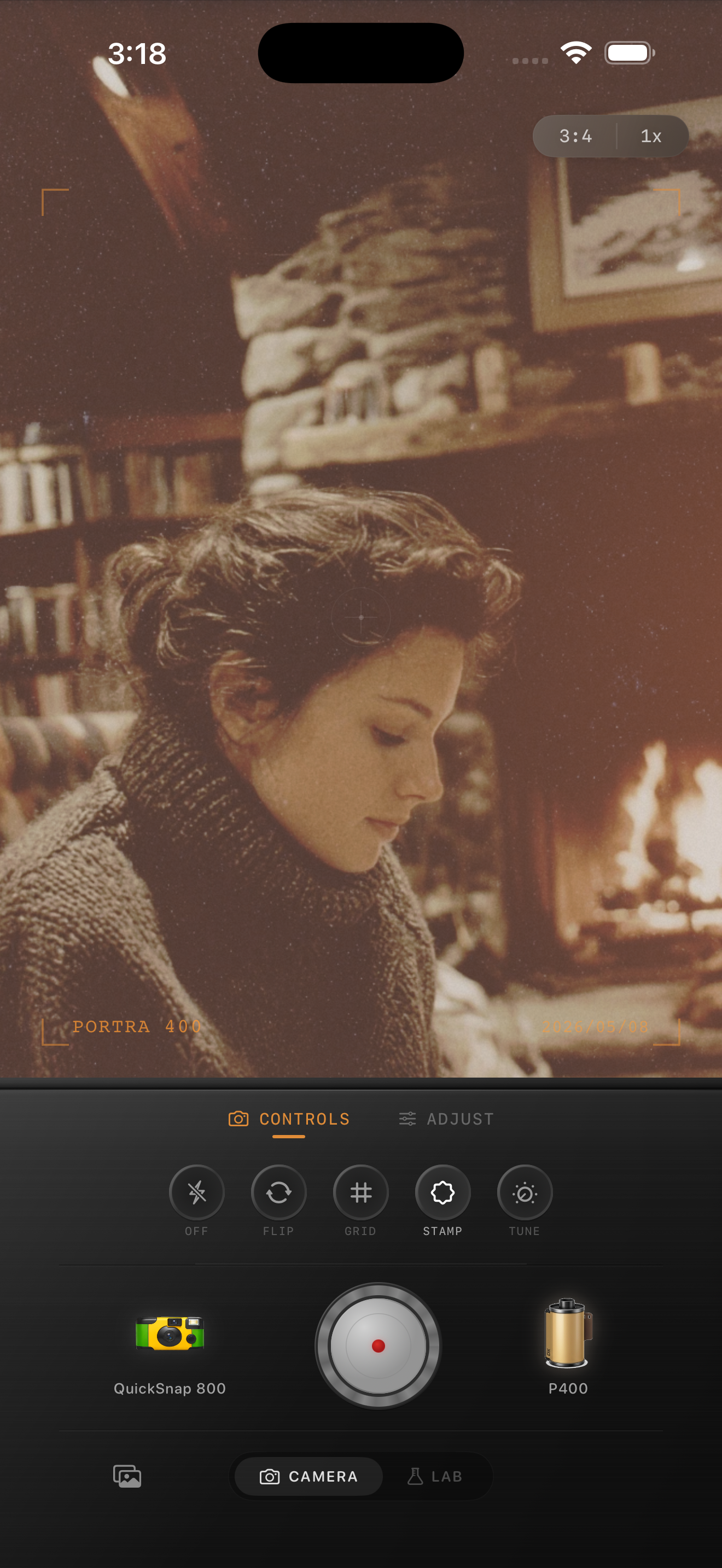
A simple iPhone film recipe for window-light portraits: soft contrast, natural skin tone, restrained grain, and gentle warmth that keeps the image calm and believable.
Window-light portraits already have the softness film needs
Window-light portraits usually succeed because the light falls off gently across skin, hair, and clothing. That soft transition is already close to what people want from a film look, so the edit should refine it rather than forcing a dramatic effect on top.
A believable film treatment keeps the light calm, controls overly sharp iPhone detail, and adds texture without making smooth indoor backgrounds look gritty.
- Keep contrast soft so the light roll-off stays natural.
- Use fine to medium grain instead of coarse disposable texture.
- Warm skin slightly, but let neutral walls and shadows stay balanced.
- Add only a small amount of fade unless the original image is very contrasty.
- Protect detail in bright curtains, windows, and cheeks.
A reliable window-light settings starting point
Start with film intensity around 70-82%, grain around 20-32%, warmth around +4 to +9, fade around 3-6%, and vignette around 3-7%. That usually gives the portrait a printed softness without making it look sleepy or overworked.
If the window side of the face is too bright, lower highlights before adding more grain. Window-light portraits usually look more like film when the bright side glows softly instead of clipping hard.

Choose a cleaner camera body first
Window-light portraits usually benefit from a cleaner compact or 35mm-inspired body rather than a rough disposable profile. The goal is softness and character, not chaos.
That body choice matters because it sets the baseline texture. If the camera personality is too rough, every later adjustment has to fight against heavy grain and edge damage that does not fit a calm indoor portrait.
When to stop before the portrait looks filtered
The portrait is close when the skin feels less digital, the shadows stay open, and the mood feels quieter without becoming flat. If the first thing you notice is orange skin, gray blacks, or obvious grain, the edit has gone too far.
In Nostalgia Cam, begin with a cleaner body, choose a gentle film look, then tune grain, warmth, fade, and vignette until the portrait feels like a small stack of indoor prints.
Keep indoor portraits soft in Nostalgia Cam
Open Nostalgia Cam, choose a cleaner camera body, then fine-tune grain, warmth, fade, and vignette so your window-light portraits feel natural, tactile, and film-inspired without looking overedited.
FAQ
How much grain works for window-light portraits?
A restrained range around 20-32% is a solid starting point. It adds texture without covering skin detail or making smooth indoor backgrounds look dirty.
Should window-light portraits be warmed up heavily to look like film?
Usually no. A small warmth boost is enough. The analog feeling usually comes more from soft contrast, highlight roll-off, and controlled grain than from strong orange color.