
Editing guide
Best Film Settings for Retro Diner Portraits on iPhone
A practical iPhone film recipe for retro diner portraits: cleaner reds, warmer skin, softer chrome highlights, and enough grain to feel analog without muddy booth lighting.
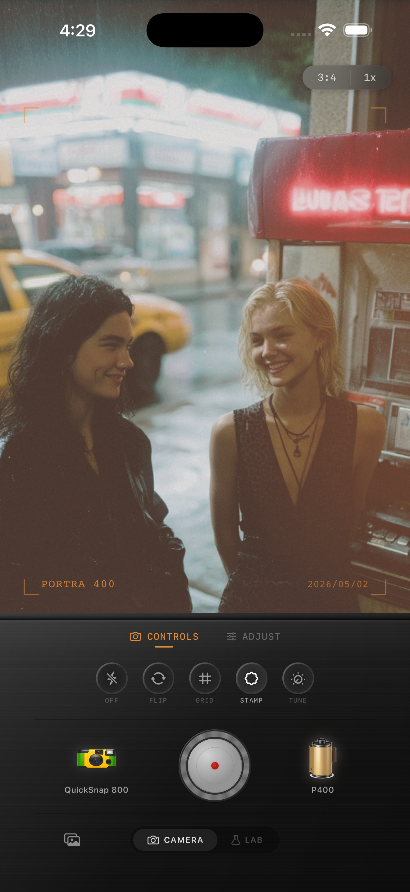
Diner portraits need color discipline first
Retro diner portraits are full of warm booths, red accents, chrome trim, menus, glass reflections, and mixed indoor light. That is great for a film-style edit, but it also means colors can get muddy fast if you treat the whole frame with one heavy vintage pass.
The goal is to keep the portrait feeling lively and nostalgic at the same time. Skin should stay warm, reds should stay believable, and reflective highlights should soften without turning flat.
- Keep skin warmer than the booth upholstery.
- Control reds before adding extra fade.
- Use grain to soften the scene, not bury it.
- Let chrome stay bright but not harsh.
- Avoid pushing warmth until menus and whites go orange.
A reliable retro diner baseline
Start around film intensity 76-88%, grain 28-40%, warmth +5 to +10, fade 3-7%, and vignette 5-9%. That range usually preserves the diner mood while keeping faces readable and booth shadows from collapsing.
If the portrait includes neon or direct window reflections, keep fade lower and let the brighter highlights hold some shape. If the scene is mostly booth light, you can add a touch more grain and warmth.
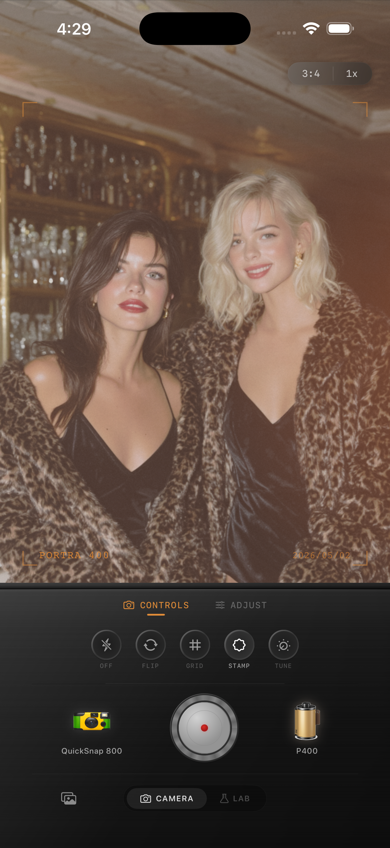
Watch the whites, metal, and skin together
Diner portraits often contain small neutral references like napkins, plates, menus, chrome, and tiled walls. Those details are useful because they tell you immediately when the grade is drifting too orange or too pink.
Check faces next to those neutrals before you finish. If skin looks healthy and the whites still look like whites, the edit is probably in the right range.
Choose between cleaner film and disposable energy
A cleaner 35mm-inspired body usually works best for retro diner portraits because it preserves skin and booth detail. If you want more late-night snapshot energy, then a mild disposable-style body can work, but keep it restrained.
In Nostalgia Cam, start with the calmer body for portraits, then push toward rougher texture only if the photo needs more point-and-shoot character.
Tune diner portraits in Nostalgia Cam
Use Nostalgia Cam to balance booth warmth, skin tone, grain, fade, and camera-body character so retro diner portraits feel printed and nostalgic without muddy reds or harsh chrome.
FAQ
Why do diner portraits get muddy so easily with film edits?
They usually combine warm booths, red surfaces, and mixed light, so heavy warmth plus too much fade can collapse the color separation and make skin look dull.
What kind of grain works best for retro diner portraits?
Moderate grain usually works best. It softens the clean iPhone finish and supports the nostalgic mood without covering faces, menus, or chrome details.