
Editing guide
Best Film Settings for Payphone Photos on iPhone
A practical payphone-photo film recipe for iPhone: cleaner reds, restrained grain, softer flash color, and enough analog texture to make retro street details feel real instead of gimmicky.
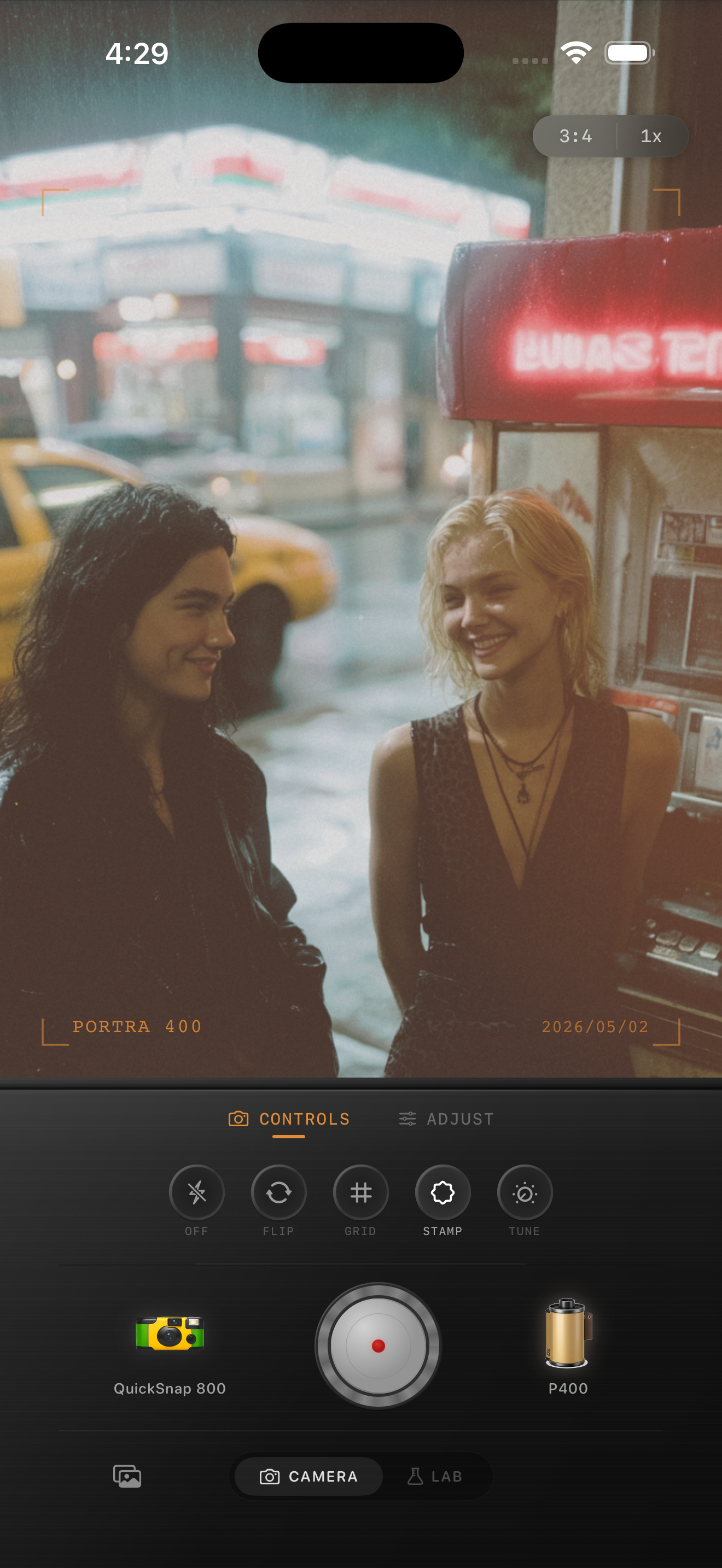
Payphone photos need color separation more than heavy vintage effects
Payphone scenes already come with most of the nostalgia people usually try to force in editing: plastic color, reflective metal, old signage, dim interiors, and a subject that feels pulled from another decade. The edit should help that detail read clearly instead of covering it with coarse grain and muddy warmth.
What usually breaks the mood is overcommitting to the obvious retro idea. If the reds, chrome, and skin tones all slide into the same warm cast, the photo stops feeling like a discovered street detail and starts feeling like an overlay.
- Keep the payphone color distinct from nearby skin tones.
- Use moderate grain so numbers, cords, and lettering stay readable.
- Protect chrome and plastic highlights before adding fade.
- Let surrounding darkness stay moody instead of lifting it flat.
- Use a cleaner film body unless the photo was intentionally shot with flash chaos.
A dependable payphone-film baseline
Start around film intensity 74-86%, grain 24-36%, warmth +3 to +8, fade 3-6%, and vignette 4-8%. That range usually softens the default iPhone finish while keeping the payphone itself crisp enough to stay interesting.
If the scene already has bright red booths, neon, or diner lighting, lower warmth before lowering grain. Payphone photos usually fall apart because color stacks too quickly, not because they need less film character.
Judge plastic, metal, and skin separately
Payphone photos often mix bright painted surfaces, reflective metal, and human skin in a very small frame. A believable film-inspired edit keeps those materials distinct. If the plastic turns dull, the chrome turns chalky, or faces pick up the same red cast as the booth, the image loses its depth.
Check each surface on its own before deciding the edit is done. When the materials still feel different from each other, the whole scene usually feels more photographic and less processed.
Let the retro object carry the nostalgia
You do not need exaggerated dust, scratches, or fake damage to make a payphone photo feel old. The subject already carries that story. A cleaner compact-film or 35mm-inspired treatment usually works better because it preserves detail while still softening the digital edge.
In Nostalgia Cam, start with the calmer camera body first, then add only enough grain, warmth, and fade to make the scene feel like a small print from a late-night stop rather than a novelty filter.
Keep retro details clear in Nostalgia Cam
Use Nostalgia Cam to tune camera body, grain, warmth, fade, and vignette so payphone photos keep their signage, plastic color, and nostalgic mood without turning muddy or over-styled.
FAQ
Should payphone photos use strong grain to look like film?
Usually no. Moderate grain works better because payphones already have texture from cords, buttons, chrome, and signage. Too much grain hides the details that make the subject interesting.
Why do payphone edits turn muddy so quickly on iPhone?
They usually turn muddy when warmth, fade, and grain are all pushed before the booth color and nearby highlights are balanced. Keep the object readable first, then add texture carefully.