Editing guide
Best Film Settings for Pasta Dinner Photos on iPhone
A practical pasta-dinner film recipe for iPhone: warm but controlled color, softer highlights, restrained grain, and enough fade to make restaurant photos feel printed instead of processed.
Dinner photos should feel warm, not orange
Pasta dinner photos already have what most film edits are trying to invent: warm light, steam, reflective glass, deep shadows, and a lived-in mood. The job is to keep that atmosphere while taking the digital edge off the iPhone file.
The most common mistake is stacking warmth, saturation, and grain all at once. That usually turns sauce neon, skin too yellow, and table highlights greasy instead of nostalgic.
- Protect white plates and shiny cutlery before adding more warmth.
- Use moderate grain so the table feels textured, not dirty.
- Let the room stay dim enough to feel intimate.
- Keep reds and oranges rich but believable.
- Add only a small vignette so the food still feels inviting.
A dependable pasta dinner settings recipe
Start around film intensity 72-86%, grain 26-38%, warmth +6 to +12, fade 4-8%, and vignette 5-11%. This is usually enough to soften the iPhone finish without making the photo muddy or overly filtered.
If the restaurant already has amber lighting, lower warmth and rely more on softer contrast. If there is one bright lamp or candle in frame, hold the highlights first so the glow stays shaped instead of clipping flat.
Judge the edit from plates, skin, and table light
A dinner photo can fall apart quickly if whites turn yellow or if the darkest parts of the table become crunchy. Check plates, hands, candlelight, and the brightest sauce highlights before pushing the effect further.
Once those anchor points look believable, the rest of the image can stay softer and darker without losing the cozy restaurant feeling.
Pick a calmer film mood than a flash snapshot
Most pasta dinner scenes work better with a balanced 35mm-inspired or compact-film mood than with a harsh disposable treatment. You want warmth and texture, but usually not the chaos of direct-flash party photos.
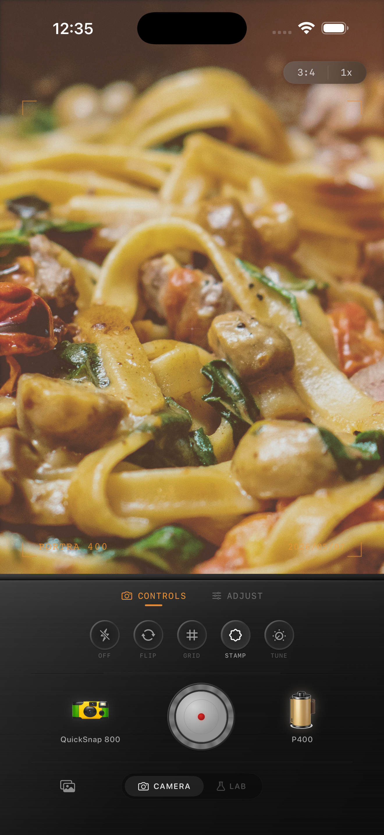
In Nostalgia Cam, start with a cleaner body, then tune grain, warmth, fade, and vignette until the photo feels like a printed dinner memory rather than a heavy food preset.
Make dinner photos feel like a printed memory
Use Nostalgia Cam to shoot or import restaurant photos, then balance camera body, grain, warmth, fade, and vignette so pasta dinners feel intimate, textured, and naturally film-inspired.
FAQ
Should dinner photos use strong grain to look like film?
Usually no. Moderate grain works better for restaurant scenes because it adds texture without making food, skin, or white plates look dirty.
Why do pasta dinner edits turn orange so easily?
Because the scene is already warm. It usually looks better to protect highlights first, then add only a modest warmth boost and let softer contrast plus grain do the rest.