Editing guide
Best Film Settings for Paris Travel Portraits on iPhone
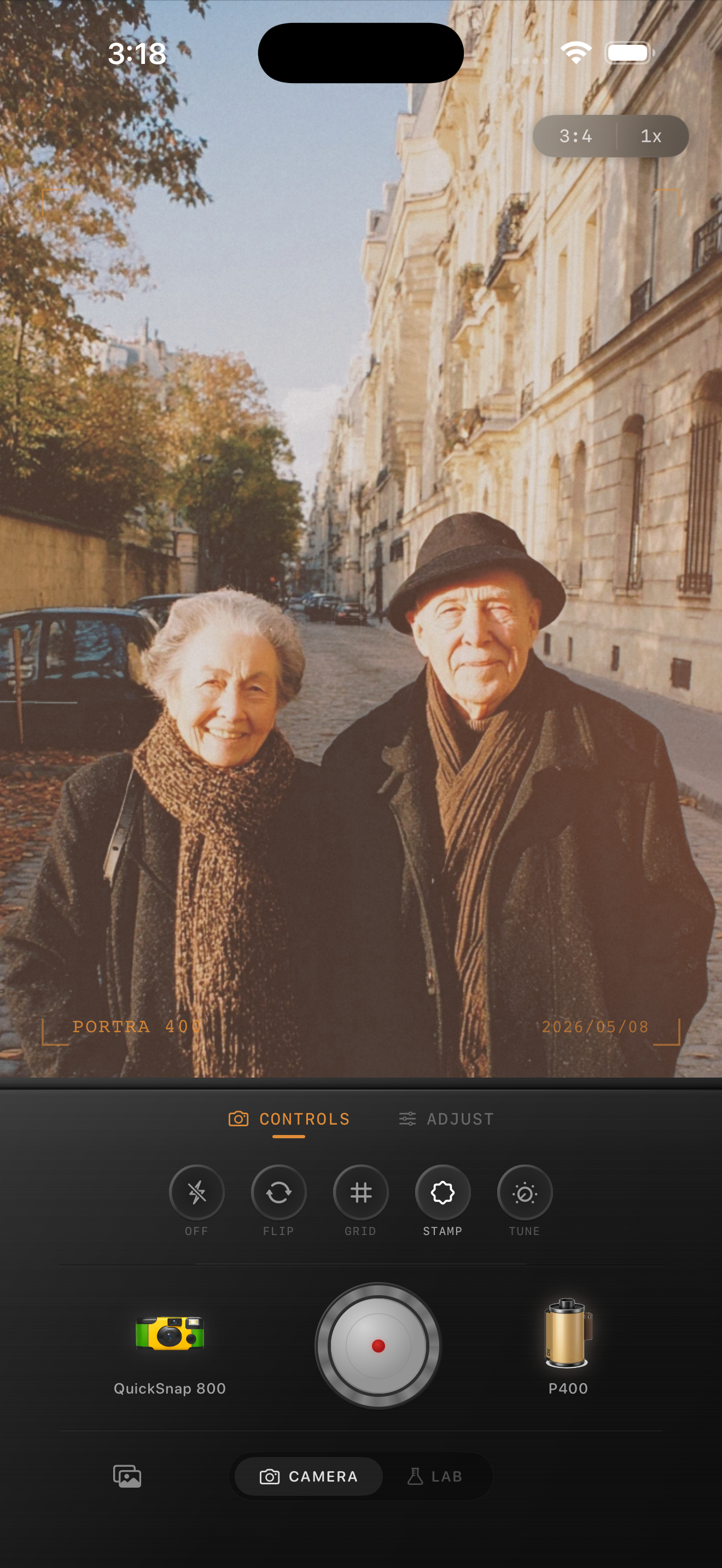
A practical Paris travel portrait recipe for iPhone: calm color, soft stone tones, natural skin, and enough grain to feel film-inspired without turning the city muddy.
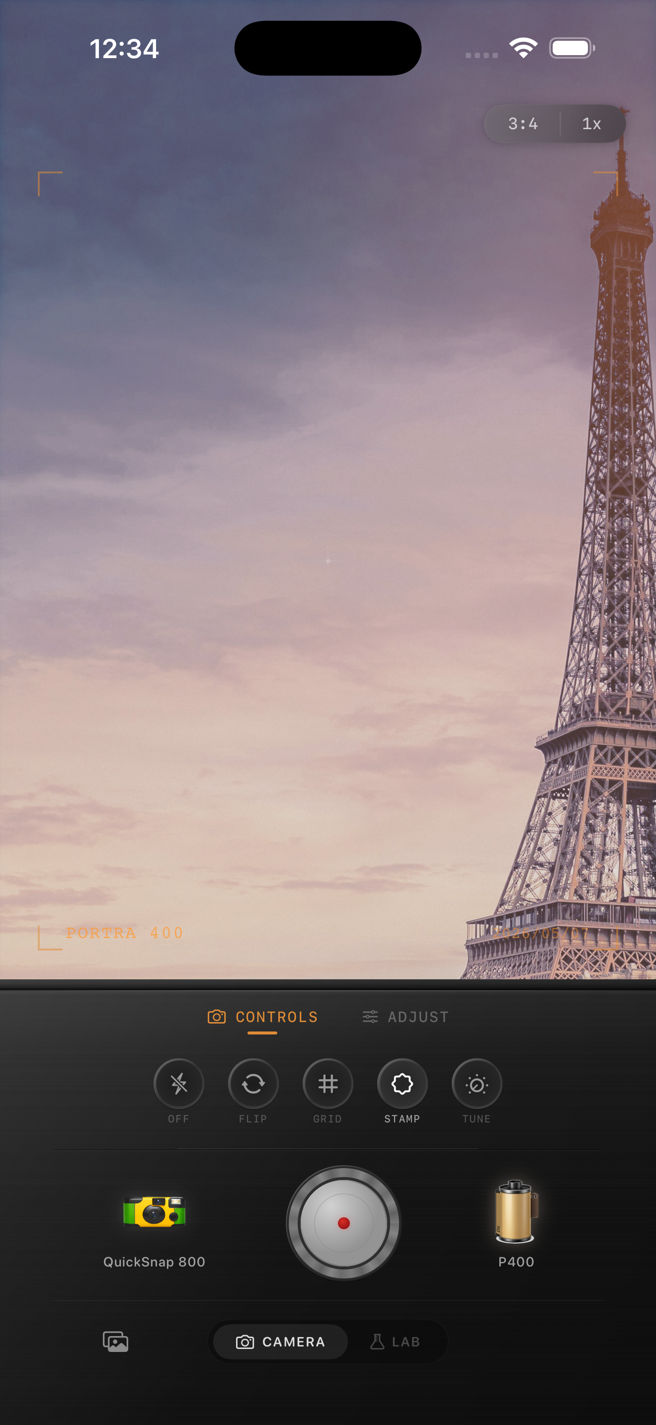
Paris portraits work best when the city stays light
Paris travel portraits already have a lot going for them: pale stone, soft skies, café tones, older streets, and clothing that usually sits in a calmer palette than nightlife photos. The main risk is editing them too warm or too grainy until the scene loses the quiet elegance that made it appealing.
A better film-style approach is to keep the city airy and let the subject carry the warmth. That makes the portrait feel like a travel print, not a heavy preset laid over a landmark photo.
- Keep contrast soft before adding extra fade.
- Use fine grain rather than rough disposable texture.
- Protect pale walls and sky from turning gray.
- Let skin stay slightly warmer than the background stone.
- Use only a light vignette so the city still feels open.
A dependable Paris travel portrait recipe
Start around film intensity 70-84%, grain 18-30%, warmth +3 to +7, fade 3-6%, and vignette 2-6%. That range usually keeps the portrait gentle while preserving detail in coats, sidewalks, and old buildings.
If the sky is flat and bright, lower contrast first instead of adding more fade. If the stone starts drifting yellow, back off warmth before changing anything else.
Choose a body that feels like travel, not nightlife
Most Paris travel portraits fit a compact 35mm-inspired body better than a rough disposable one. You want some softness and character, but you still need street signs, coat texture, and architecture to stay readable.
In Nostalgia Cam, start with a cleaner body and a softer film look, then tune grain and warmth until the image feels like a print picked up after a trip rather than a high-effect social filter.
Watch stone color before you watch skin color
Skin matters, but Paris portraits usually fail first in the buildings. If pale façades turn orange or dirty, the whole edit starts feeling wrong even when the face still looks fine.
Use the stone as your edit anchor. If the architecture stays believable, the portrait can keep its nostalgic mood without losing the place itself.
Give travel portraits a calmer film finish
Use Nostalgia Cam to combine film-inspired color, fine grain, and camera-body character so Paris portraits feel soft, printed, and specific to the trip instead of generically vintage.
FAQ
How much grain should Paris travel portraits use on iPhone?
Fine grain around 18-30% is a strong starting range. It softens the digital finish without making pale buildings, coats, and faces look dirty.
Should Paris travel portraits be edited warm to look like film?
Usually only a little. A modest warmth boost works better because too much warmth can push skin and old stone into the same yellow-orange range.