Editing guide
Best Film Settings for Cozy Restaurant Photos on iPhone
Use warm film-inspired settings for restaurant photos on iPhone without turning candlelight orange soup. This guide covers grain, fade, skin tones, highlights, and when to stop editing.
Restaurant photos already have the mood
Cozy restaurant photos usually do not need a dramatic filter. The warm bulbs, candles, table reflections, and shallow phone framing already give you most of the atmosphere. The job of the edit is to keep that warmth while removing the overly clean digital feel.
That means using grain and fade with restraint. If the food, glasses, or faces lose separation, the image stops feeling like film and starts feeling muddy.
- Keep warmth subtle if the room is already amber.
- Use soft grain, not rough disposable-style texture.
- Protect highlights on candles, plates, and glassware.
- Let some shadow stay in the frame so the scene keeps depth.
Settings that work for dinner tables
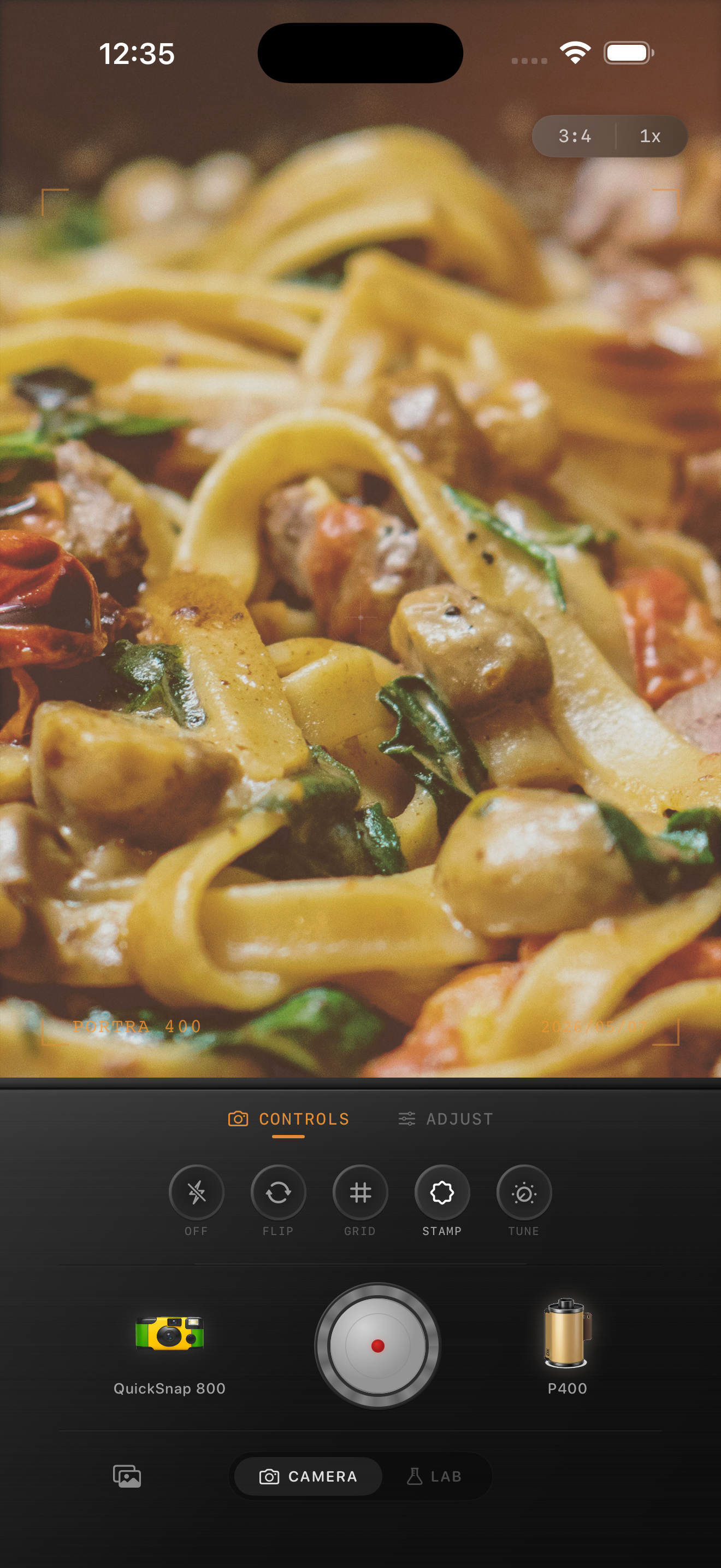
Start around film intensity 72-84%, grain 24-36%, warmth +4 to +10, fade 5-10%, and vignette 5-11%. This usually preserves the restaurant glow without flattening the whole image.
If the shot includes people, prioritize skin tone first. If it is mostly food and tabletop detail, you can add a little more grain and fade as long as the whites on plates and napkins stay clean.
Choose cleaner film character over rough disposable energy
For most restaurant photos, a cleaner compact-film mood works better than a harsh disposable-camera effect. Disposable-style settings can be fun for loud flash birthday shots, but they often overpower quiet candlelit tables and low-light date-night scenes.
If the moment is intimate or design-focused, keep the camera character smoother and let the warm lighting do the storytelling.
The common mistakes to avoid
The biggest mistakes are pushing orange too far, adding grain to every surface equally, and lifting shadows so much that the room loses contrast. Restaurant photos should still feel dim in the right places.
In Nostalgia Cam, build the look until the image feels like a printed memory from a good dinner, then stop. When you can still read the food, the table light, and the people naturally, the edit is usually done.
Keep dinner photos warm without turning them muddy
Use Nostalgia Cam to combine film-inspired color, grain, fade, and camera-body character so restaurant photos keep their low-light mood while still looking clean and natural.
FAQ
How much grain should I use for restaurant photos on iPhone?
Usually less than a disposable-camera edit. Moderate grain is enough to soften the digital look while keeping food, glassware, and faces readable.
Why do restaurant edits turn too orange so easily?
Indoor dining spaces are already warm-lit, so adding too much extra warmth stacks on top of amber bulbs and candlelight. A small warmth boost is usually enough.