Editing guide
Best Film Settings for Cozy Reading Photos on iPhone
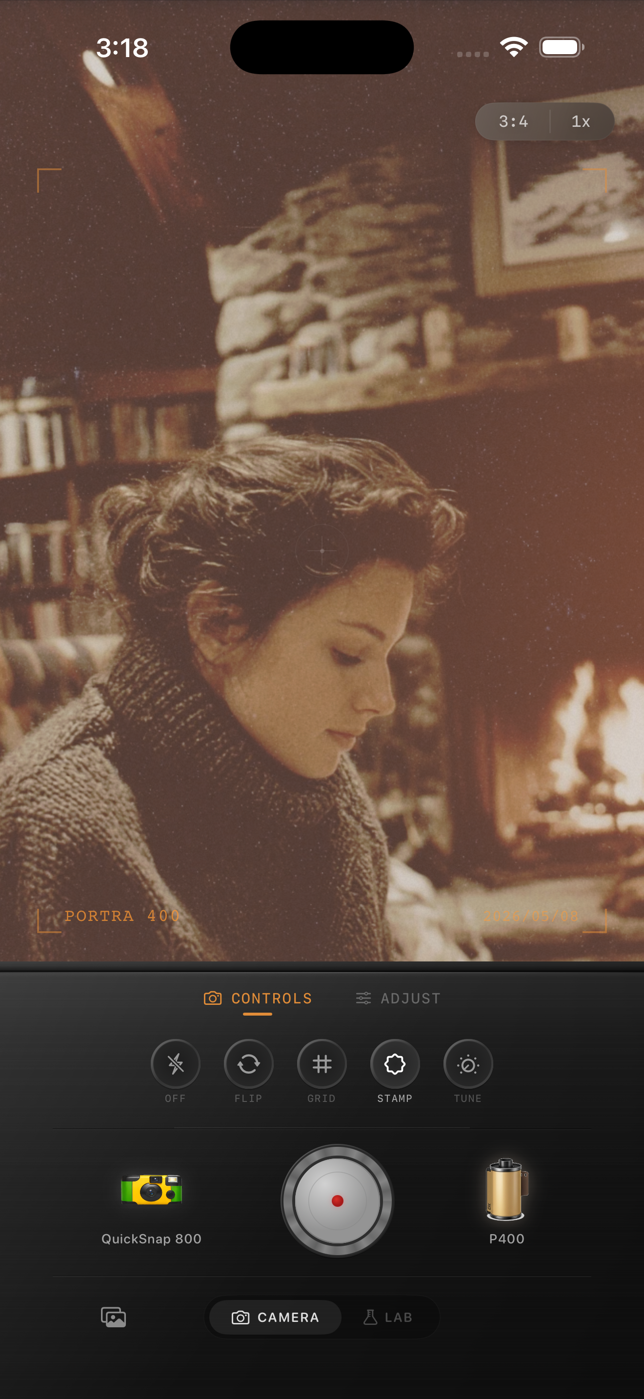
A practical film recipe for cozy reading photos on iPhone: softer contrast, warm highlights, believable grain, and enough fade to make indoor scenes feel intimate instead of muddy.

Why reading photos can feel too digital
Cozy reading scenes already have the mood people want from film: quiet light, warm corners, fabric texture, books, wood, and stillness. What breaks the feeling is usually the default iPhone finish, which can make lamp light too crisp and shadows too open.
A strong film edit for reading photos should protect the calmness of the room. The point is not to make the image louder. It is to make it feel softer, warmer, and a little more printed.
A strong settings baseline
Start around film intensity 74-86%, grain 26-38%, warmth +8 to +15, fade 5-9%, and vignette 6-12%. That range usually keeps pages, blankets, and skin soft while giving the image enough texture to move away from the glossy phone-camera look.
If the scene is lit mostly by a lamp or fireplace, rely more on softness and grain than on extra warmth. If the room is dim and cool-toned, a slightly stronger warmth boost can help without turning everything orange.
- Keep highlights creamy instead of bright white.
- Use moderate grain so paper and fabric stay clean.
- Let dark corners stay dark enough to hold the mood.
- Use fade sparingly so wood and hair keep depth.
Edit around the light source
The light source should lead the image. If there is a fireplace, candle, or reading lamp, let that warm area stay emotionally central. Keep the rest of the room slightly softer and darker so the scene still feels intimate.
This is where many edits go wrong. Pushing fade too far can flatten the room, while too much grain can make clean pages and skin look dirty. A balanced indoor film edit is usually moderate across several controls instead of extreme in one.
Choose a cleaner camera mood first
Most reading photos want a cleaner 35mm-inspired treatment rather than a rough disposable effect. The scene is usually quiet and intentional, so the camera body should feel gentle, not chaotic.
In Nostalgia Cam, start with a cleaner body, then tune grain and warmth until the room feels like a memory. If the first thing you notice is the filter, pull it back.
Keep reading photos soft and believable
Use Nostalgia Cam to pair a cleaner film-style camera body with grain, warmth, fade, and vignette so cozy reading photos feel intimate and nostalgic without turning muddy.
FAQ
How much grain should a cozy reading photo use?
Usually moderate grain works best. Start around 26-38% so the room gains texture without making paper, skin, or blankets look dirty.
Why do indoor reading photos turn orange so easily?
Because warm light is already doing part of the work. It often looks better to add a small warmth boost, then rely on softer contrast and grain for the rest of the film feeling.