iPhone film look
How to Edit iPhone Photos to Look Like Matte Film Prints
A practical matte-film-print recipe for iPhone photos, with softer blacks, restrained contrast, gentle grain, and print-like color that feels calm instead of flat.
Matte film prints should feel soft, not washed out
When people ask for a matte film print look, they usually want gentler blacks, lower glare, calmer color, and a paper-like finish. What they usually do not want is a gray photo with no depth.
The best matte-film edits keep enough contrast to hold the subject together. They simply reduce the glossy digital snap that makes iPhone images feel too sharp and polished.
- Lift blacks a little instead of flattening the whole frame.
- Use fine grain so the image feels printed, not noisy.
- Keep whites clean so the matte look does not turn chalky.
- Lower contrast gently rather than draining all color.
- Use minimal vignette unless the scene already needs it.
A reliable matte-print starting recipe
Start around film intensity 66-80%, grain 20-30%, warmth +3 to +8, fade 8-14%, and vignette 2-6%. That range usually softens the image enough to suggest a matte print without removing the structure from faces, sidewalks, skies, or clothing.
If the photo begins to look dusty or gray, reduce fade first. Matte-film prints still need clean highlights and some tonal separation to feel real.
Which scenes work best for a matte print look
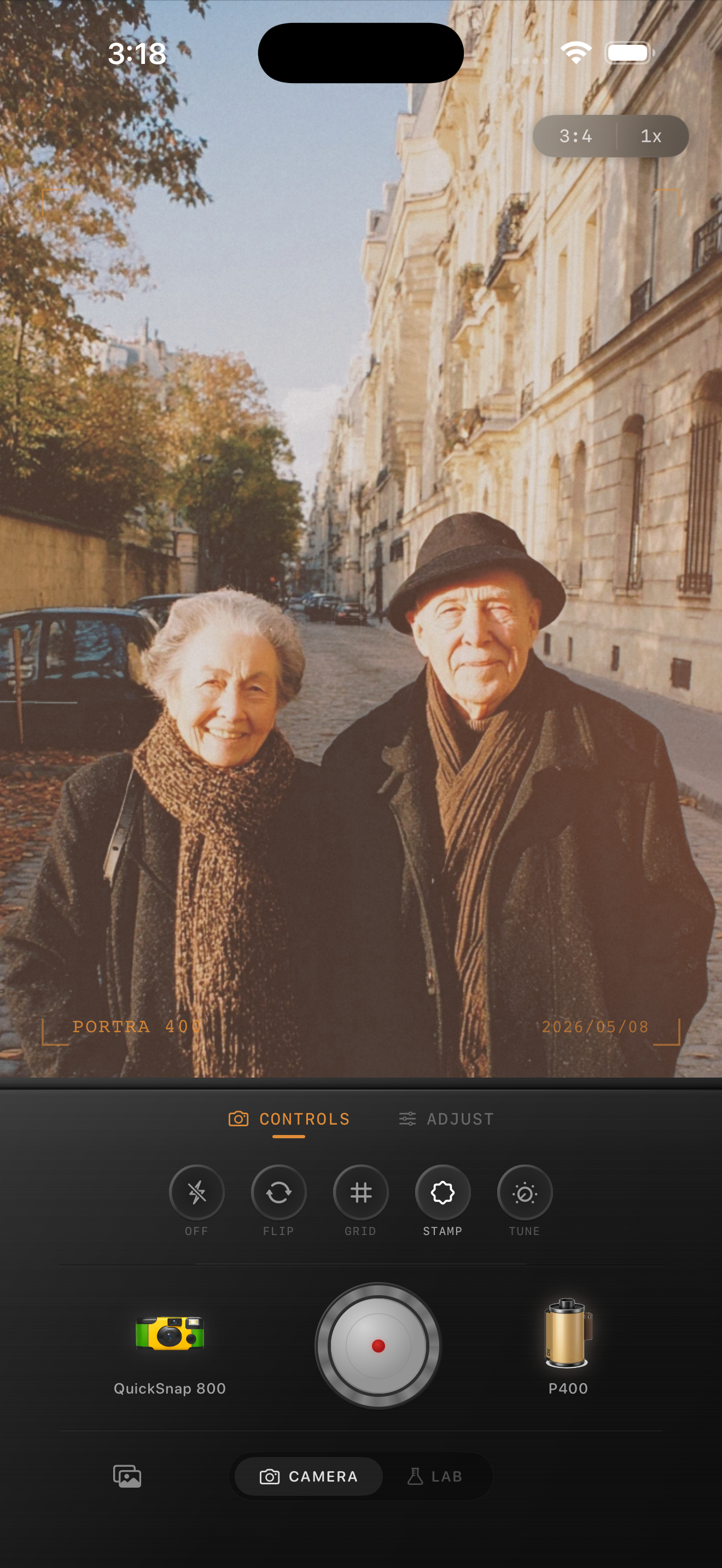
Matte-film styling works especially well for travel photos, grandparents, street scenes, cafés, overcast portraits, and quiet interiors. These subjects already carry emotional texture, so a calmer print finish reinforces the memory.
Very glossy product shots or high-saturation neon scenes usually want less fade. They can still use a matte influence, but the full treatment may take too much life out of the frame.
How to keep the edit believable
If the image feels dull, add back a little contrast before adding more warmth. If it still feels too digital, use slightly more grain or a softer film-inspired profile rather than flattening it further.
A good matte-film-print edit should feel tactile and calm. It should not look like a trendy overlay sitting on top of an otherwise modern file.
Build a calmer print finish in Nostalgia Cam
Use Nostalgia Cam to combine film-inspired color, grain, fade, and camera-body character so iPhone photos feel like soft matte prints instead of glossy digital exports.
FAQ
What makes a matte film print look realistic on iPhone?
A realistic matte-film-print edit uses softer contrast, slightly lifted blacks, fine grain, and restrained warmth while still keeping enough depth for the image to feel clear.
How much fade works for matte film prints?
A practical starting range is around 8-14%. That usually gives the photo a calmer print feel without making highlights chalky or shadows lifeless.