iPhone film look
How to Make iPhone Photos Look Like ISO 400 Film
A practical ISO 400 film-style recipe for iPhone photos, with balanced grain, softer contrast, flexible color, and enough texture to feel analog in daylight or indoors.
What people usually want from an ISO 400 film look
When people ask for an ISO 400 film look, they usually want something flexible and everyday: visible grain, softer contrast than a default iPhone file, and color that feels calm rather than aggressively stylized. It is the kind of look that works across portraits, travel, sidewalks, cars, cafés, and mixed weather.
The point is not to make every photo rough or damaged. It is to give an iPhone image enough texture and softness that it feels like a well-loved 35mm roll instead of a polished digital capture.
A strong ISO 400 starting recipe
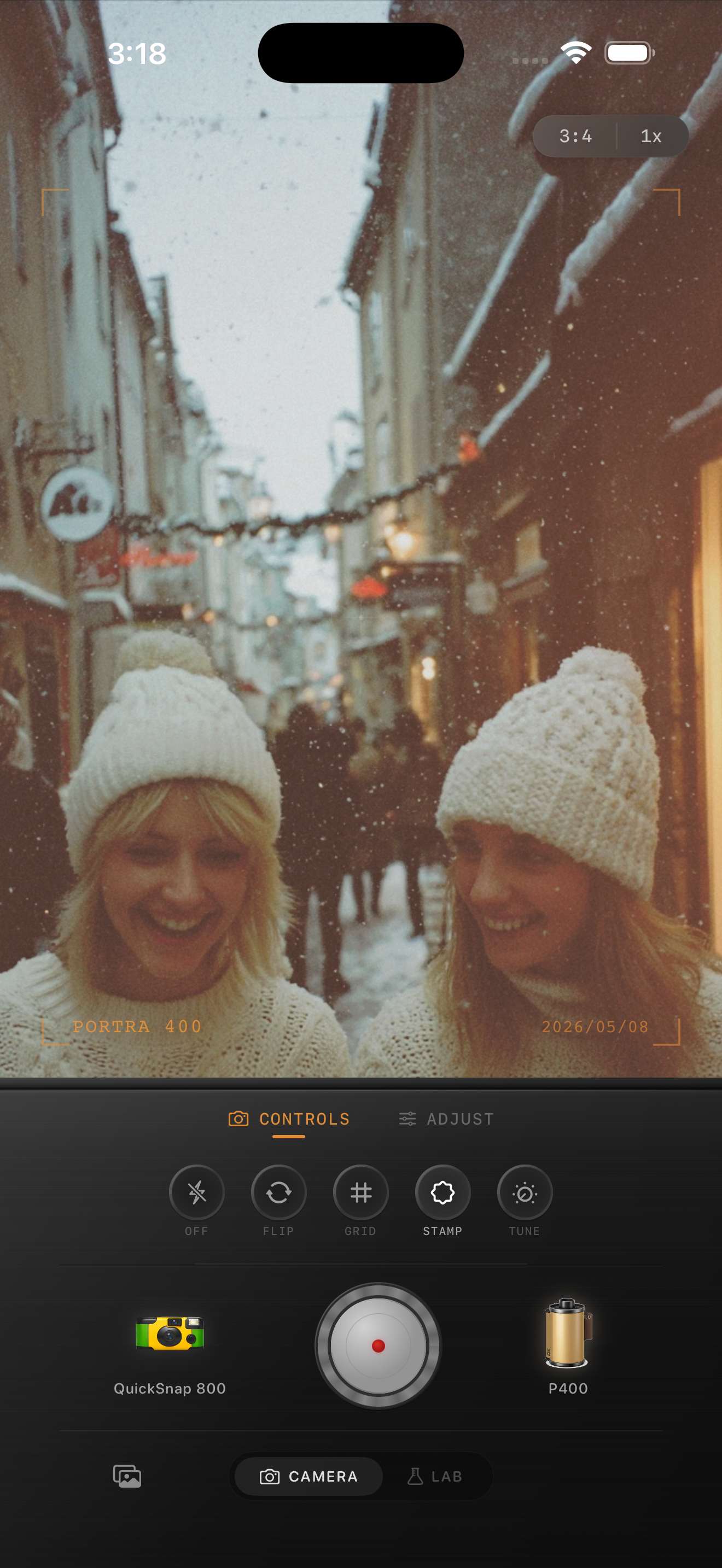
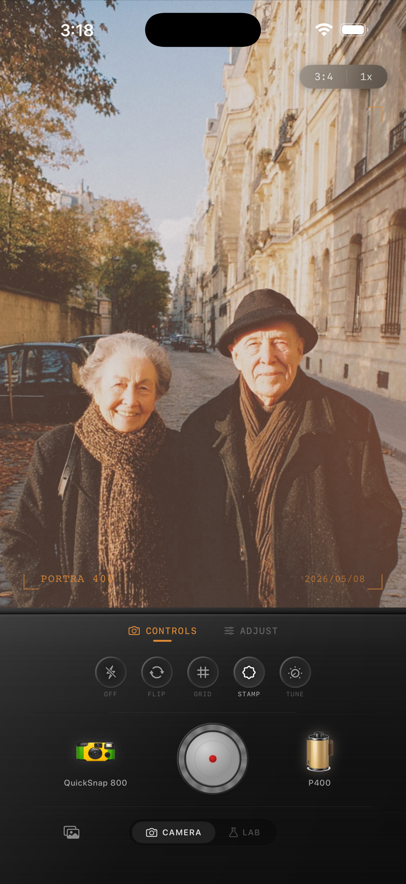
Start around film intensity 72-86%, grain 28-40%, warmth +4 to +12, fade 4-8%, and vignette 4-9%. That range usually gives you the balanced middle ground people expect from a 400-speed film-inspired edit: enough grain to show up, but not so much that the photo turns gritty.
If the original iPhone shot is very sharp or HDR-heavy, lean a little more on softness and grain. If the scene already has fog, snow, or gentle window light, keep the grain lower and let the atmosphere carry more of the analog feeling.
- Use moderate grain instead of a heavy damaged-film texture.
- Keep contrast soft so highlights roll off naturally.
- Warm the image slightly, but avoid an all-over orange cast.
- Use only a light vignette unless the frame edges feel distractingly clean.
Adjust the recipe for daylight and indoor photos
In daylight, the easiest mistake is overdoing warmth or fade until the photo looks dusty. Stay cleaner and let the grain be finer. Indoors, especially with lamps or restaurant light, you can push the warmth slightly more and let the grain carry a bit more texture in the shadows.
A useful mental check is this: ISO 400-inspired photos should still feel practical. If the edit becomes too glossy for everyday moments or too rough for portraits, you have moved away from the balanced look that makes the style appealing.
Choose a camera body that feels everyday
A cleaner compact or 35mm-inspired camera body usually fits this look better than the roughest disposable option. You want some personality, but not total chaos. Think street snapshots, travel portraits, friends outside, and casual indoor scenes rather than loud flash-party energy.
In Nostalgia Cam, start with the body that feels most neutral, then fine-tune grain, warmth, fade, and vignette until the photo feels lived-in and printed instead of clinically perfect.
Build an everyday film look in Nostalgia Cam
Use Nostalgia Cam to pair a cleaner camera body with balanced grain, soft contrast, warmth, fade, and vignette so your iPhone photos land in that flexible ISO 400-style middle ground.
FAQ
How much grain should an ISO 400 film-style iPhone edit use?
A moderate range around 28-40% is a good starting point for most photos. The goal is visible texture that still feels clean enough for everyday portraits and travel scenes.
Is an ISO 400 film look better for daylight or indoors?
It works well for both. In daylight, keep the grain and warmth a little cleaner. Indoors, you can use slightly more warmth and let the grain show more in the shadows.