iPhone film look
How to Get Portra-Style Colors on iPhone
A practical Portra-style iPhone editing recipe for soft contrast, warm skin tones, gentle greens, creamy highlights, and believable 35mm grain.
What people usually mean by Portra-style
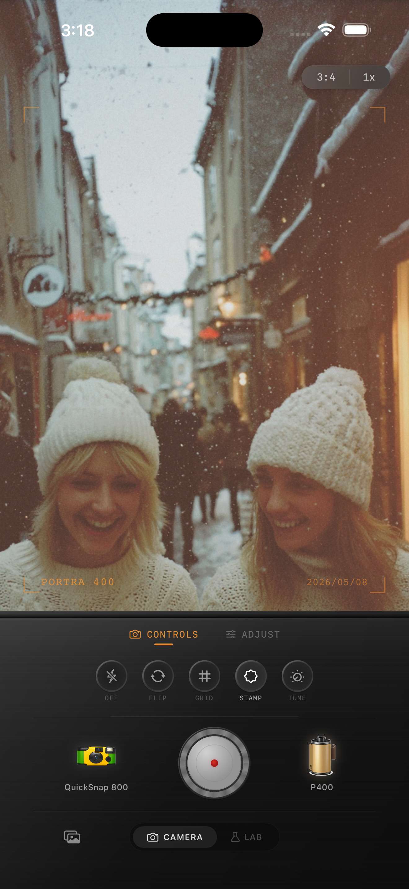
When people search for Portra-style colors, they usually want soft contrast, warm skin tones, gentle saturation, creamy highlights, and greens that do not feel neon. It is less about copying a brand name and more about getting that calm portrait-film feeling.
This guide is not affiliated with Kodak or Portra. Think of it as a practical color recipe for iPhone photos that need softer, warmer, portrait-friendly film color.
The basic iPhone recipe
Start with film intensity around 70-85%, warmth around +8 to +18, grain around 25-40%, fade around 5-10%, and vignette under 12%. Keep saturation moderate. The whole look falls apart if the colors become candy-bright.
If the photo has snow or pale walls, protect the whites. Warm them a little, but do not turn them yellow. If the photo has skin tones, make the warmth feel natural before you judge the grain.
- Soft contrast, not flat contrast.
- Warm highlights without orange skin.
- Muted greens and calm blues.
- Fine-to-medium grain.
- Very light vignette, only when needed.
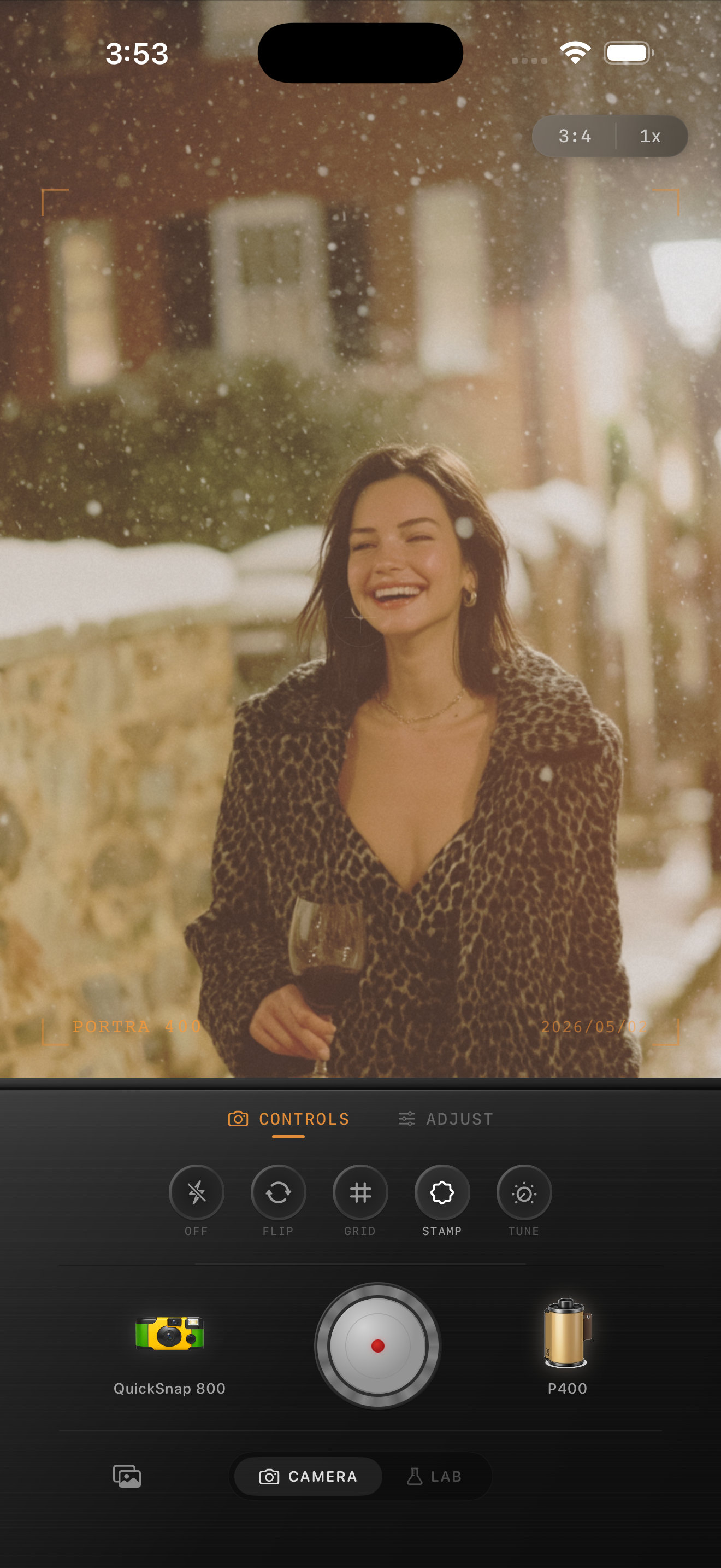
Portraits need less drama
For people photos, avoid the urge to add heavy fade and strong vignette. A Portra-style edit usually looks expensive because it is restrained. The skin stays readable, highlights roll off gently, and grain is present without becoming dirty.
If a portrait starts to look muddy, reduce fade first. If it looks too digital, add a little more grain or soften the image before pushing color harder.
Use the Lab for fine tuning
The camera view is fast when you already know the mood. The Lab is better when you want to compare a few film looks on the same photo and dial the last 10%. Try a warmer film look, then adjust grain, fade, and vignette until the image feels printed.
Save a few versions. A slightly cleaner version often performs better on Instagram, while a grainier version can feel more like a scanned print.
Build a softer portrait-film look
Use Nostalgia Cam to test warm portrait-style film looks, then tune grain, fade, warmth, and vignette until your iPhone photo feels softer and less digital.
FAQ
Is Nostalgia Cam affiliated with Kodak or Portra?
No. This guide uses Portra-style as a common descriptive phrase for a warm, soft portrait-film look. Nostalgia Cam is not affiliated with Kodak or Portra.
What is the most important Portra-style setting?
Warmth and contrast matter most. Keep the image soft and warm without making skin orange or highlights yellow.