iPhone film look
How to Make iPhone Photos Look Like Color Negative Film
A practical color-negative-film recipe for iPhone photos: softer contrast, gentle warmth, fine grain, and scan-like color that feels printed instead of overly filtered.
What color negative film usually gets right
Color negative film usually feels forgiving. Highlights roll off more gently, colors lean softer than a phone file, and skin tends to feel calmer instead of hyper-detailed. That is why a good color-negative-style edit often looks natural before it looks stylized.
The mistake on iPhone is chasing the look with too much fade or too much warmth. A believable result usually comes from reducing the digital sharpness of the image while keeping enough contrast and color separation for the scene to stay alive.
- Keep contrast soft, not flat.
- Use fine-to-medium grain instead of rough disposable texture.
- Warm the image slightly without turning whites beige.
- Let greens, reds, and skin stay muted rather than neon-clean.
- Aim for a scanned-print feeling, not a heavy retro overlay.
A dependable starting recipe
Start around film intensity 70-84%, grain 22-34%, warmth +4 to +10, fade 4-8%, and vignette 3-7%. That range usually gives an iPhone photo the gentler shoulder and softer texture of color negative film without making it muddy.
If the scene already has warm late-day light or indoor amber tones, stay lower on warmth and let the environment do the work. If the image is cooler or overcast, a small warmth move can keep it from feeling sterile.
Judge the edit from skin, concrete, and sky
Most color-negative-style edits break in predictable places: skin goes orange, sidewalks go too gray, or pale sky turns dirty once grain and warmth stack up. Those three reference points usually tell you whether the edit still feels photographic.
If those anchors look balanced, the rest of the image can stay understated. That is often the difference between a film-inspired photo and a preset that announces itself immediately.
Choose a calmer camera body than a party look
Most color negative film looks work better with a balanced 35mm-inspired or everyday compact-film body than with a rough disposable treatment. You usually want the character of a lived-in print, not hard flash, edge damage, or loud vignette.
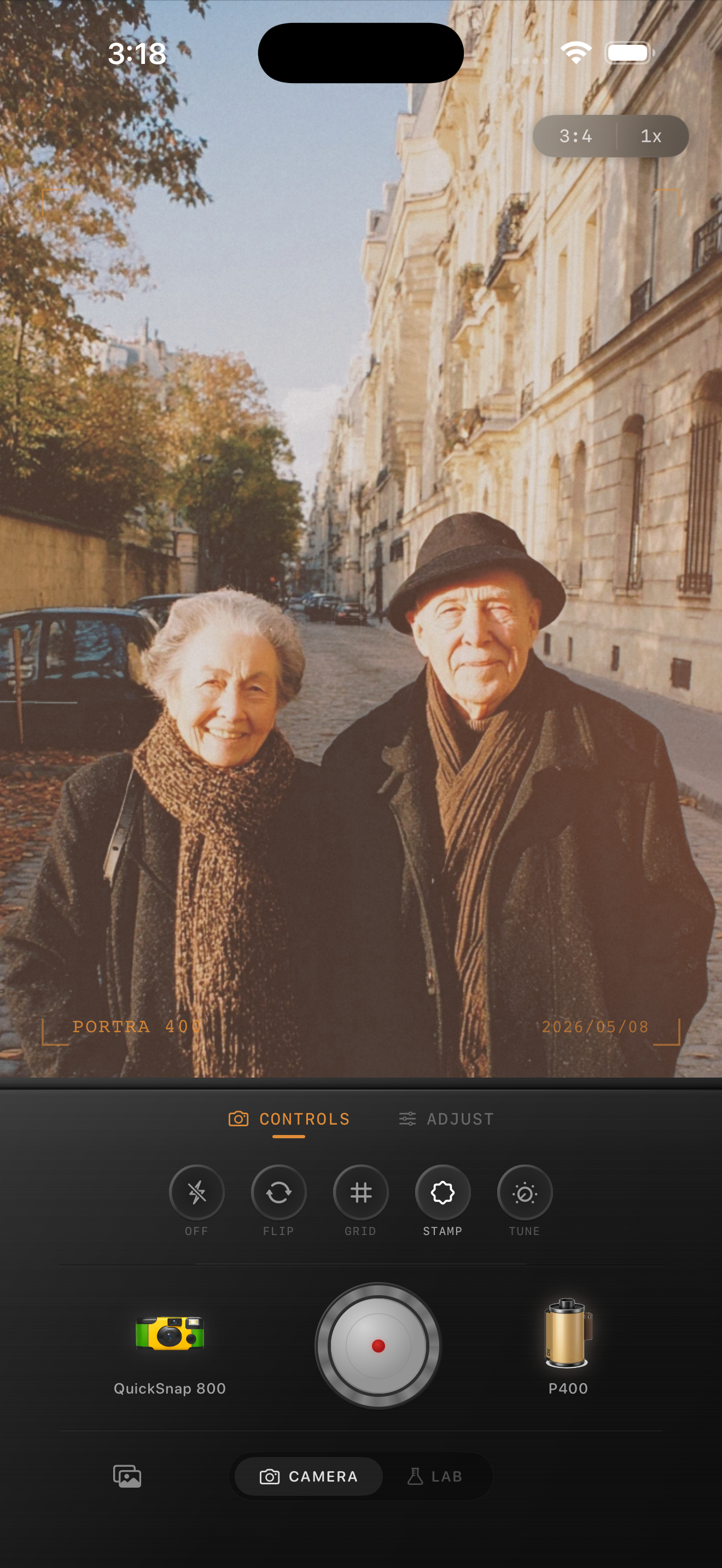
In Nostalgia Cam, start with the cleaner camera body first, then tune grain, warmth, fade, and vignette until the photo feels soft, printed, and naturally film-inspired.
Build a softer printed-film finish
Use Nostalgia Cam to shoot or import photos, then balance camera body, grain, warmth, fade, and vignette so everyday iPhone images feel like scanned color prints instead of glossy digital files.
FAQ
What makes a color negative film edit different from a disposable look?
A color-negative-style edit is usually cleaner and gentler. It relies on softer contrast, calmer color, and finer grain rather than rough edges, loud flash, or obvious damage.
Should color negative film edits be warm?
Usually slightly warm, but not aggressively so. The goal is a gentle printed feeling, not orange highlights or beige whites.