iPhone film look
How to Get Fuji-Style Colors on iPhone
A practical Fuji-style iPhone editing recipe for cooler whites, controlled greens, soft contrast, and crisp travel color that still feels natural.
What people usually mean by Fuji-style
When people ask for Fuji-style colors, they usually mean cooler whites, cleaner blues, richer greens, and a slightly more restrained warmth than a classic portrait-film edit. The feeling is often airy, travel-friendly, and a little cleaner than a warm nostalgic grade.
This guide is not affiliated with Fujifilm. Think of it as a practical iPhone recipe inspired by the color character people associate with Fuji-style film and compact digital simulations.
A good starting recipe
Start with film intensity around 65-80%, warmth around -4 to +4, grain around 20-32%, fade around 4-8%, and vignette around 4-10%. Keep contrast soft enough to hold detail in clouds and pale buildings, but not so soft that the image loses shape.
If the photo includes skin tones, avoid pushing the cool cast too far. Fuji-style color usually feels fresh, not icy.
- Keep white balance near neutral or slightly cool.
- Let greens stay natural instead of neon.
- Use fine grain rather than chunky texture.
- Protect highlights so skies and windows stay creamy.
- Add only a small vignette unless the frame feels too flat.
Best scenes for this color palette
Fuji-style color works especially well on travel photos, overcast streets, spring greens, blue-hour city scenes, and quiet portraits in natural light. It is useful when warm edits make the scene feel too yellow or too nostalgic.
For snowy or cloudy photos, this approach can keep the whites crisp while still adding enough grain and softness to avoid the default iPhone look.
What to avoid
The most common mistake is confusing cooler film color with desaturation. If you drain too much color, the photo goes flat. Keep some depth in blues, some life in skin, and enough contrast that the image still feels photographic.
Avoid heavy orange skin tones and heavy matte fade together. That combination fights the cleaner, fresher color balance that makes this look work.
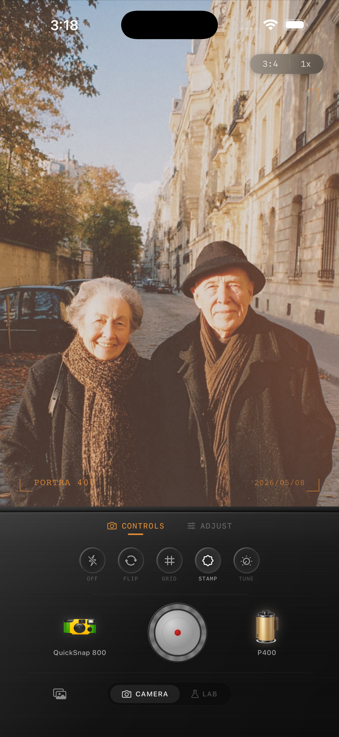
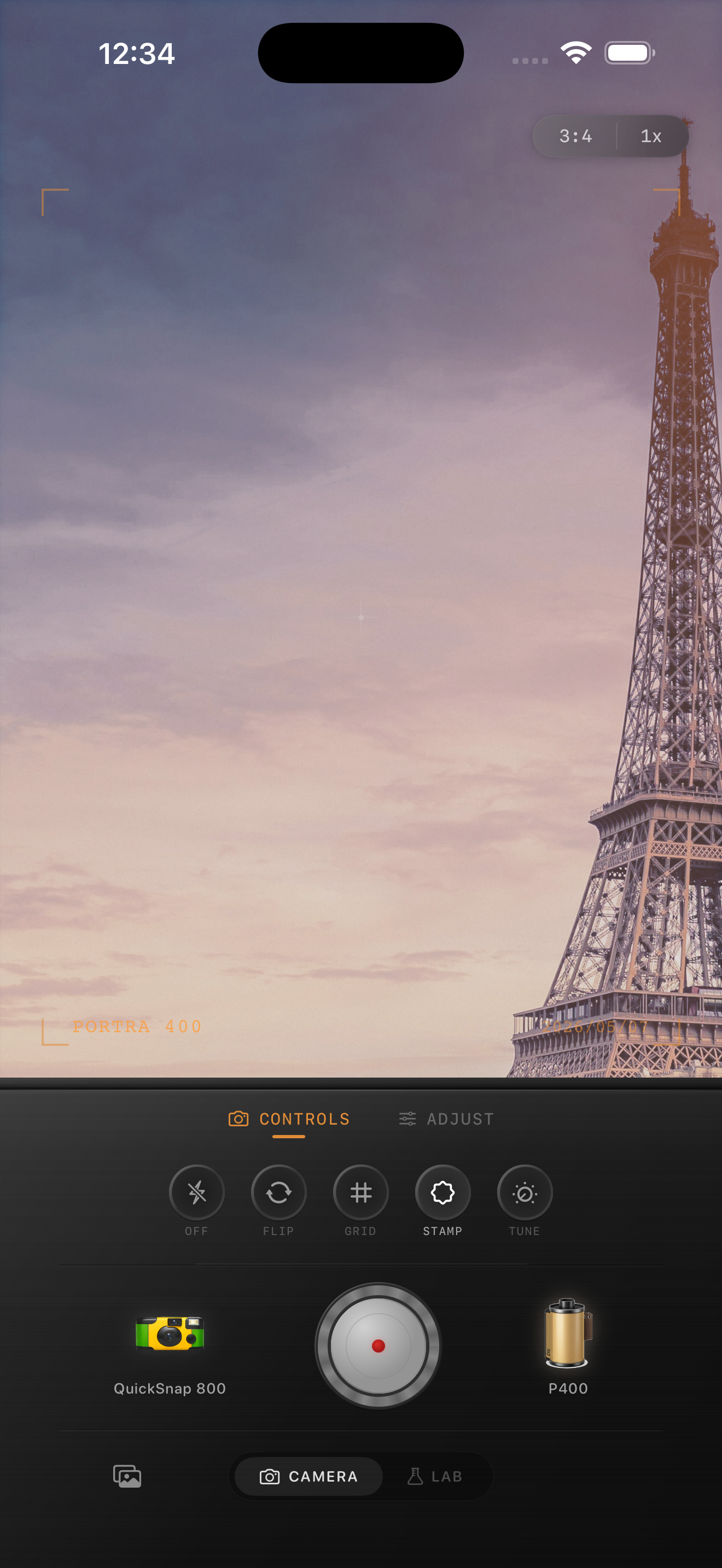
Try a cooler film palette in Nostalgia Cam
Use Nostalgia Cam to test film looks, grain, fade, and camera-body character until your iPhone photo lands on a cleaner travel-film mood instead of a generic cool preset.
FAQ
Do Fuji-style colors need to look cold?
No. The look is usually cooler than warm portrait-film edits, but it should still keep skin tones and daylight believable.
What photos work best with Fuji-style color on iPhone?
Travel photos, overcast streets, greenery, architecture, and natural-light portraits usually respond well because the cooler palette keeps the scene feeling fresh without looking harsh.