iPhone film look
How to Edit Paris Street Photos to Look Like Film on iPhone
A practical Paris street photography recipe for iPhone: softer contrast, restrained grain, travel-film color, and simple settings that keep architecture and people feeling natural.
What makes Paris street photos respond well to film edits
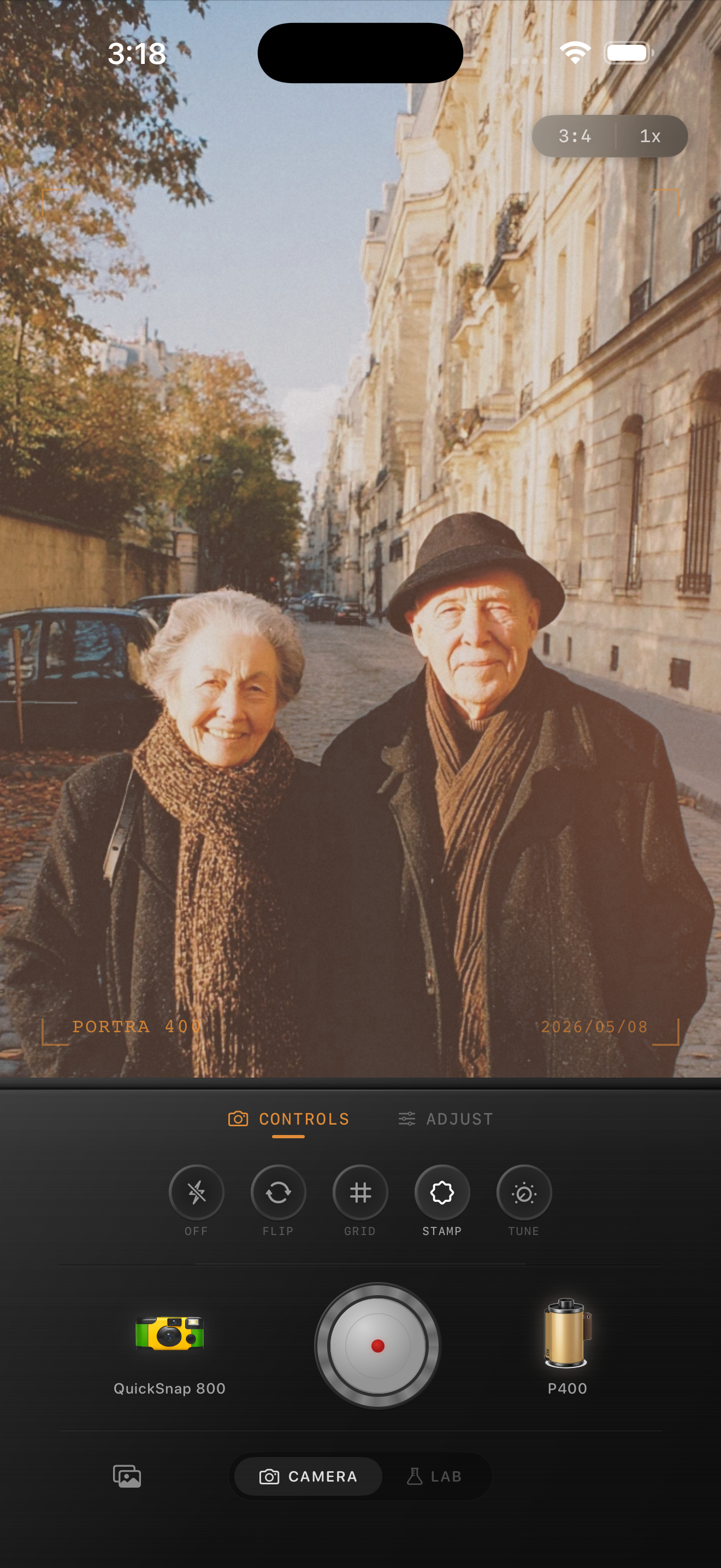
Paris street scenes usually already have the ingredients that make film-inspired editing work: pale stone buildings, soft daylight, layered backgrounds, café shadows, and people moving through the frame. The goal is not to over-style the shot. It is to remove the extra-clean digital finish and keep the scene feeling lived in.
A good edit should preserve the atmosphere of the street. Let buildings stay creamy instead of stark white, keep skin tones believable, and use enough grain to add texture without making sidewalks and sky look dirty.
- Lower the digital sharpness before pushing grain.
- Keep warmth subtle so stone and pavement do not turn yellow.
- Use a little fade to soften shadows under awnings and doorways.
- Let the people in the frame stay the emotional focus.
A clean travel-film starting recipe
Start around film intensity 68-82%, grain 22-34%, warmth +2 to +8, fade 4-8%, and vignette 4-9%. This keeps the frame soft and photographic without tipping into a rough disposable look.
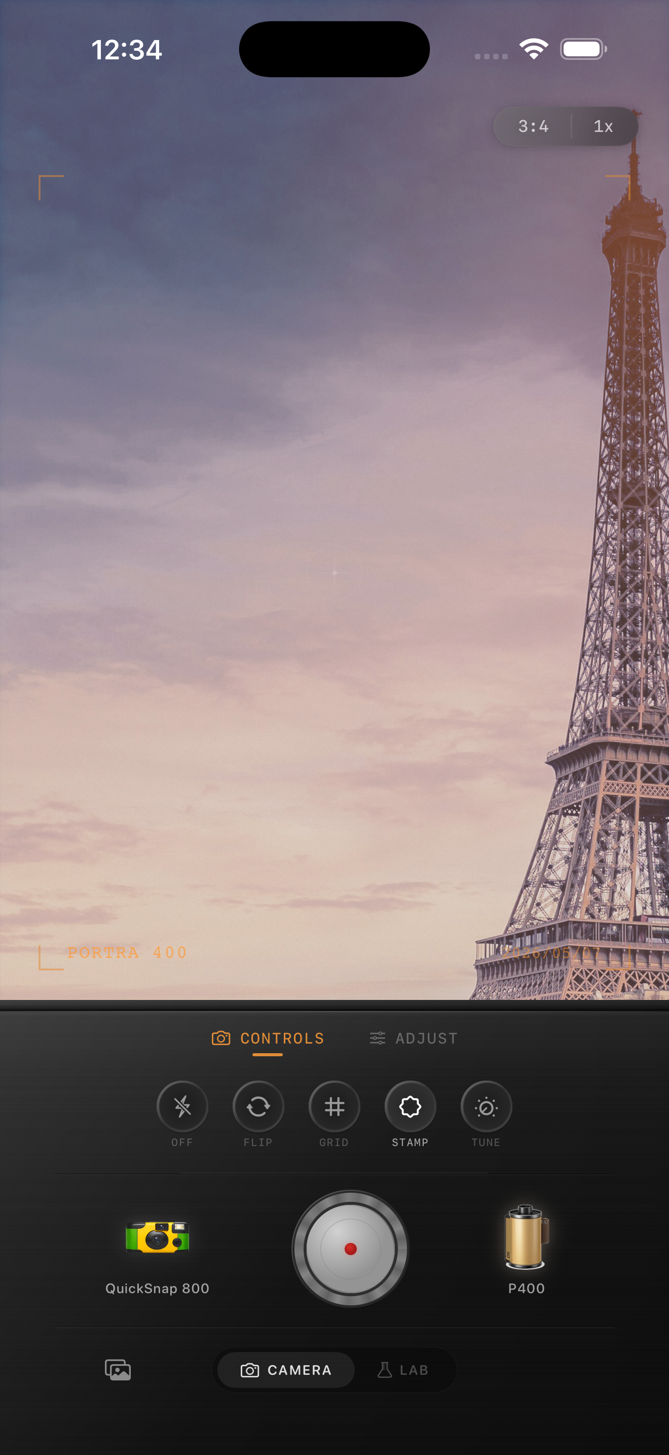
If the street is overcast, you can cool the image slightly and keep contrast gentle. If the light is golden or late afternoon, let warmth rise a little, but protect highlights so pale buildings still hold detail.
How to balance people and architecture
Street photos can fail when the edit treats every part of the frame the same. Faces often need a cleaner touch than stone walls, windows, or road texture. If people start looking muddy, reduce grain before changing the color recipe.
For architecture-heavy frames, keep the vignette light and avoid extreme matte fade. Paris scenes usually feel better when lines stay readable and the image feels printed rather than washed out.
When to push the look further
You can push a rougher analog feel if the image includes rain, café interiors, nighttime windows, scooters, or strong reflections. In those cases, a little more grain and a touch more vignette can help the frame feel closer to a compact-camera travel roll.
For bright daytime boulevards and landmark shots, stay cleaner. The best result should feel like a memory from a trip, not a heavy preset on a postcard.
Build a travel-film look inside Nostalgia Cam
Use Nostalgia Cam to pair film-inspired color with camera-body character, then fine-tune grain, fade, and vignette until your Paris street shot feels softer, calmer, and less digital.
FAQ
Should Paris street photos use warm or cool film color?
Usually somewhere in the middle. Slight warmth works well for stone buildings and cafés, but heavy warmth can make the whole frame look yellow. Keep it subtle and adjust based on the light.
How much grain is enough for travel street photos?
Usually less than you think. A moderate amount around the low-to-mid range is often enough to break the digital finish without making skies, faces, and pavement look noisy.