
Editing guide
How to Edit iPhone Vacation Photos to Look Like Film Without Overdoing Grain
A practical vacation-photo recipe for keeping travel memories soft, printed, and film-inspired without covering skies, faces, and landmarks in heavy grain.
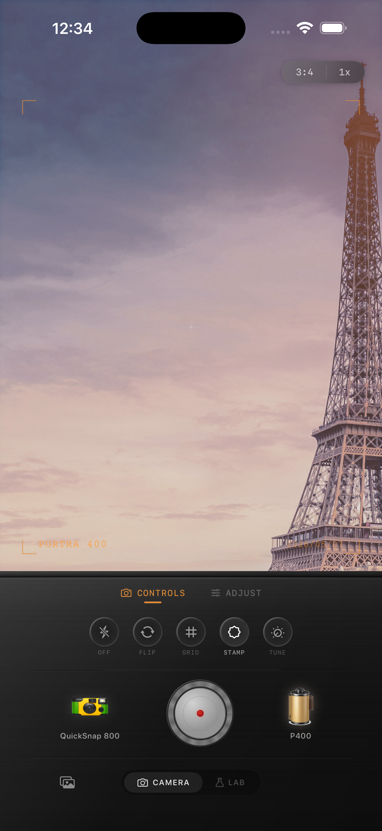
Vacation photos need memory, not texture for texture's sake
Travel photos already come with strong ingredients: unfamiliar light, layered backgrounds, movement, architecture, meals, and people you want to remember. Grain should support that feeling, not sit on top of it.
The mistake most people make is treating every vacation image like a night snapshot. Daylight plazas, hotel balconies, beaches, trains, and landmark portraits usually need lighter texture so the place still feels open and real.
- Keep grain lower on sky, stone, and other clean surfaces.
- Let color and contrast do more of the nostalgic work than texture.
- Use a little fade so bright travel light feels printed, not clinical.
- Adjust per scene instead of forcing one recipe across the whole trip.
Start with the location, then match the film mood
Ask what the memory actually felt like. A breezy city morning, a warm cafe lunch, and a late train platform do not want the same amount of grain even if they came from the same trip.
A cleaner 35mm-inspired direction usually works best for landmarks, street portraits, window light, and daytime walking shots. Save the rougher disposable-style mood for flashy dinners, quick friend snapshots, or night scenes where the grain can hide inside the atmosphere.
A dependable vacation-film settings baseline
Start around film intensity 68-82%, grain 18-28%, warmth +4 to +10, fade 4-8%, and vignette 3-7%. That range usually keeps travel photos soft and nostalgic without making skies, stone buildings, or skin look dirty.
If the image has a lot of bright architecture or pale sky, lower grain first before changing everything else. Travel photos often look more expensive with slightly cleaner texture and better color balance.
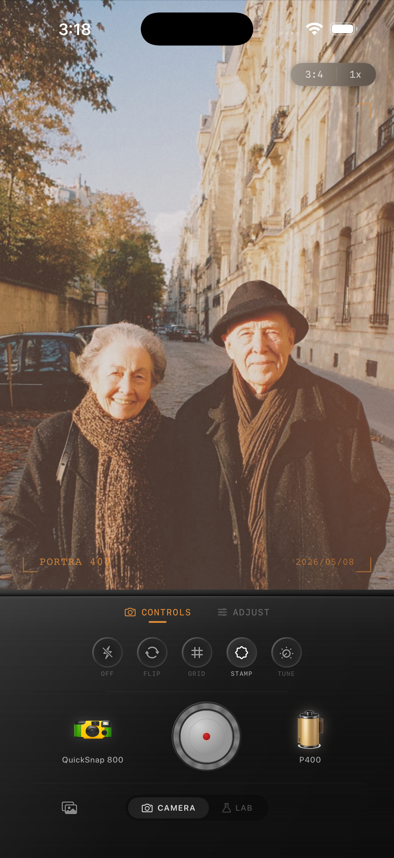
Use more grain only when the scene can carry it
Night walks, train stations, rainy streets, and direct-flash dinner photos can handle more visible grain because the scene already has texture and contrast. Midday sightseeing shots usually cannot.
If you want a warmer print-like palette or a cooler travel-film direction as inspiration, use that as an overall mood cue. The final image should still feel like your trip, with no implication of brand affiliation.
Stop when the place still feels breathable
A good vacation edit leaves room for the location to speak. You should still notice the sky, distance, and architecture before the grain itself. If the frame starts feeling dusty or dense everywhere, back the texture down.
The best test is to scroll through a few trip photos together. If every image has identical heavy grain, the trip starts to look processed instead of remembered.
Give travel photos a film mood without burying the place
Use Nostalgia Cam to pair film-inspired color, grain, fade, and camera character so vacation photos feel soft and memorable without turning every scene gritty.
FAQ
How much grain should vacation photos use?
Usually less than night or flash photos. Start light, especially for daylight landmarks, pale skies, and wide travel scenes, then increase only if the frame still feels too clean.
Why do travel photos look worse with heavy grain?
Because heavy texture can make open skies, bright buildings, and faces look dirty or crowded. Travel photos often need cleaner texture and stronger color judgment instead.