
Editing guide
How to Edit iPhone Snowy City Portraits to Look Like Film Without Blue Skin
A practical winter portrait guide for iPhone: keep snow clean, warm skin just enough, add believable film grain, and avoid the cold blue cast that makes city portraits look harsh.
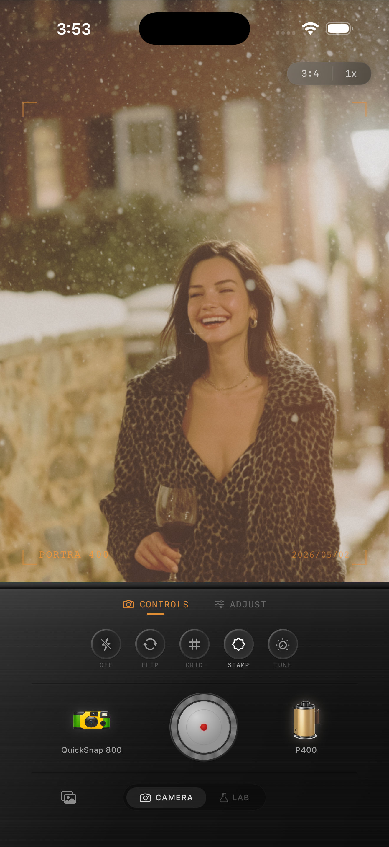
Blue skin usually comes from chasing the snow
Snowy city portraits are tricky because iPhone files often lean cool before you edit them, and then the instinct is to preserve crisp snow by keeping the whole image even colder. That is how skin starts looking blue, gray, or drained while the background still feels too digital.
A better film edit separates the jobs. Keep the snow neutral and airy, but give the subject a little warmth, softer contrast, and moderate grain so the portrait feels printed instead of frozen.
A reliable winter portrait starting range
Start with film intensity around 72-84%, grain around 26-38%, warmth around +6 to +12, fade around 4-8%, and vignette around 5-10%. Winter portraits usually need less warmth than candlelight photos, but more than overcast landscapes.
If the snow starts turning yellow, the warmth is too high. If cheeks and hands still look gray-blue, add a little warmth back and lower harsh contrast before raising the grain.
- Keep snow bright but not fluorescent white.
- Warm skin gently instead of warming the whole frame heavily.
- Use moderate grain so coats and brick keep texture.
- Avoid strong teal shadows in the face.
- Let the background stay a little soft.
Why softer contrast helps more than extra warmth
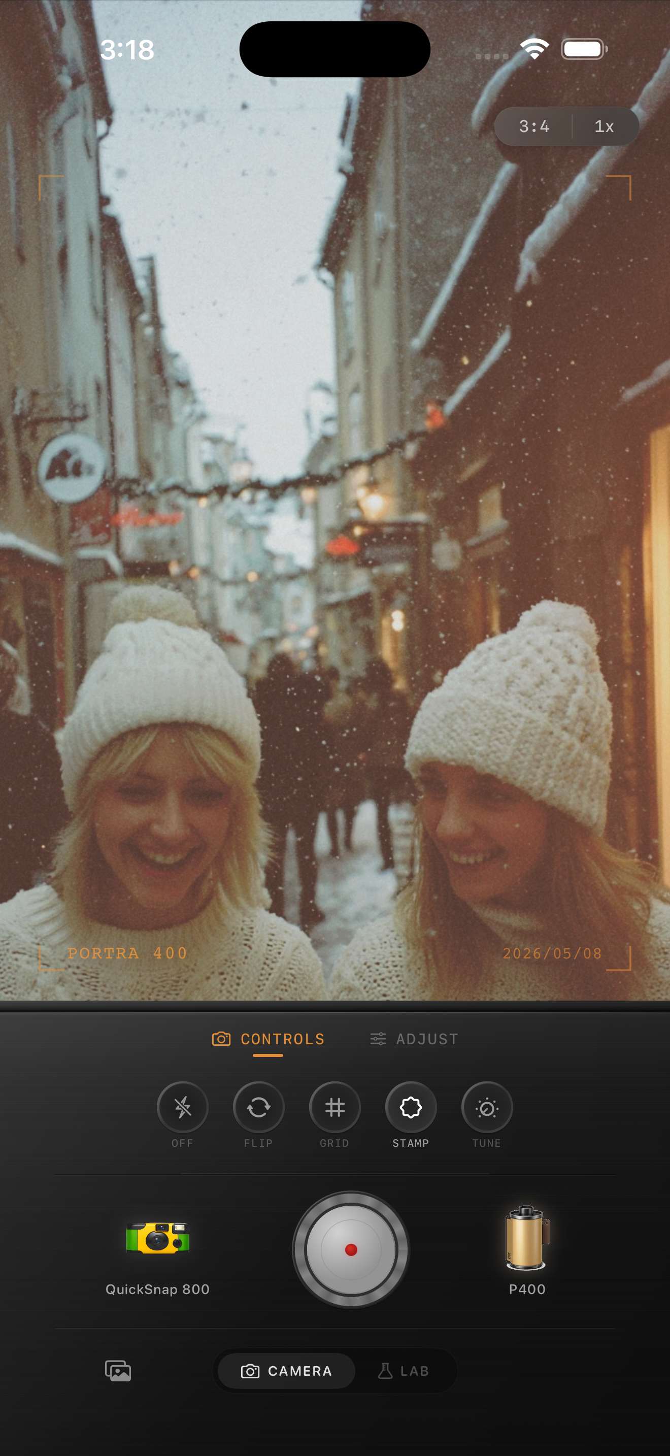
Winter light can make dark coats, hair, and building shadows feel hard-edged. If you only add warmth, the portrait still looks brittle. Softening contrast slightly often does more to create a film look than pushing color harder.
That is especially true in city scenes with brick, stone, and brownstone steps. Film-style softness helps the subject sit naturally inside the environment instead of looking cut out against it.
Finish by checking the face first
At phone size, the portrait should read as warm enough to feel human, while the street still feels cold enough to remain seasonal. If your eye goes to yellow snow or orange skin, pull back. If the coat looks good but the face still feels icy, add a touch more warmth and a little fade.
The best winter film edits keep both truths at once: cold weather in the scene, comfortable life in the subject.
Balance winter color without losing the season
Use Nostalgia Cam to pair a clean film body with restrained grain, warmth, fade, and vignette so snowy city portraits stay crisp, flattering, and naturally analog.
FAQ
Why do snowy iPhone portraits make skin look blue?
Cool ambient light from snow and sky can push skin toward blue-gray, especially if you keep the whole edit too cold while trying to protect the snow.
How much grain should winter city portraits use?
Usually moderate grain works best. Start around 26-38% so coats, brick, and sidewalks get texture without making the snow look dirty.