
Editing guide
How to Edit Eiffel Tower Photos to Look Like Film on iPhone Without Gray Skies
A practical Eiffel Tower film recipe for iPhone: softer landmark contrast, cleaner stone and sky separation, restrained grain, and travel color that feels printed instead of flat.
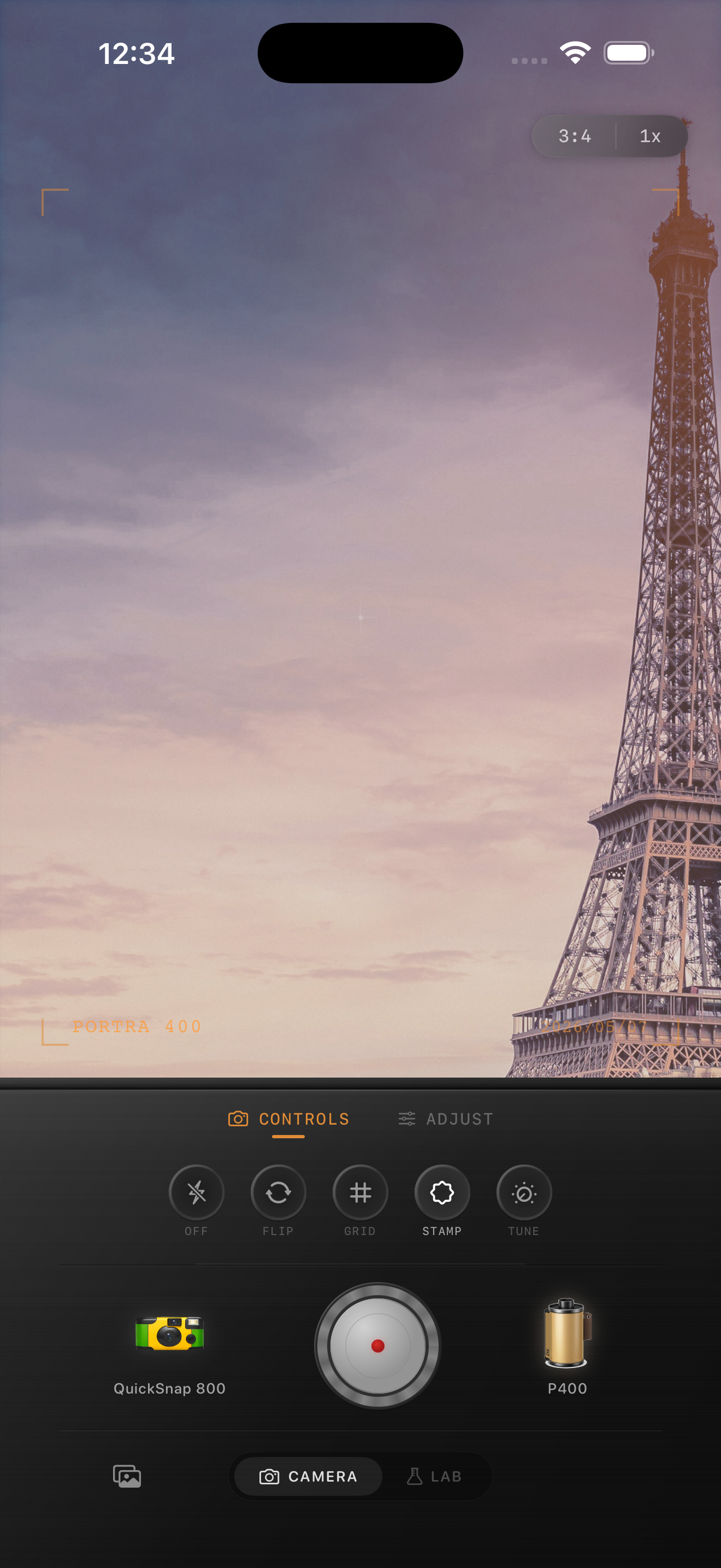
Why Eiffel Tower photos go flat
Eiffel Tower photos often start with pale sky, broad stone surfaces, distant haze, and a dark metal structure cutting through the middle of the frame. If you push fade and grain too early, the sky and the buildings lose separation and everything turns into one gray travel file.
A believable film-inspired edit should keep the city feeling open first. The analog mood comes from softer contrast and calmer color, not from draining the sky until the landmark disappears into it.
- Protect the sky before adding much fade.
- Keep the tower slightly darker than the surrounding stone.
- Use moderate grain so distant detail stays readable.
- Let the travel atmosphere do most of the nostalgic work.
A dependable Eiffel Tower baseline
Start around film intensity 70-82%, grain 18-28%, warmth +2 to +6, fade 2-5%, and vignette 3-6%. That range usually softens the default iPhone sharpness while keeping enough separation between sky, tower, pavement, and nearby buildings.
If the sky still feels gray, do not fix it by adding more warmth. Lower the fade or grain first. Too much warmth can make pale stone turn beige while the sky stays dull.
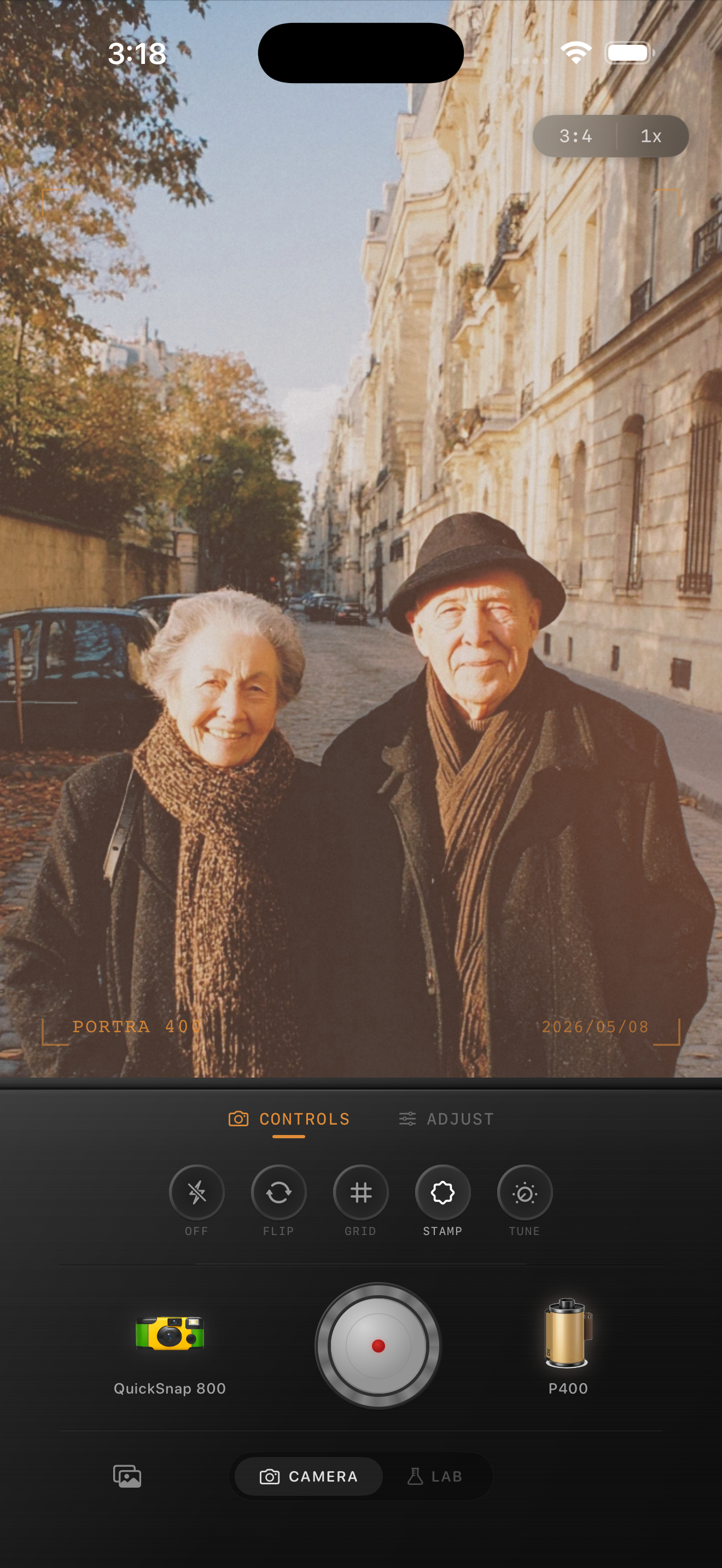
Separate the landmark from the atmosphere
The tower is not the only subject. Pavement, trees, railings, nearby facades, and people in the frame all tell the story of place. A good edit keeps those supporting pieces soft but readable so the landmark feels embedded in the scene instead of cut out from it.
That usually means keeping grain lighter in the sky and stronger in the street-level details. Even if you cannot mask each area manually, you can still mimic that balance by staying restrained overall.
Pick a cleaner travel-film body
For Eiffel Tower photos, a cleaner 35mm-inspired or color-negative-inspired body usually works better than a rough disposable look. The subject benefits from elegance, distance, and softer print-like color more than faux damage.
In Nostalgia Cam, choose the cleaner body first, then add just enough grain, warmth, and fade to make the image feel like a travel print instead of an untouched phone file.
Keep Paris skies open in Nostalgia Cam
Use Nostalgia Cam to balance camera body, grain, warmth, fade, and vignette so Eiffel Tower photos keep their sky depth, landmark shape, and travel mood without turning flat or overly gray.
FAQ
Why do Eiffel Tower film edits look gray so easily?
Because pale sky, haze, and stone surfaces can merge when fade and grain are pushed too early. It works better to protect separation first, then add only moderate film texture.
Should Eiffel Tower photos use heavy grain to look like film?
Usually no. Lighter grain tends to work better because the scene already has distance, fine structure, and atmospheric softness. Too much grain makes the sky and metalwork lose definition.