
Editing guide
How to Edit Convenience Store Photos to Look Like Film on iPhone
A practical convenience-store film recipe for iPhone: softer fluorescent highlights, natural grain, restrained warmth, and enough texture to make late-night store photos feel cinematic instead of harsh.
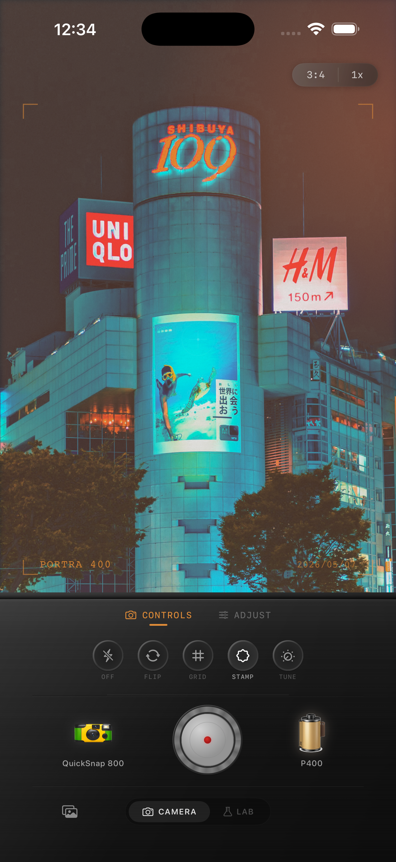
Convenience store photos already have the atmosphere
Convenience stores are good film-photo subjects because they combine bright fluorescent light, reflective windows, parking-lot darkness, snack packaging, cool signage, and the slightly accidental feeling of being out late with a phone in your hand. The mood is already there.
What usually makes the photo feel too digital is the default iPhone finish: white lights clip too fast, shadows look too clean, and every edge around the storefront gets sharpened. A film-inspired edit should soften that precision without making the frame muddy.
- Protect bright cooler lights before adding more warmth.
- Use moderate grain so windows and pavement gain texture.
- Keep blacks soft enough to feel photographic, not washed out.
- Let signs and refrigerators stay brighter than the street around them.
- Use vignette lightly because the storefront already creates focus.
A dependable convenience-store settings baseline
Start around film intensity 76-90%, grain 30-44%, warmth +1 to +7, fade 3-7%, and vignette 4-9%. This range usually takes the harsh edge off fluorescent lighting while keeping the scene crisp enough to feel like a real late-night stop.
If the store lighting leans green or blue, do not overcorrect everything toward orange. A better film edit keeps some of that cooler night feeling, then uses grain and softer contrast to make the photo feel printed instead of clinical.
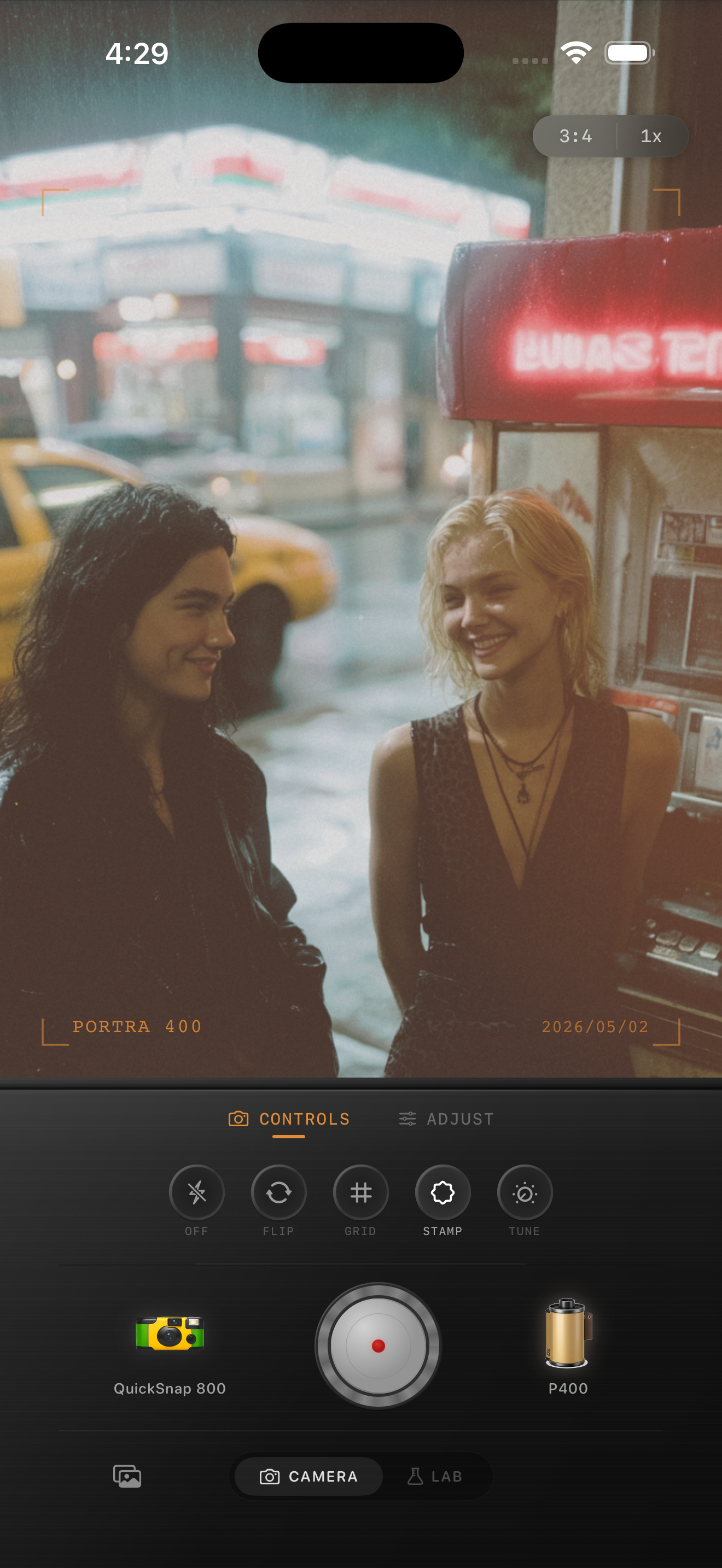
Treat the glass, people, and asphalt differently
Convenience-store shots often mix several fragile surfaces in one frame: reflective glass, bright interior shelves, skin, cars, and dark pavement. If you add the same amount of texture everywhere, the photo usually falls apart fast.
Check faces and lettering first, then the reflections in the window, then the pavement. If skin still feels believable and the store name still reads clearly at phone-feed size, the grain is probably in a healthy range.
Pick the camera mood based on the kind of stop
A cleaner 35mm-inspired body works well for quiet roadside stops, travel scenes, and moody wide frames where the store is part of a bigger night environment. A rougher point-and-shoot or disposable-inspired body makes more sense for soda runs, snapshots with friends, and flashier parking-lot moments.
In Nostalgia Cam, start with the camera body first, then tune grain, warmth, fade, and vignette until the image feels like a remembered midnight errand instead of a sharp phone file under bad lighting.
Turn late-night store stops into film memories
Use Nostalgia Cam to shoot or import convenience-store photos, then balance camera body, grain, warmth, fade, and vignette so fluorescent night scenes feel textured, cinematic, and naturally film-inspired.
FAQ
Should convenience-store photos be warmed up a lot to look like film?
Usually no. Store lighting often already has a strong color cast, so it usually looks better to keep some of the cooler tone and rely on softer contrast plus grain for the film feeling.
What matters most in a convenience-store film edit?
Highlight control matters most. If the signs, cooler lights, and window reflections keep their shape, the grain and color have room to feel cinematic instead of harsh or muddy.