
iPhone film look
Best Film Settings for Neon Crosswalk Photos on iPhone
A practical neon crosswalk guide for iPhone: keep highlight color, preserve shadow detail, and use film-style grain without turning the whole street scene muddy.
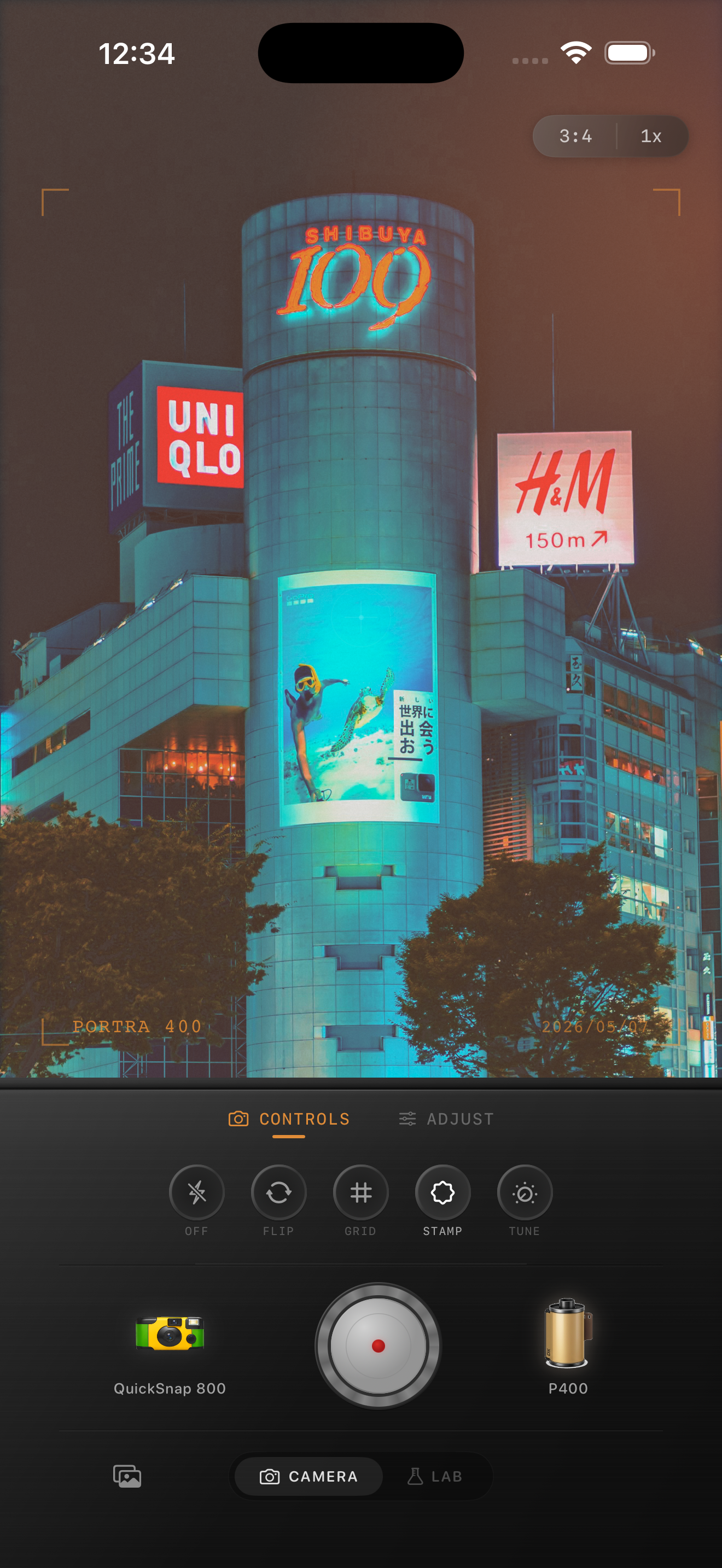
Crosswalk photos need separation, not more chaos
Neon crosswalk scenes already have motion, signage, reflections, and color contrast built in. The edit works when it organizes that energy instead of piling on extra grain, warmth, and glow all at once.
Most bad edits fail because every bright sign gets pushed equally. Once pinks, reds, blues, headlights, and crosswalk paint all start glowing the same way, the image loses depth and stops feeling photographic.
- Protect the brightest signs before adding extra glow.
- Keep grain moderate so crosswalk lines and silhouettes stay readable.
- Use warmth carefully; many neon scenes already lean warm enough.
- Let some shadows stay dark so the street still has shape.
- Add vignette lightly because city edges already carry visual weight.
A dependable neon crosswalk starting recipe
Start around film intensity 76-88%, grain 28-40%, warmth +1 to +6, fade 3-7%, and vignette 4-8%. That range usually softens the digital finish without flattening the contrast that makes the crossing feel alive.
If the pavement is wet or highly reflective, lower highlights before increasing fade. Reflection-heavy scenes usually break because bright color stacks too fast, not because they need more analog texture.
Balance the lights against the street surface
The street matters as much as the signs. A believable film-style crosswalk edit keeps some texture in the asphalt, lane paint, umbrellas, jackets, and reflections. If the ground turns into one glossy blob of color, the frame gets flatter even when the highlights look dramatic.
Check the image at normal phone size first. If people, lane markings, or the curb disappear into the color wash, pull back the warmth or glow before changing the grain.
Choose a cleaner camera body than you think
Neon scenes already contain visual noise, so they often work better with a cleaner 35mm-inspired or compact-film body than with a rough disposable one. You can still add texture, but the base should preserve legibility first.
In Nostalgia Cam, start with the calmer camera body, then tune grain, fade, and vignette until the scene feels like a real night print instead of a stylized cyberpunk overlay.
Keep neon streets readable in Nostalgia Cam
Use Nostalgia Cam to balance camera body, grain, warmth, fade, and vignette so neon crosswalk photos keep their color drama without losing sign detail, pavement texture, or shadow depth.
FAQ
Should neon crosswalk photos use heavy grain to look like film?
Usually no. Moderate grain works better because neon street scenes already contain a lot of detail and contrast. Too much grain can make signs, reflections, and silhouettes collapse together.
Why do neon street edits get muddy on iPhone?
They usually get muddy when highlights, warmth, and fade are all pushed before the brightest signs and darkest street areas are balanced. Keep the scene separated first, then add texture.