iPhone film look
How to Edit Travel Portraits to Look Like Film on iPhone
Travel portraits look more like film when skin tones stay calm, landmarks do not overpower the subject, and grain supports the memory instead of taking over the frame.
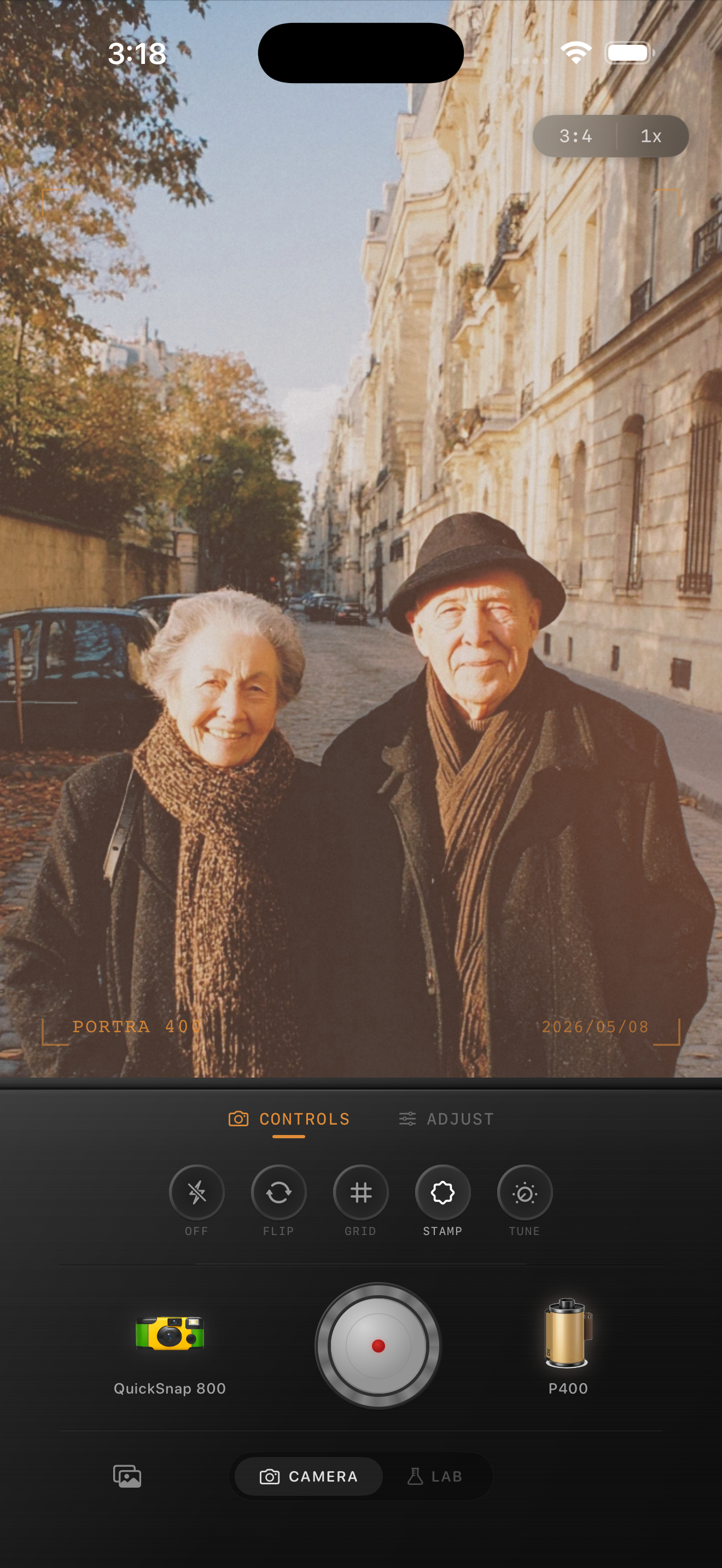
A good travel portrait keeps the person ahead of the landmark
Travel portraits usually fail when the location becomes louder than the person. The iPhone boosts detail, contrast, and color so strongly that buildings, signs, and skies can pull attention away from faces.
A film-style edit helps by calming the whole frame. You soften the digital sharpness, settle the colors, and make the scene feel like a memory from the trip instead of a phone file proving you were there.
Start with softer contrast and calm skin tones
Use film intensity around 70-82%, grain around 22-34%, warmth around +4 to +10, fade around 4-7%, and vignette around 4-9%. That usually gives enough structure for a portrait while keeping the background from looking too clinical.
If the location is already colorful, lower saturation before raising warmth. Travel portraits look more believable when skin tones stay quiet and the setting feels slightly gentler around them.
- Keep faces brighter than the surrounding street.
- Use fine or medium grain, not rough disposable grain.
- Let landmark colors soften instead of pop.
- Preserve clothing texture and hair detail.
- Use vignette lightly so the effect does not feel staged.
Choose a film mood that matches the trip
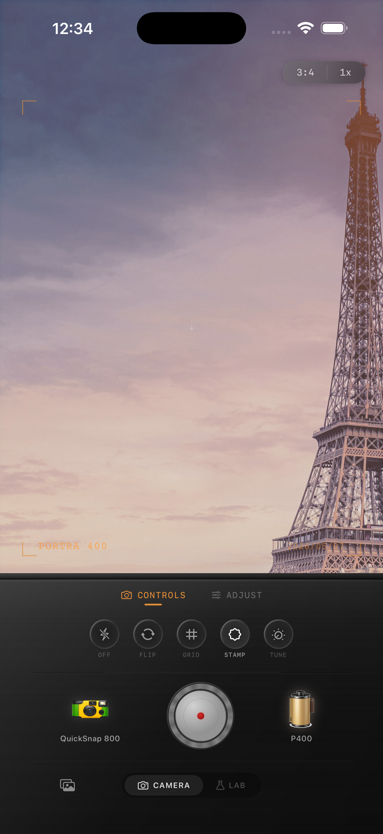
Older city streets, train platforms, hotel balconies, and cafe corners usually suit a cleaner 35mm-inspired look with fine grain and gentle warmth. Bright beaches or midday sightseeing scenes may need even less grain and less fade.
If you want a Portra-style or Fuji-style color direction, keep the language honest: use those names only as inspiration for softer pastel warmth or cooler greens, not as an affiliation claim.
The best travel portraits still feel specific
Leave some clues from the place in the frame: street signs, architecture, cafe tables, transit details, or a slice of skyline. Those details make the photo feel lived-in, and a subtle film edit helps them blend with the portrait instead of competing with it.
Once the image feels personal first and touristic second, the film look is doing its job.
Give trip portraits a more natural film finish
Open Nostalgia Cam, choose a cleaner film-style camera body, and tune grain, warmth, fade, and color softness so your travel portraits keep the place and the person in balance.
FAQ
What grain works best for travel portraits?
Usually fine to medium grain works best, around 22-34%. It adds texture without making faces and landmark details feel rough or overprocessed.
Should I make the landmark brighter or the person brighter?
The person should usually stay slightly more prominent. Let the location support the portrait instead of becoming the only thing your eye notices.