iPhone film look
Best Film Settings for Neon Sign Photos on iPhone
A practical neon-sign film recipe for iPhone photos: protect bright lettering, add controlled grain, and keep city color vivid without turning the frame into clipped digital glow.
Neon signs need highlight control first
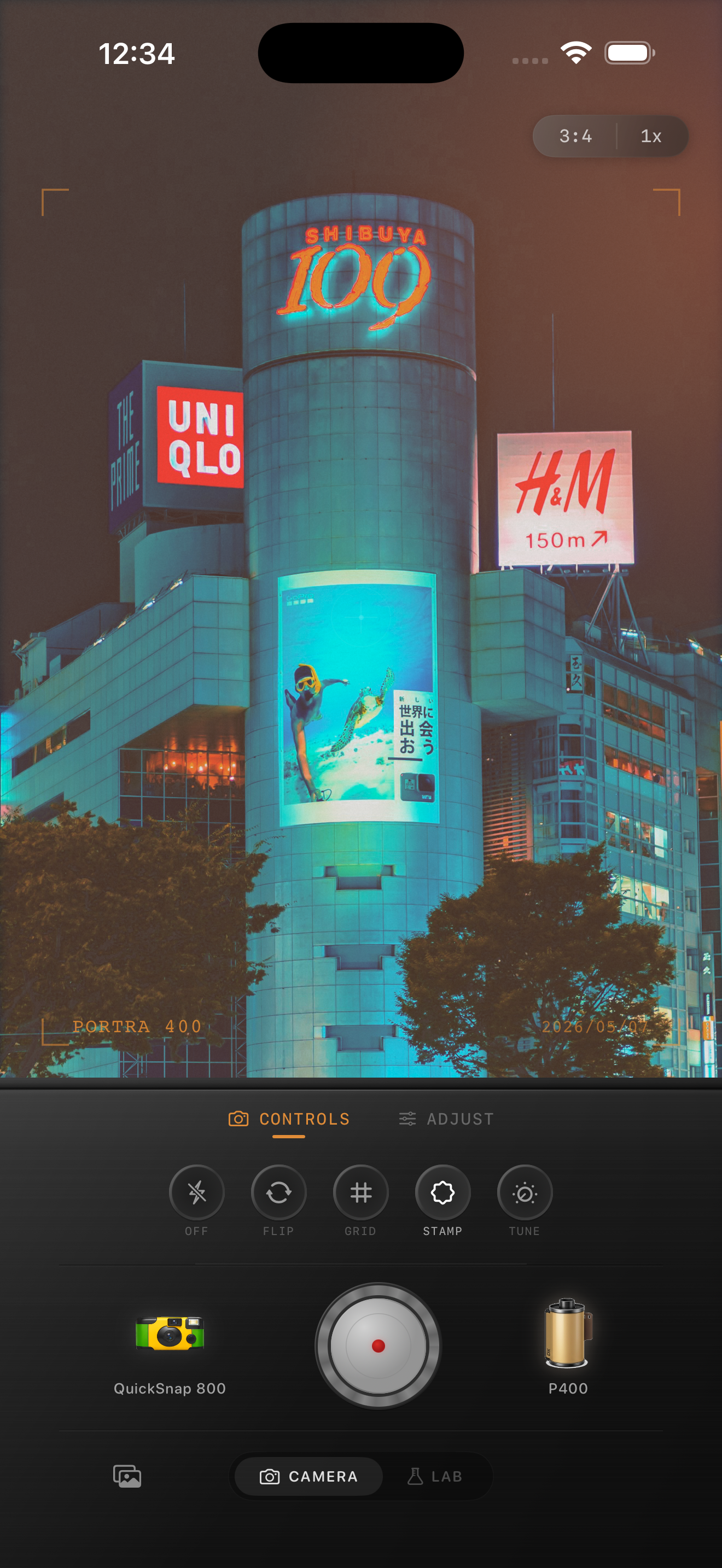
Neon scenes are one of the easiest ways to make an iPhone photo look cinematic, but they also reveal digital problems fast. Bright lettering clips, blacks get too clean, and the whole frame can feel more like a phone sensor than a night print.
The first job is to protect the sign itself. If the letters or tubes become flat white patches, no amount of grain afterward will make the photo feel like film.
A practical neon-sign settings recipe
Start with film intensity around 76-88%, grain around 28-40%, warmth around +2 to +8, fade around 3-7%, and vignette around 5-10%. Add only slight halation or glow so the light blooms a little without swallowing the edges of the sign.
If the scene already has mixed pink, blue, or red light, resist the urge to add more saturation. Neon usually looks more film-like when the highlights are softer and the grain carries the texture.
- Lower highlights before raising warmth.
- Use medium grain, not rough disposable grain.
- Keep blacks soft enough to hold shadow detail.
- Let the sign stay brighter than the street around it.
- Use only subtle glow around the lettering.
Why neon photos get overedited
People often stack contrast, saturation, grain, and halation all at once because night scenes seem like they should be dramatic. The result is usually clipped color, crunchy shadows, and skin that stops looking real.
A better neon edit uses restraint. Keep the sign vivid, let the street stay slightly darker, and use grain to break the sterile digital finish instead of forcing every effect to be loud.
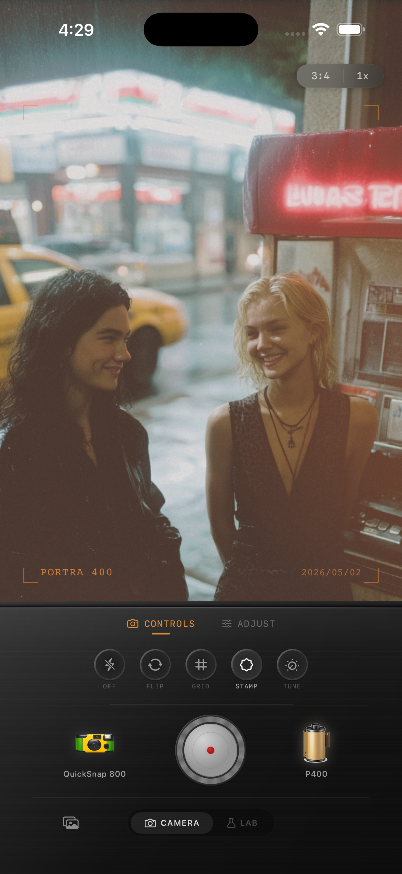
Choose angles with reflections or surrounding context
Neon sign photos get stronger when the frame includes a window, wet pavement, passing cars, a doorway, or a person moving through the scene. Those details give the grain and color somewhere to live beyond the sign itself.
In Nostalgia Cam, start with a cleaner 35mm-style body for readable signage, then add just enough texture to make the city feel lived-in.
Make neon scenes feel less digital
Open Nostalgia Cam for your next night walk, choose a cleaner film-style camera body, and tune grain, highlight softness, fade, and subtle glow until neon signs feel cinematic without blowing out.
FAQ
Should neon sign photos use a lot of grain?
Usually medium grain works best, around 28-40%. It adds texture to the darker parts of the frame without making lettering and color edges feel dirty.
Why do neon signs turn white in my edits?
They usually turn white when highlights are not controlled before warmth, glow, or saturation are added. Pull the highlights back first, then build the film look around the preserved sign color.